24 Inspirational Squarespace Websites for Restaurants
Check out these Squarespace restaurant websites before building your own
Squarespace offers an array of beautiful templates tailored for restaurants, making it easier than ever to create a stunning and user-friendly website. With a Squarespace template, restaurant owners can showcase their culinary offerings, share their unique ambiance, and engage with their patrons in a visually appealing and informative way.
Let’s go over some of our favorite restaurant websites built with Squarespace for inspiration.
Try Squarespace for free – and save 10% when you purchase a subscription with code APPLET10
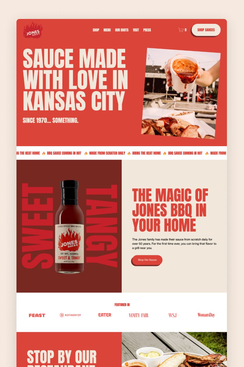
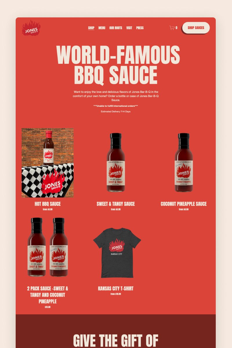
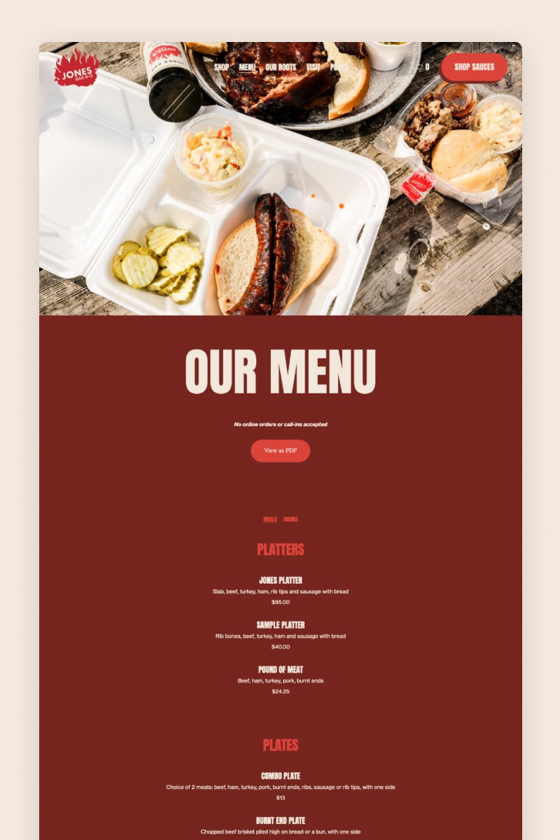
Jones Bar-B-Q
The Jones Bar-B-Q website features a jaw-dropping design with large typography and dynamic components that seamlessly reflect the personality of the business. Its maroon-based color palette matches its specialty dishes and immerses visitors into the restaurant’s offerings immediately.
The website’s pages are marked by large, animated images and a fairly simple design. The website also includes a grid-style shop where visitors can purchase their world-famous BBQ sauce.
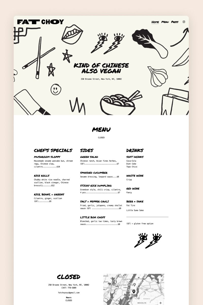
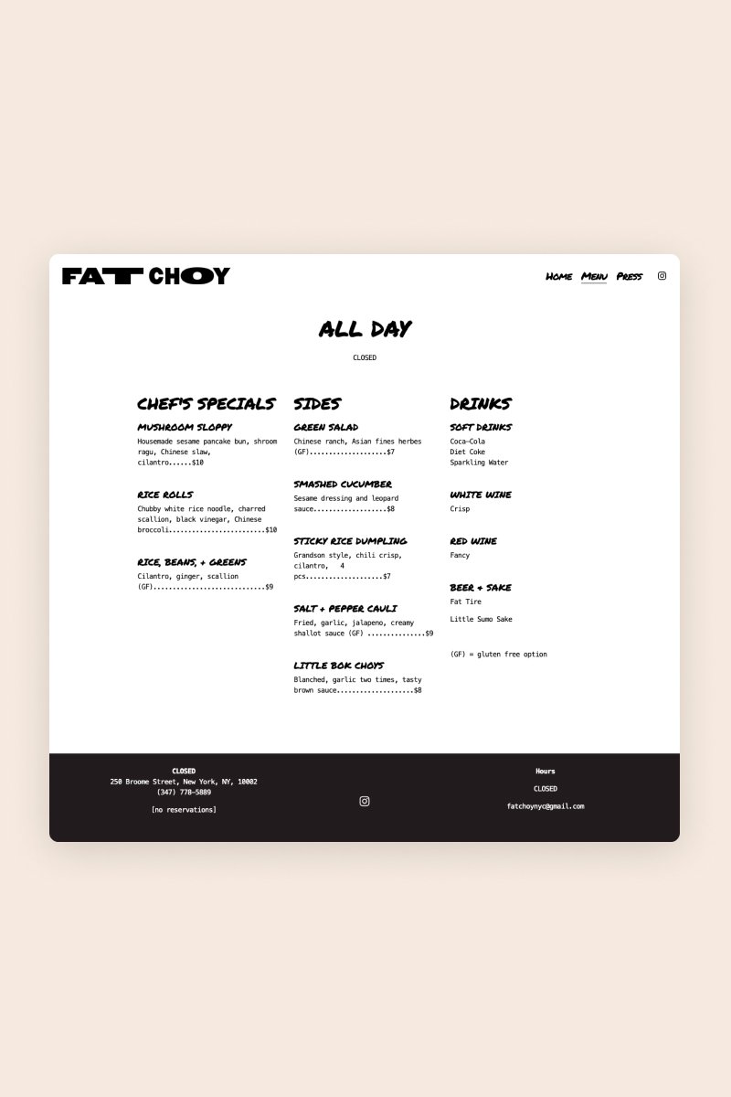
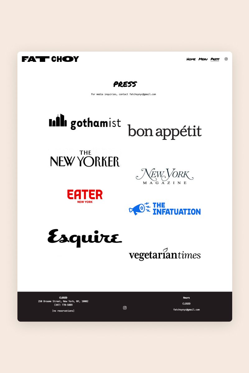
Fat Choy
With its one-of-a-kind design, the Fat Choy website does a great job of reflecting the kind of experience you get at this Chinese and vegan restaurant. The website is styled in black and white and packed with illustrations that add a touch of personality.
The homepage lays out everything foodies want to know (menu, address, and opening hours) and even includes pictures of some of the main dishes. This provides an effortless experience for visitors, especially those who may be using the mobile version.


Blue Dog
The Blue Dog NYC website has a clean, elegant aesthetic that balances white space with rich, warm photography. The layout feels modern and polished, using a centered column for text sections and full-width hero images to create visual impact. Throughout the site, typography is kept minimal and readable – serif fonts for headings give the brand a refined tone, while body text remains simple and legible. This combination creates a premium, almost editorial vibe.
Food photography plays a major role in the visual identity. The homepage and gallery sections are filled with vibrant, close-up shots that highlight dishes, drinks, and ambiance. These images are arranged in a way that feels curated rather than cluttered, which helps reinforce the brand’s “elevated yet approachable” personality. The imagery gives the site warmth and character, breaking up the minimalistic structure and inviting visitors to explore.
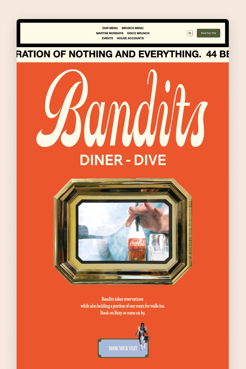
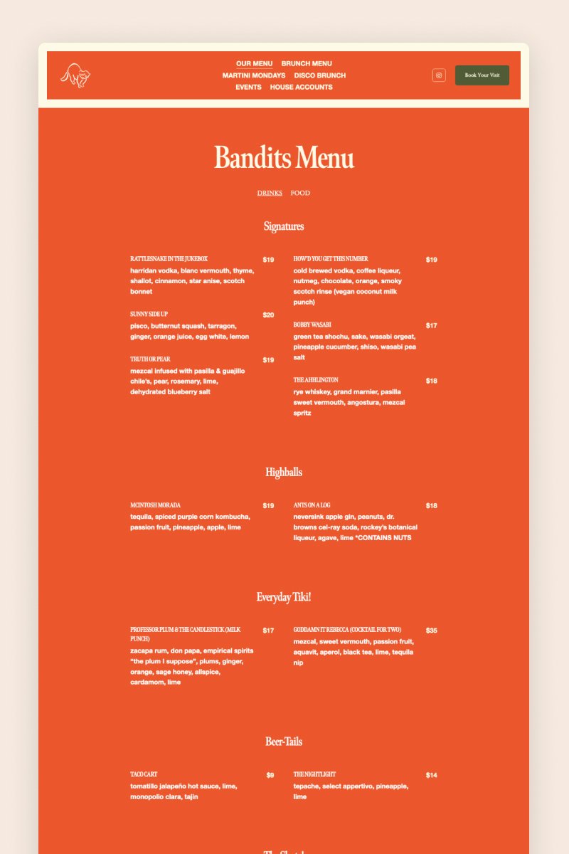
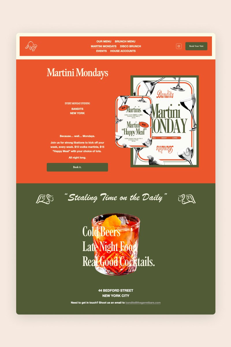
Bandits
The Bandits website leverages Squarespace’s features to create an eye-catching, appetite-inducing experience for its customers. It welcomes visitors with a pop-up offering a discount if they sign up for their newsletter — a great way to grow a mailing list if you ask me!
The overall design features massive images and one-of-a-kind buttons, all blended in a color palette that seamlessly combines green and orange tones.


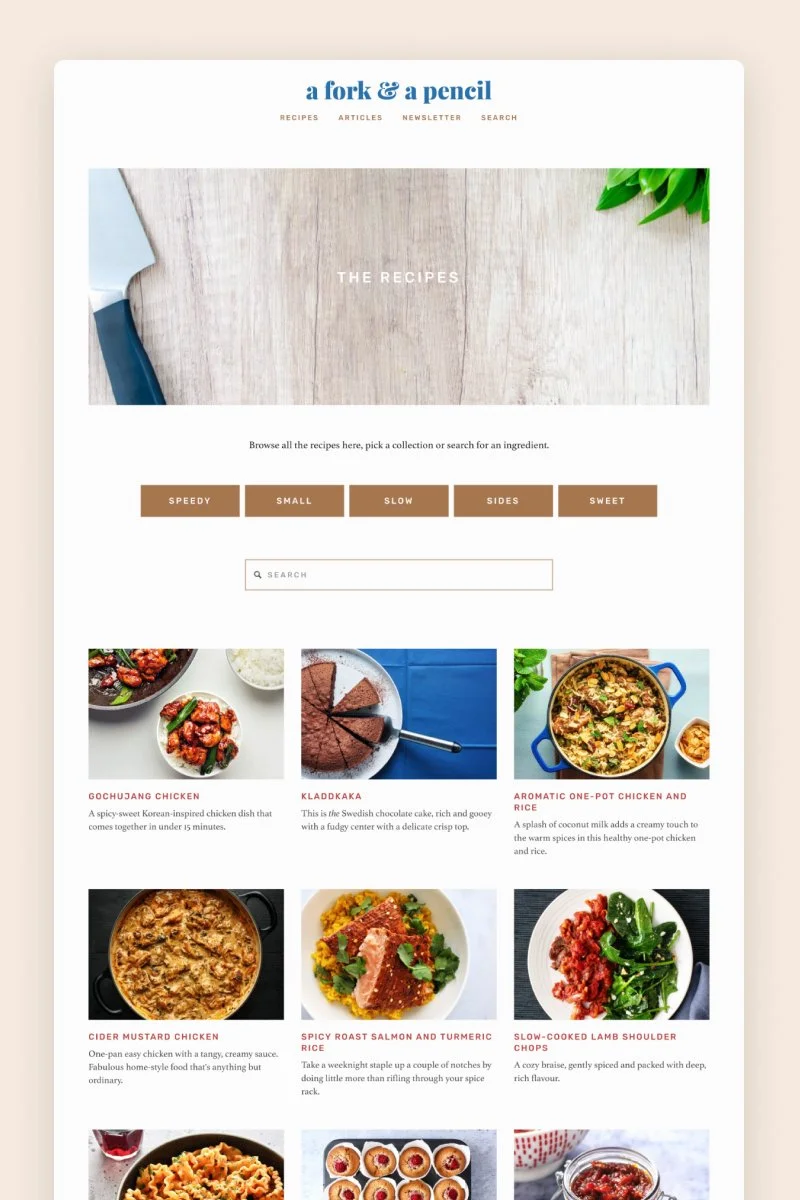
A Fork & a Pencil
The design of a fork & a pencil website is a masterclass in elegant, image-focused food blogging, demonstrating how to let content shine. The site employs a beautiful minimalist aesthetic, utilizing a clean, light (white/cream) background that allows the large, high-quality food photography to take center stage. This approach instantly elevates the recipes, making them look irresistible and sophisticated.
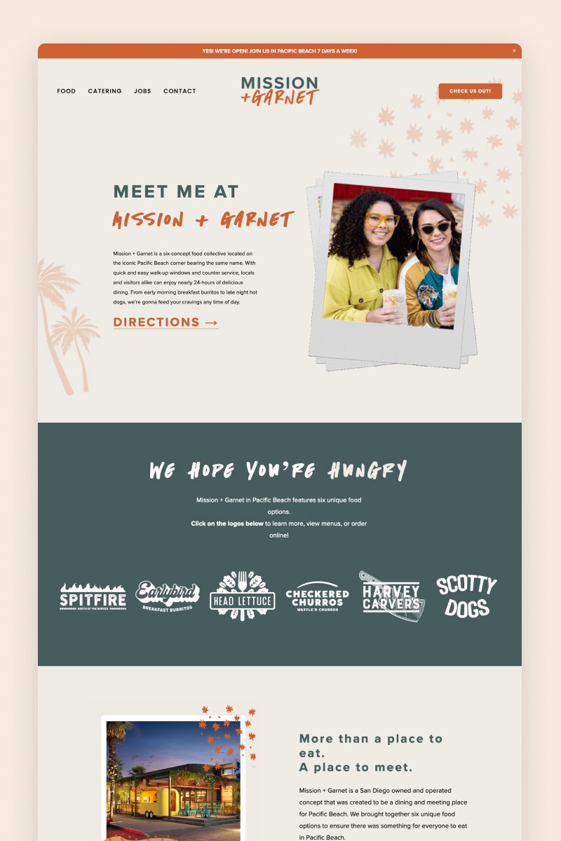
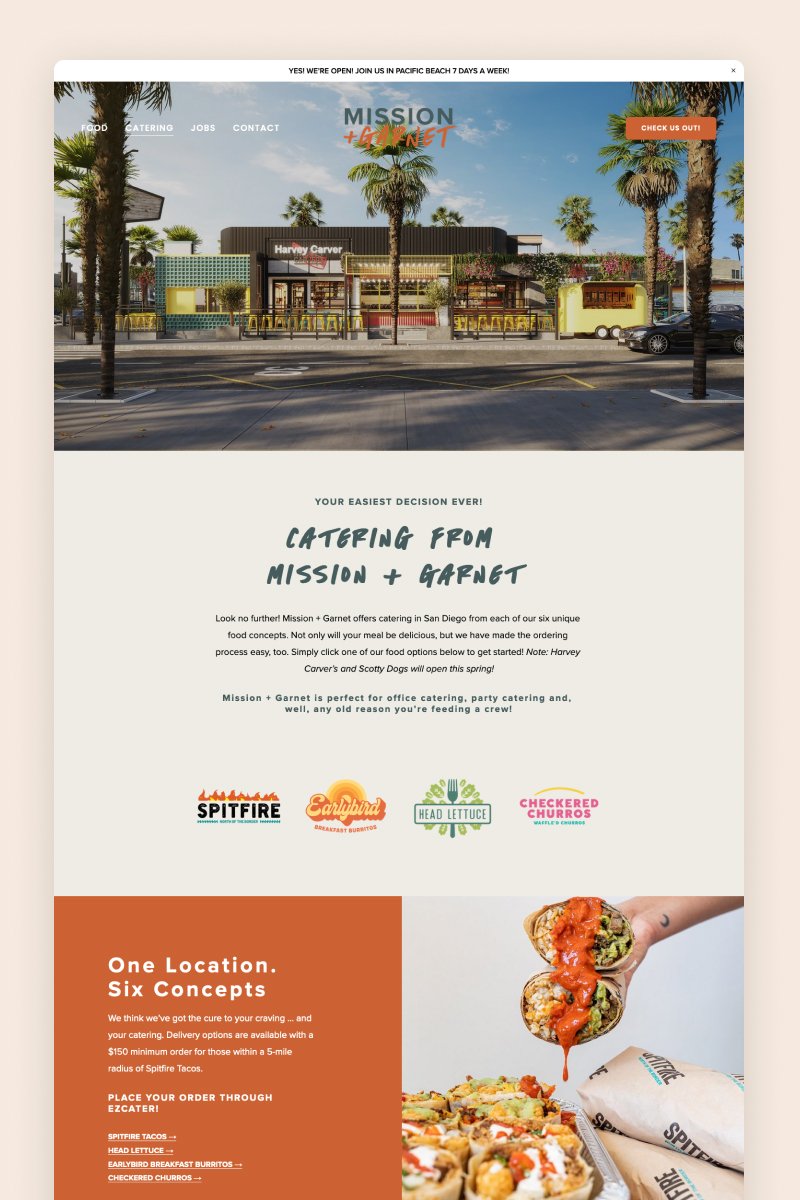
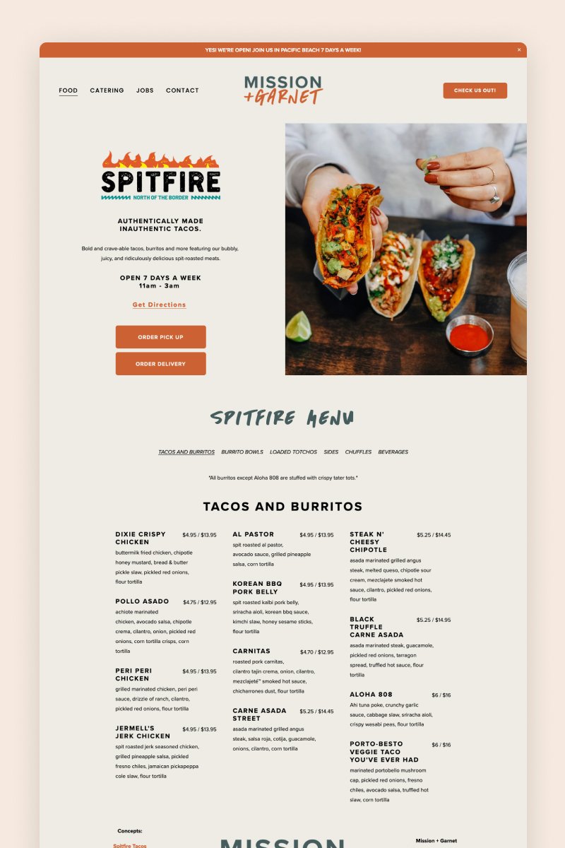
Mission + Garnet
Mission + Garnet’s website was created using one of the premium Squarespace templates from our shop and has an easy-to-navigate structure. It includes a home page, catering, six pages dedicated to concept restaurants, and a contact page, all styling a funky, colorful design.
Each restaurant’s page uses a bold split as a hero section with enticing images of the delicious food they serve. These pages contain detailed menus and CTA buttons for pick-up and delivery, with a great structure to organize this relevant information.


Supernatural Kitchen
The design for Supernatural Kitchen has a perfect balance between playful brand personality and robust e-commerce functionality. The site’s aesthetic is built on a foundation of a clean, light background that beautifully contrasts with the vibrant, high-energy product packaging. Branding is delivered through a whimsical, hand-drawn script logo and border elements, which inject personality and a storybook charm.
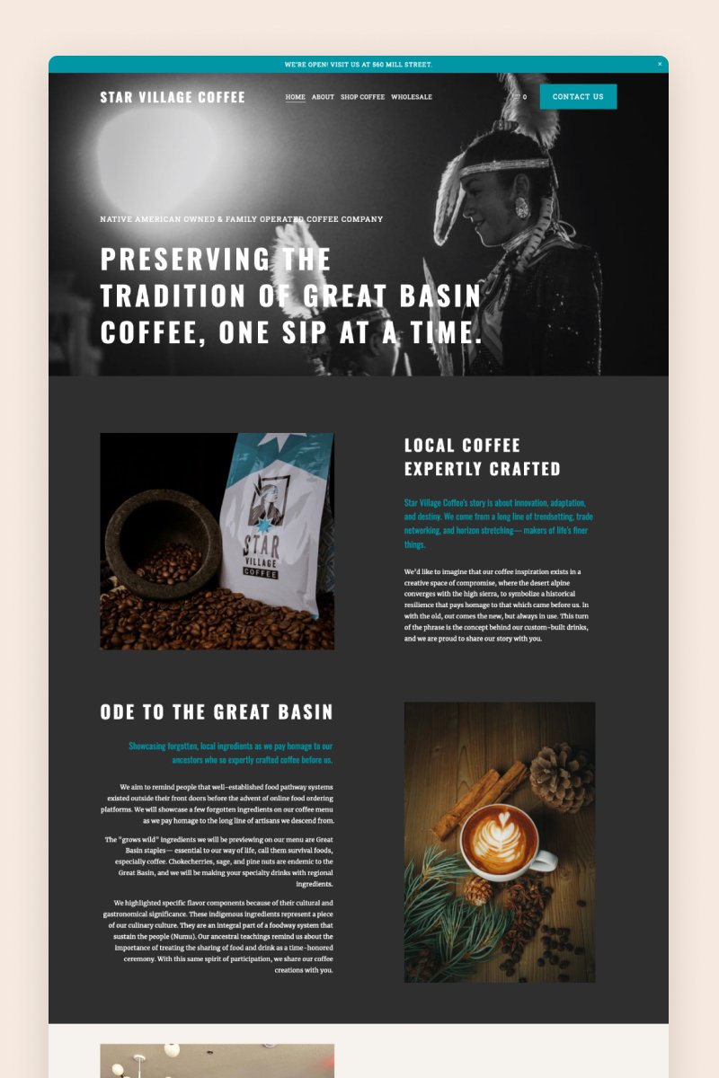
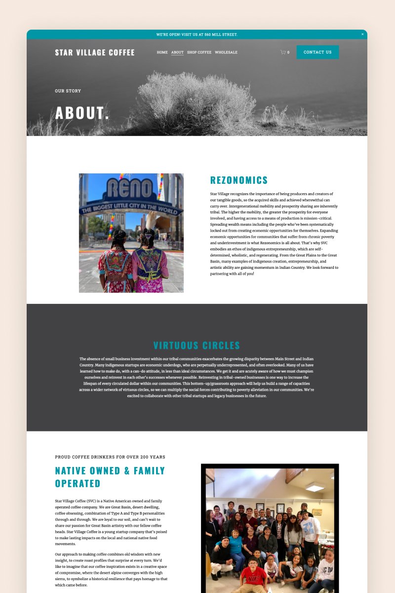
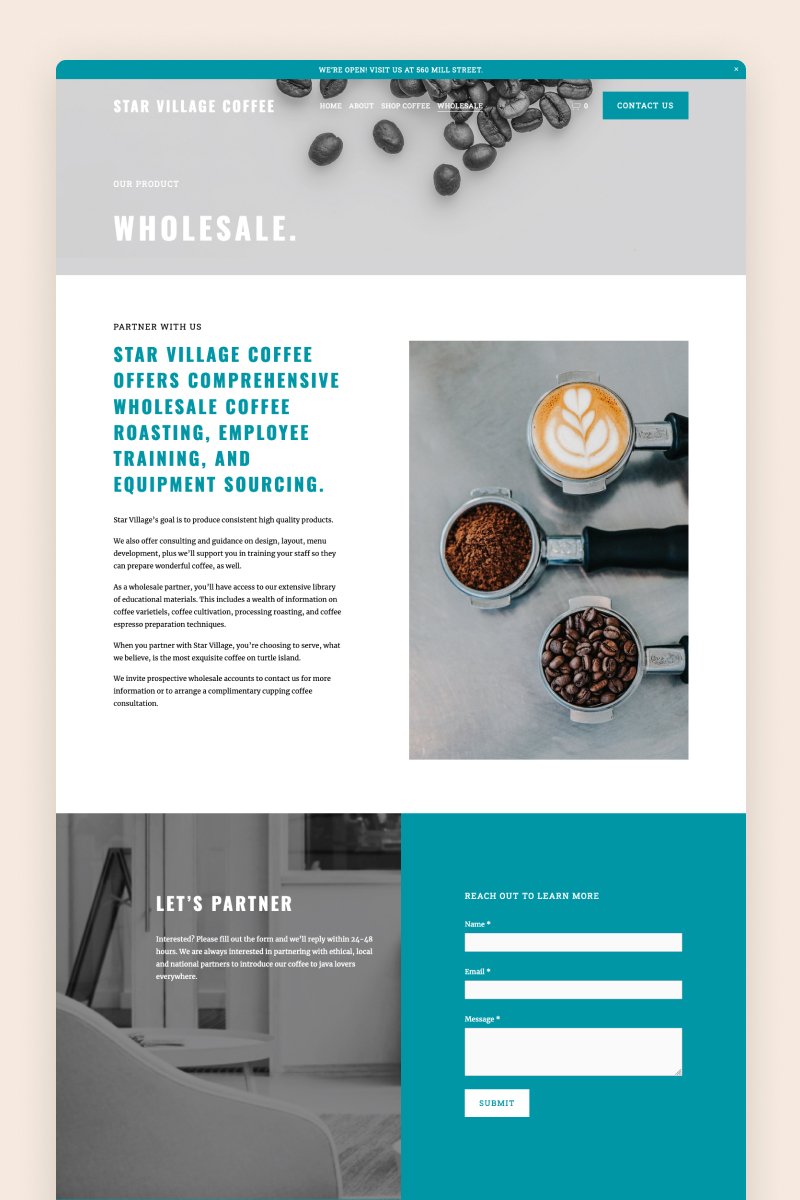
Star Village Coffee
Star Village Coffee is a Native American-owned and family-operated coffee company. They needed a modern yet well-balanced website and they chose Squarespace and the Studio89 template from our shop.
SVC’s business is diverse: they have a physical location (a coffee shop), an online shop, and wholesale partnerships. Despite this diversity, they manage to keep things simple, tidy, and user-friendly.
The homepage opens with a black&white hero image and the b&w backgrounds keep coming up around the website. The original template’s accent color was terracotta. SVC swapped it for their signature color aquamarine which is everywhere on their branding including the coffee packaging. Now, with little to no effort, they have cohesive branding that is also easily recognizable.
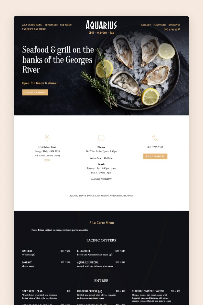
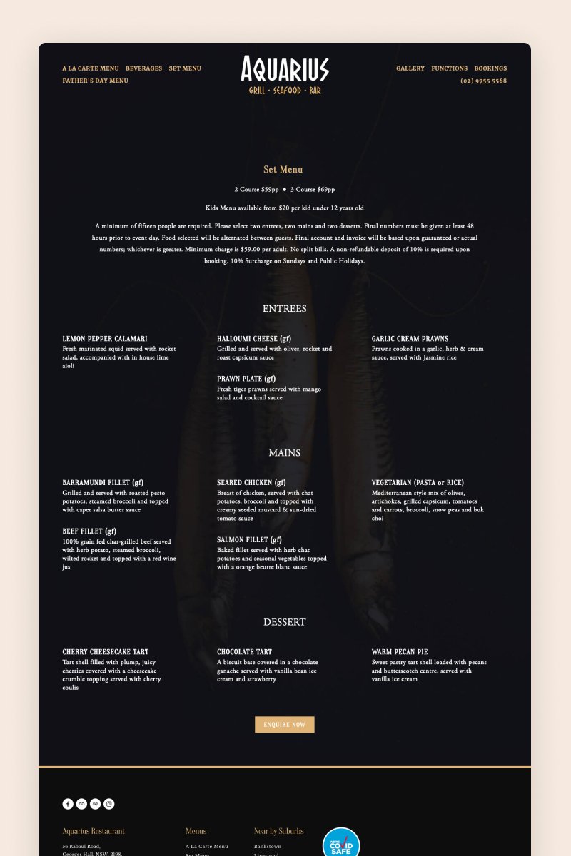
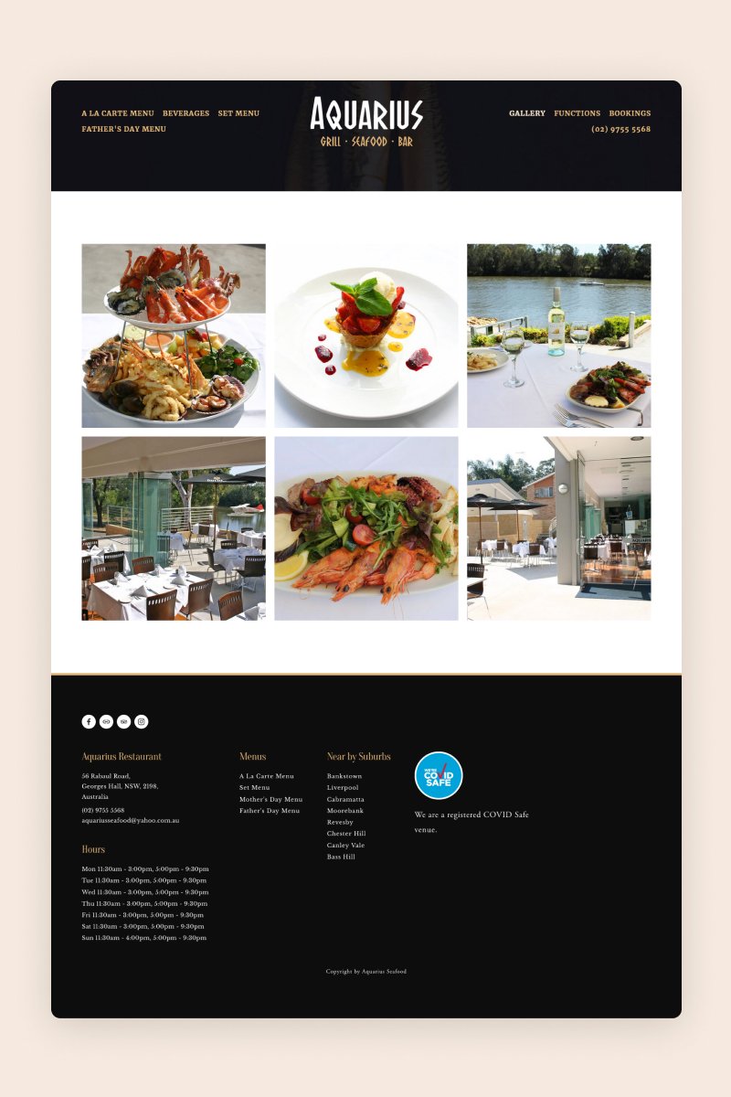
Aquarius
Aquarius is a seafood restaurant in Australia with a simple but quite effective website. It features large images of both their dishes and the restaurant itself, inviting visitors to pop by for a great meal.
The website includes several pages with all the information foodies might need to plan a visit, including the a la carte menu, beverages, and special holiday menus. It even offers customers the possibility to book a table on the website through a useful widget.
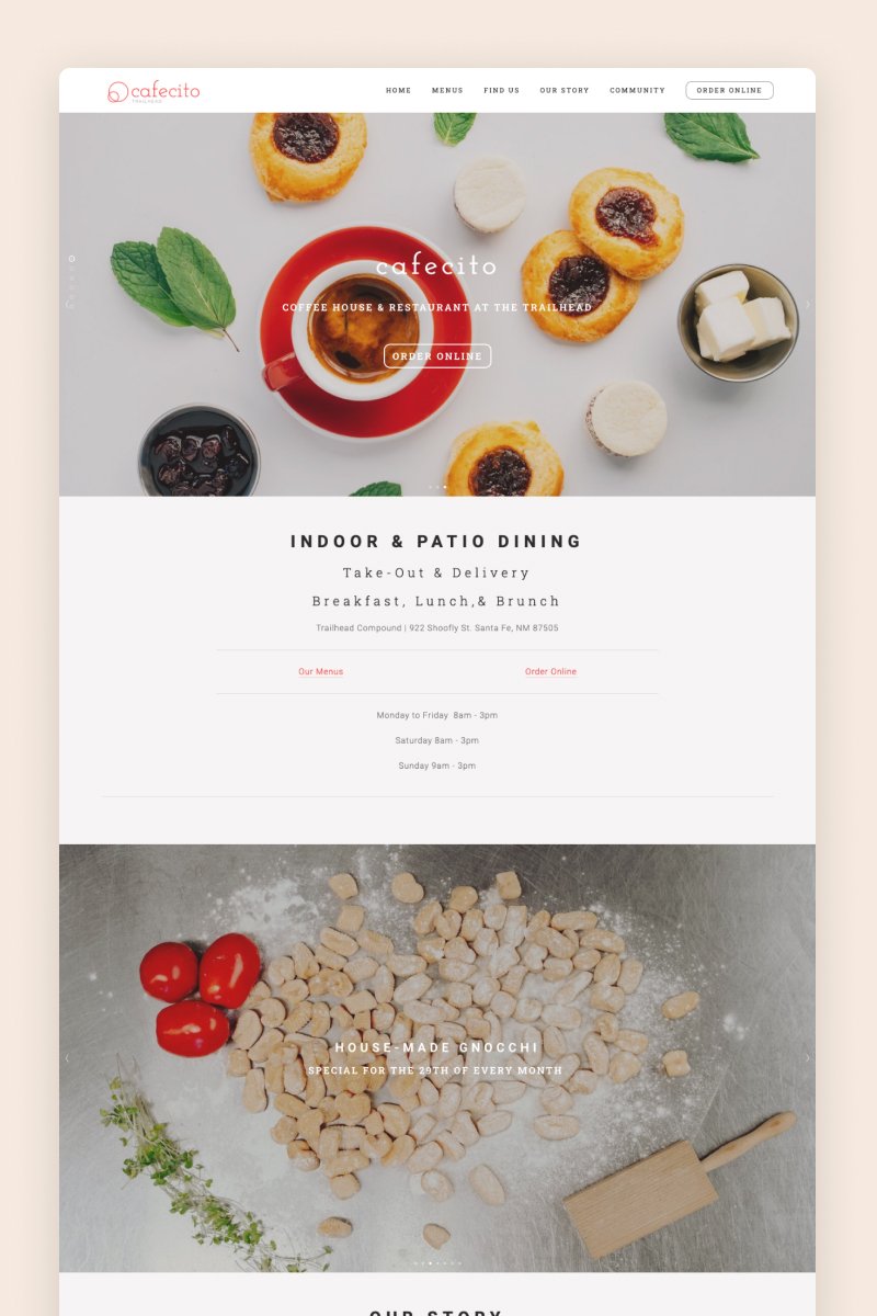
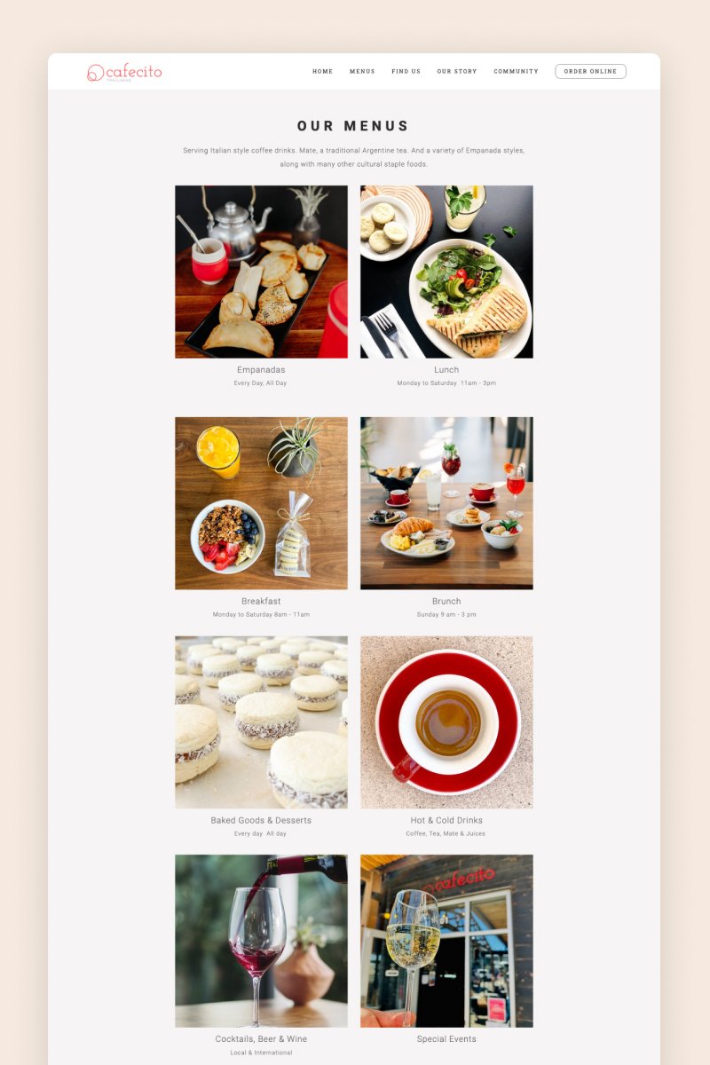
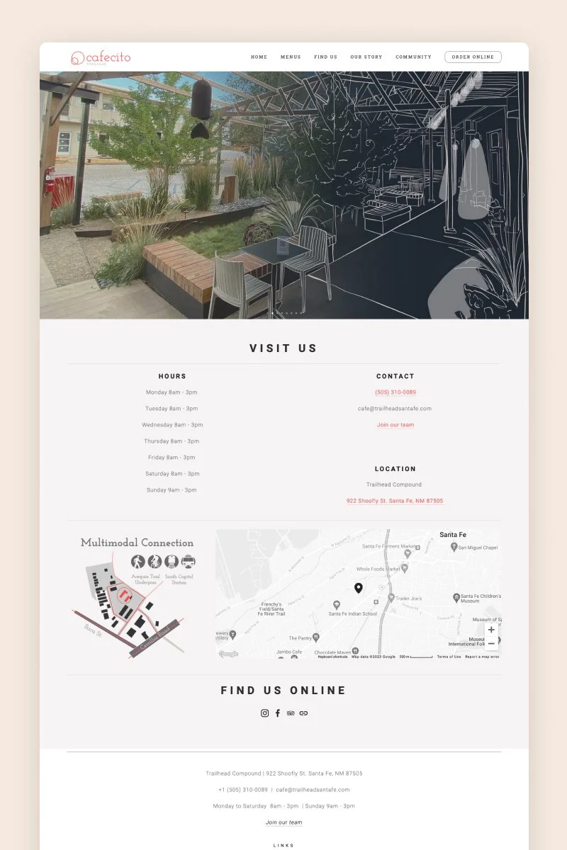
Cafecito
On Cafecito’s website, images are the protagonists. The stunning pics of tempting alfajores and empanadas catch visitors’ attention immediately and lead them through the website toward the menu and the online order system.
A carousel summary block displays the latest news and events at the coffee store, which visitors can click on to go to a blog post with further info. Towards the end, at the footer, the restaurant included a newsletter section to grow its mailing list.
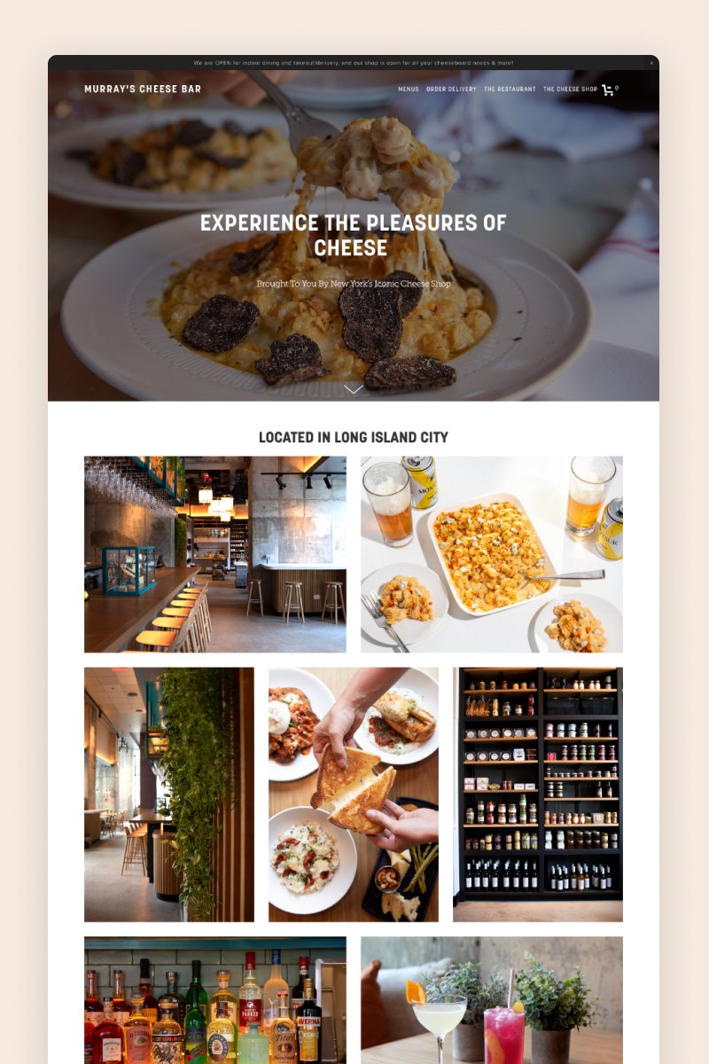
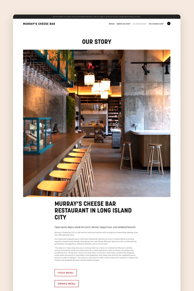
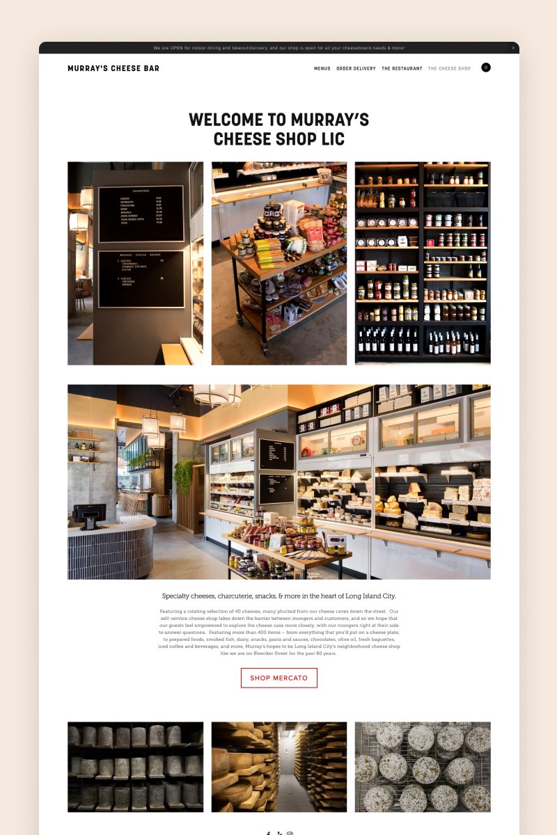
Murray’s Cheese Bar
The website for Murray’s Cheese Bar welcomes visitors with a full-bleed hero section featuring a pic of some mouth-watering, cheesy pasta. It features a gallery block with images of the restaurant and its glorious dishes, as well as helpful links to the menu and the booking page.
As far as Squarespace restaurant websites go, this is a pretty simple one, but its design is still very effective and gives off sophisticated vibes.
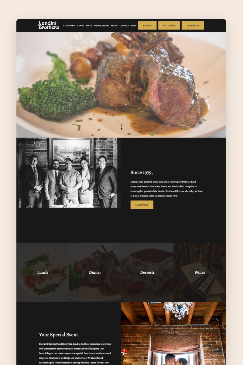
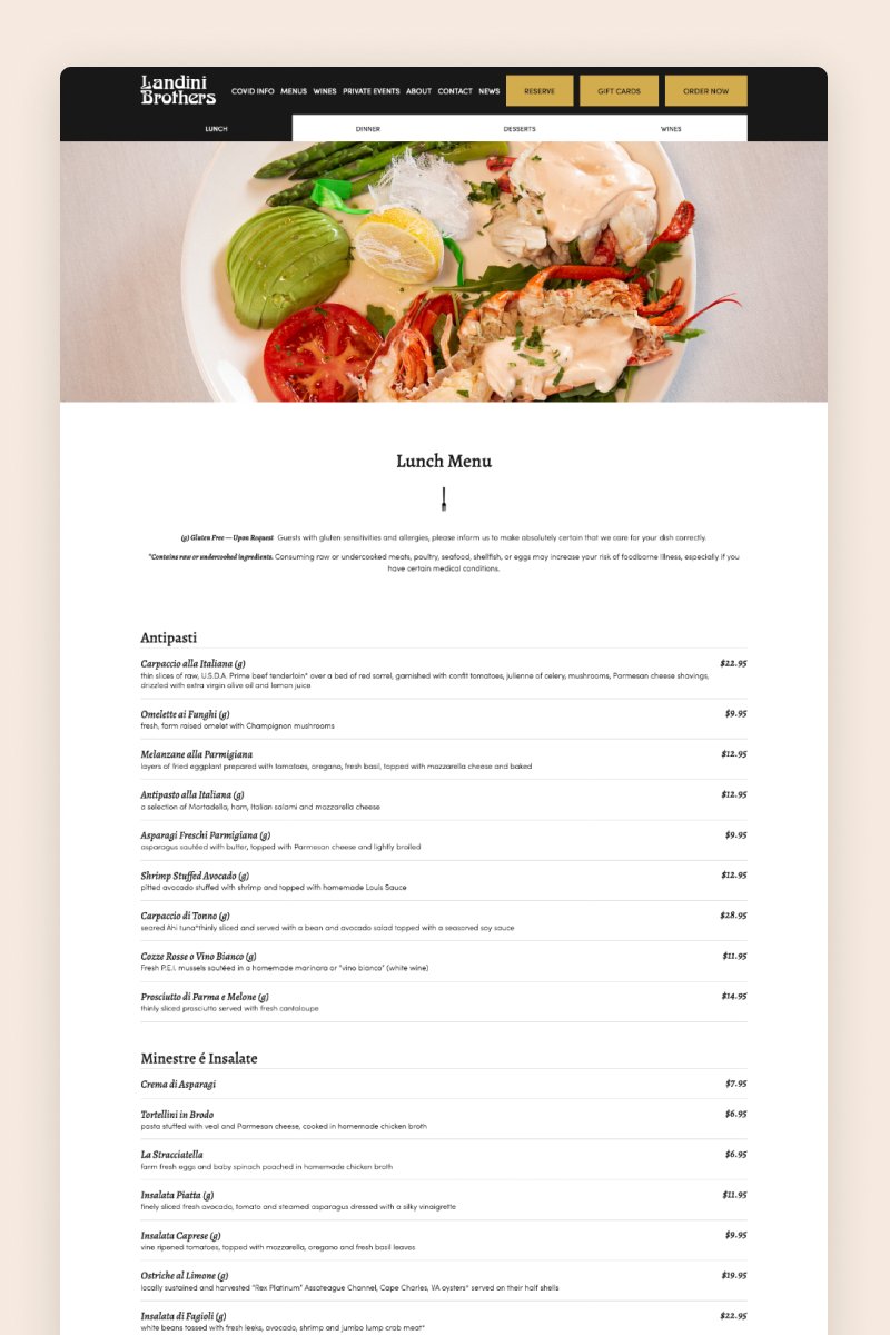
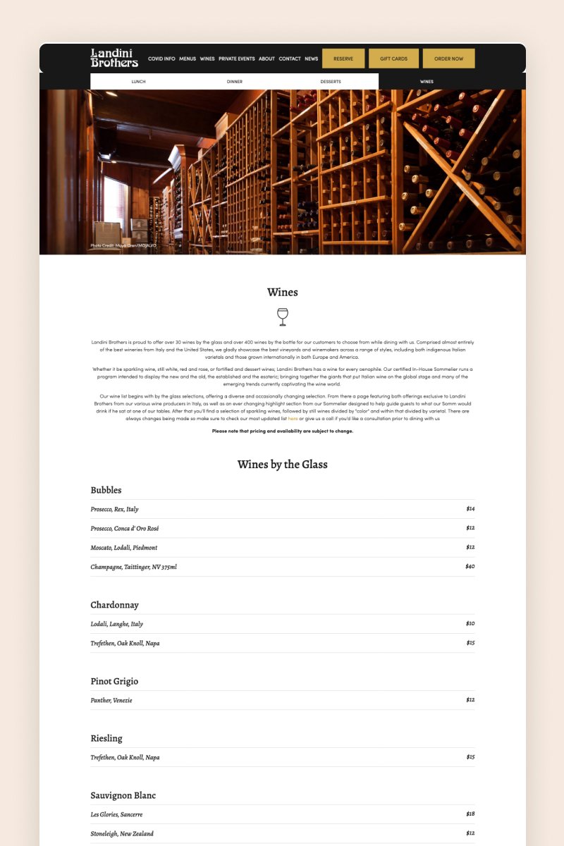
Landini Brothers
The Landini Brothers' website is packed with images displaying not only yummy dishes but also the people behind the restaurant’s history. With its big, eye-catching CTAs, the website does a great job of converting visitors into happy customers.
The menu page is conveniently organized in tabs that visitors can explore, and it’s designed like a classic restaurant menu on a blog post page.
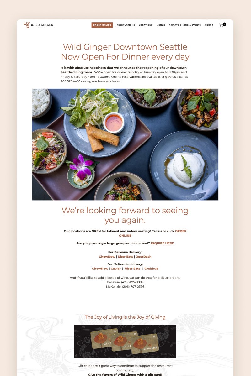
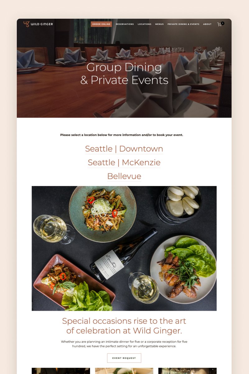
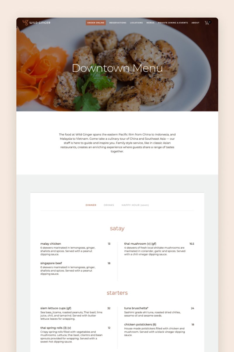
Wild Ginger
Wild Ginger’s website features large, eye-catching images of their best dishes organized in an asymmetric and very effective layout. Its carefully placed CTAs and animated components make for a pleasant and engaging browsing experience.
The restaurant also uses one of the many Squarespace-compatible widgets available to offer customers the chance to book a table on the website, saving them time and effort.
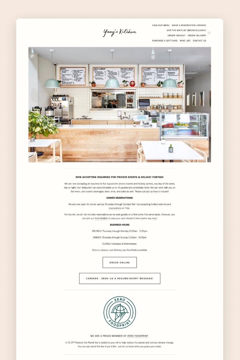
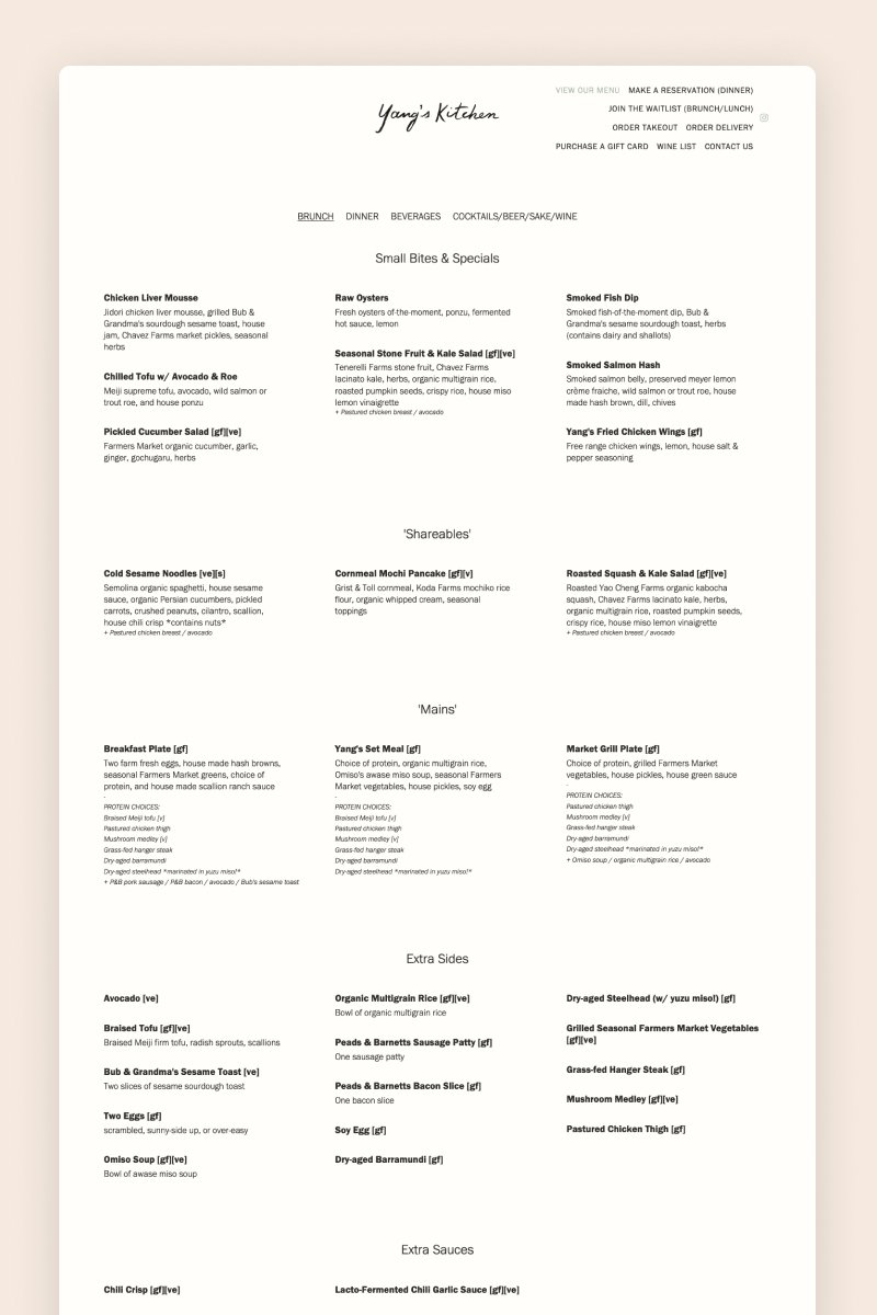
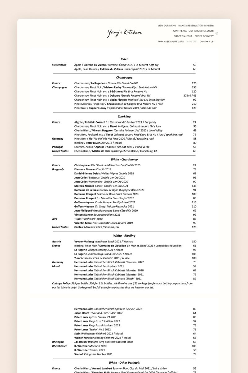
Yang’s Kitchen
The website for Yang’s Kitchen styles a straightforward black-and-white design that comes alive with colorful, on-brand images of the restaurant and its specialties. It features an Instagram carousel section and social media icons that invite visitors to engage further.
The navigation bar is stacked towards the right —a bit of an unconventional but bold move — and visitors can browse through the pages to find everything they need, from the menu to the reservation system.
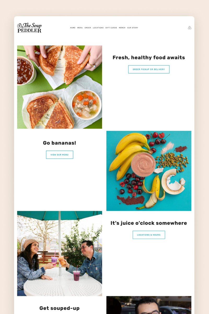
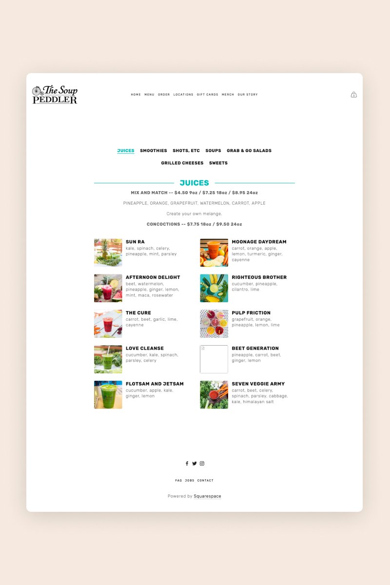
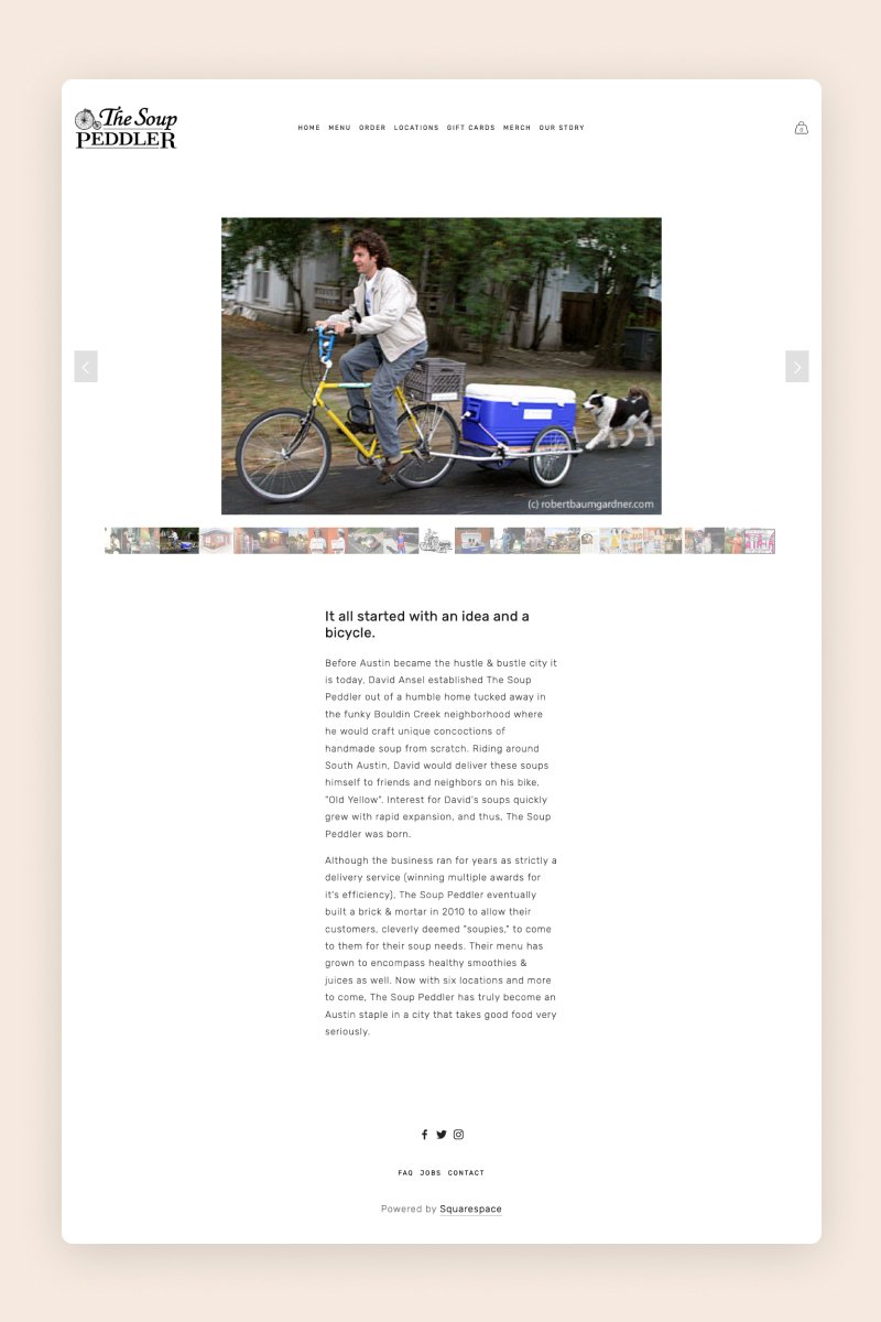
The Soup Peddler
With a split layout featuring alternating images and text, The Soup Peddler’s website offers foodies a quick and easy way to find out all the relevant information about this restaurant. The homepage includes a slideshow gallery block that displays colorful, popping images of their daily specials and draws visitors in right away.
Another cool detail is that they leverage Squarespace’s e-commerce capabilities to sell their merchandise to loyal customers.
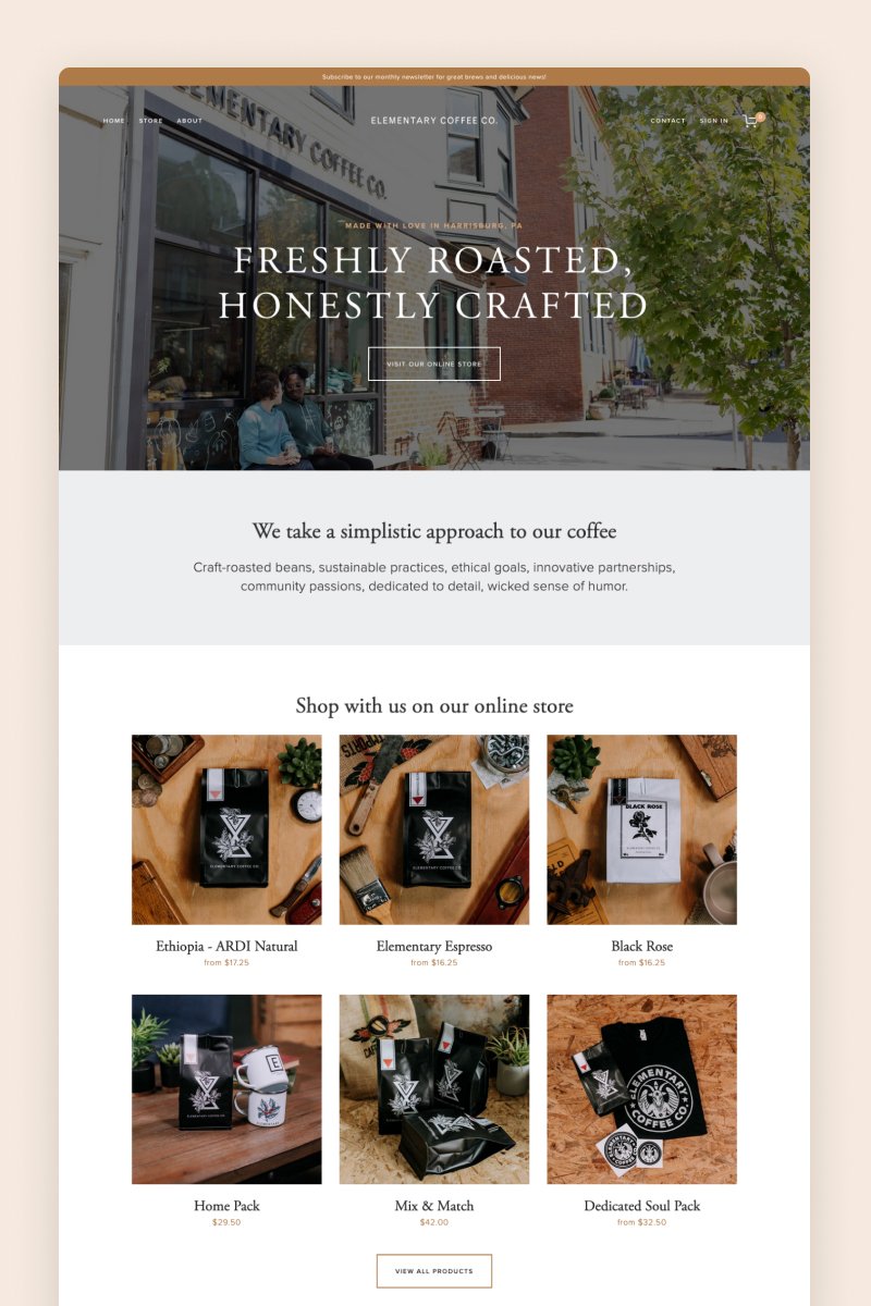
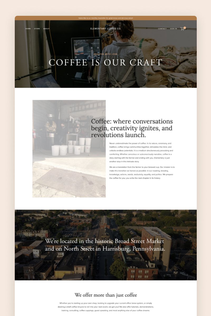
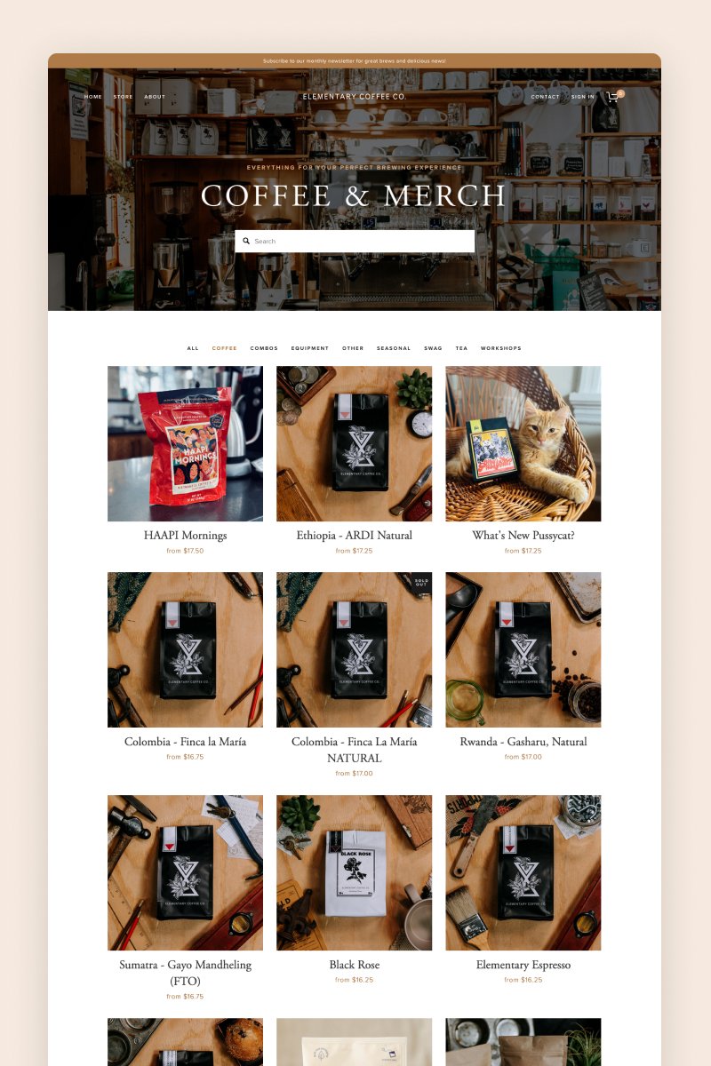
Elementary Coffee
The Elementary Coffee’s website welcomes visitors with a full-bleed hero section featuring an image of the store and showing off its stylish vibes. This coffee shop prides itself on its simplistic approach to coffee, and they have translated that into their website.
It combines a wooden color palette, gorgeous on-brand images, and effective CTAs to create an overall great browsing and shopping experience.
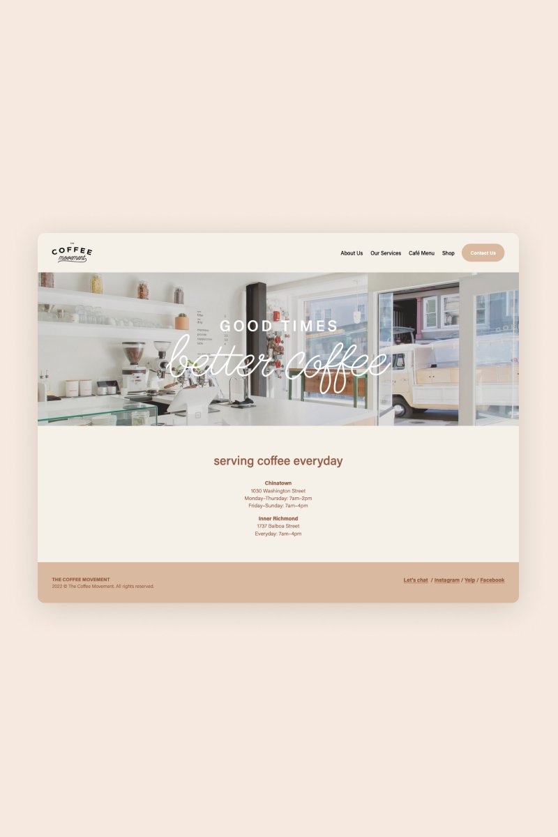
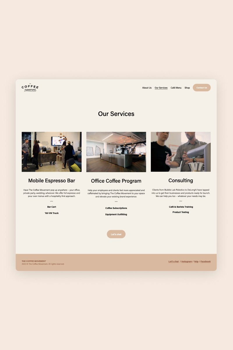
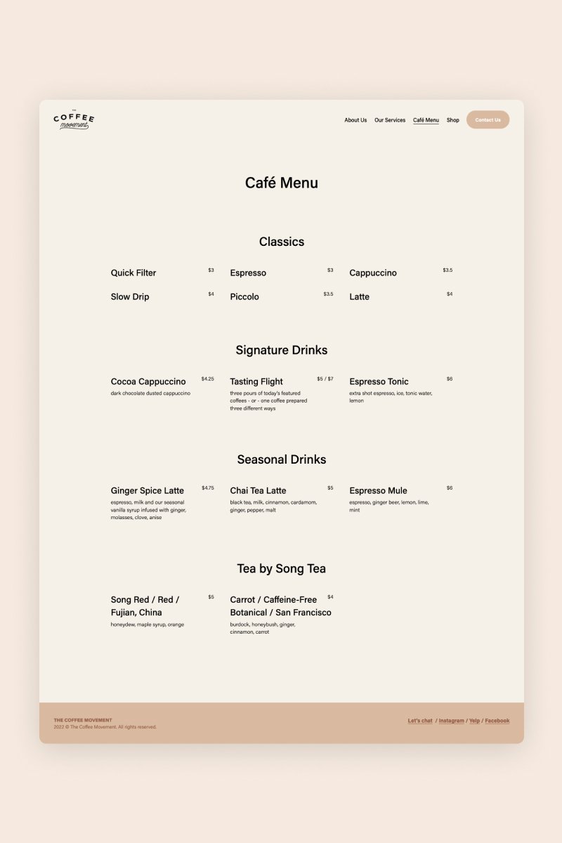
The Coffee Movement
The website for The Coffee Movement is short and sweet. It was built with Pulanski, one of Squarespace’s best templates for restaurants, but it was effectively adapted to reflect the personality of this cute coffee joint.
On its Services page, the store uses a summary block to display relevant images, the name of each service it provides, and a short description, which makes it extremely easy for customers to find what they are looking for.
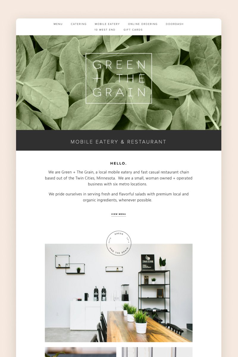
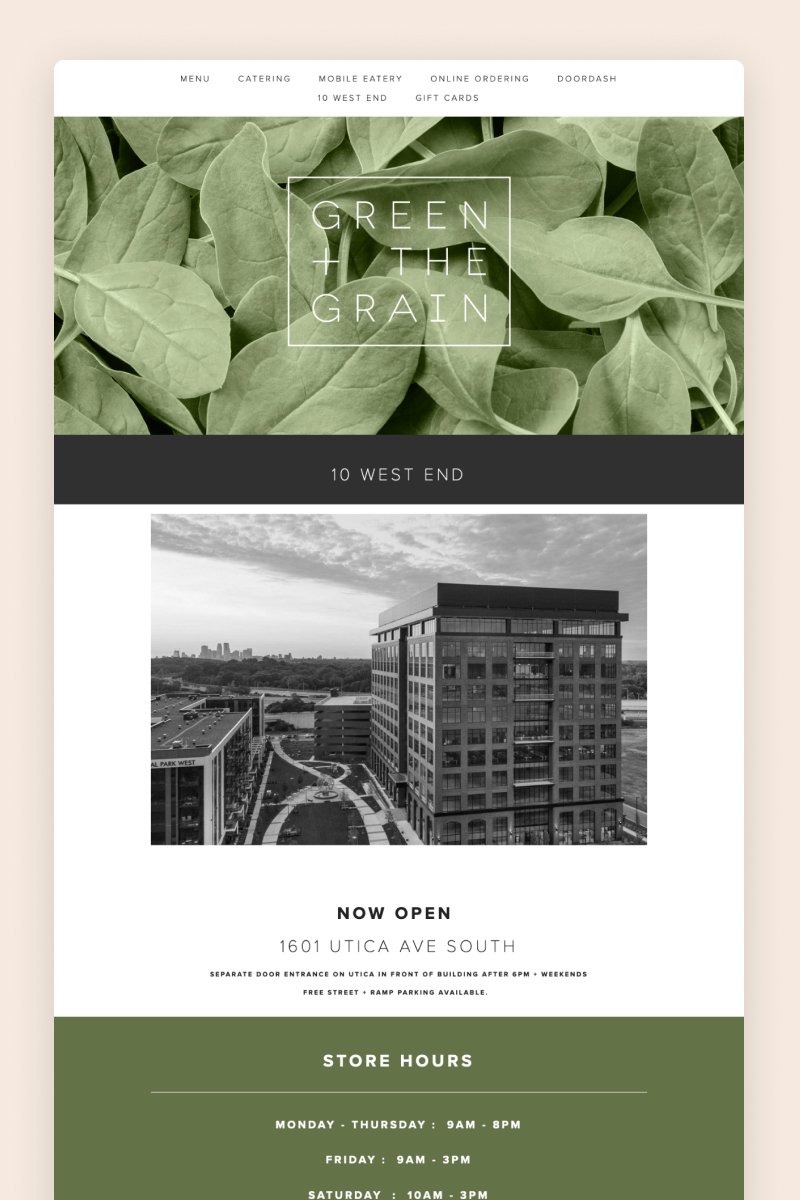
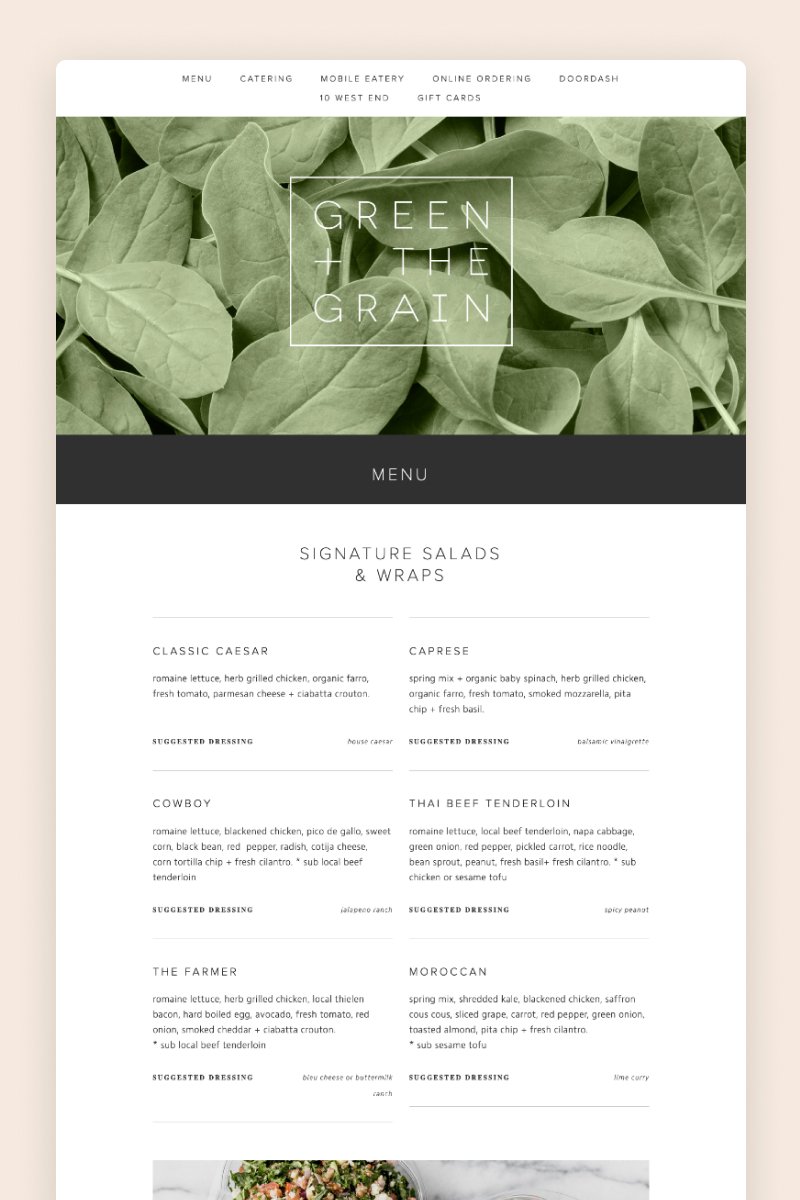
Green + The Grain
Green + The Grain created a sophisticated, sleek restaurant website using Squarespace. It’s styled in black and white, interrupted only by the pops of color of the images — including those on the Instagram block, which light up when you hover over them.
The menu page is organized in a grid layout and offers customers relevant details about their dishes.
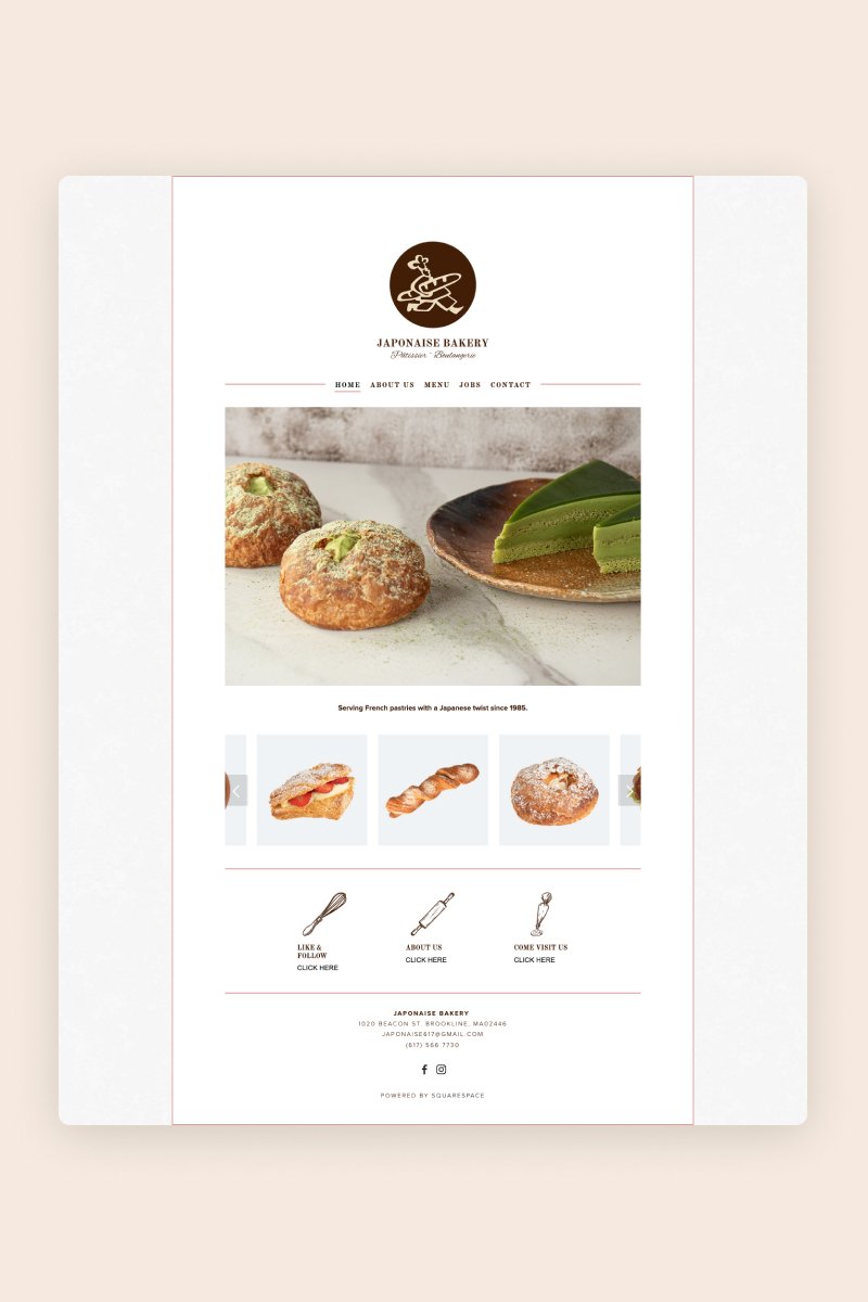
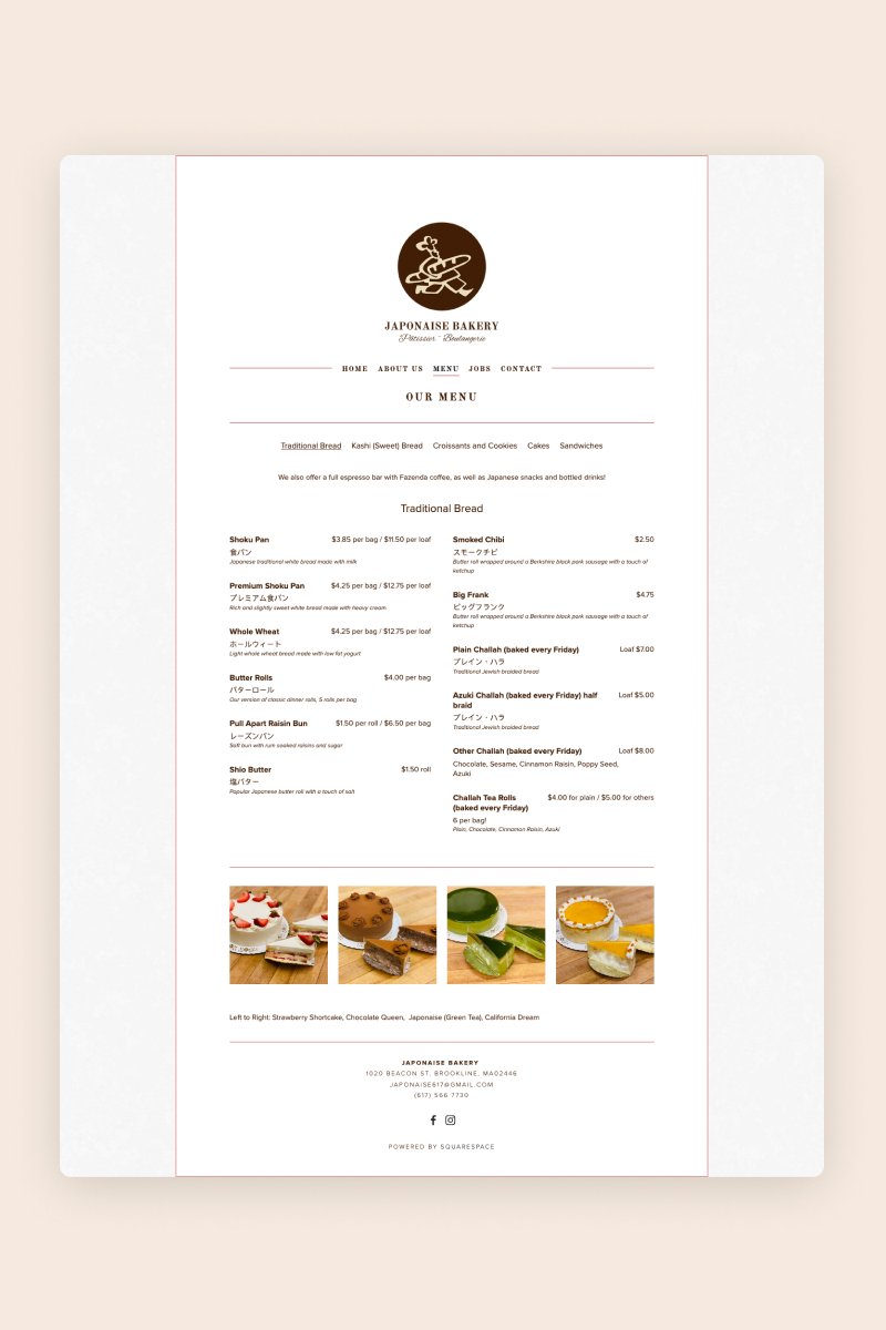
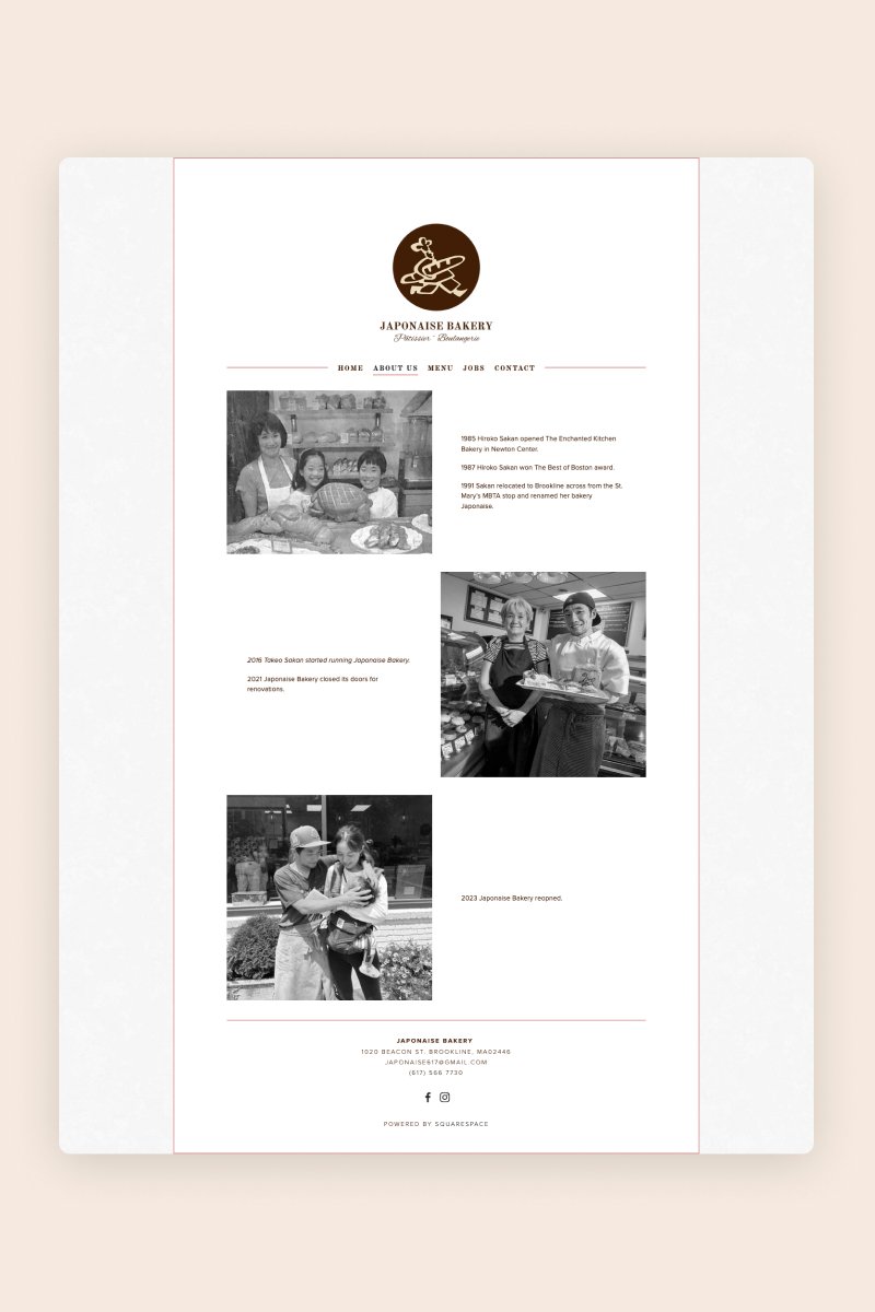
Japonaise Bakery
This Brookline bakery has been serving French pastries with a Japanese twist since 1985. They built the simplest yet elegant website that resembles a real-life menu.
To spark interest they’ve added a carousel of pictures of mouth-watering pastries. The menu is neatly organized in two-columns. Apart from the dark brown text and muted red frames the website is almost colourless.
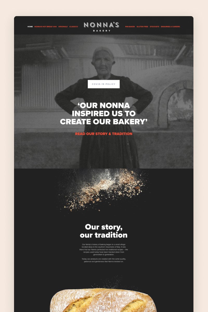
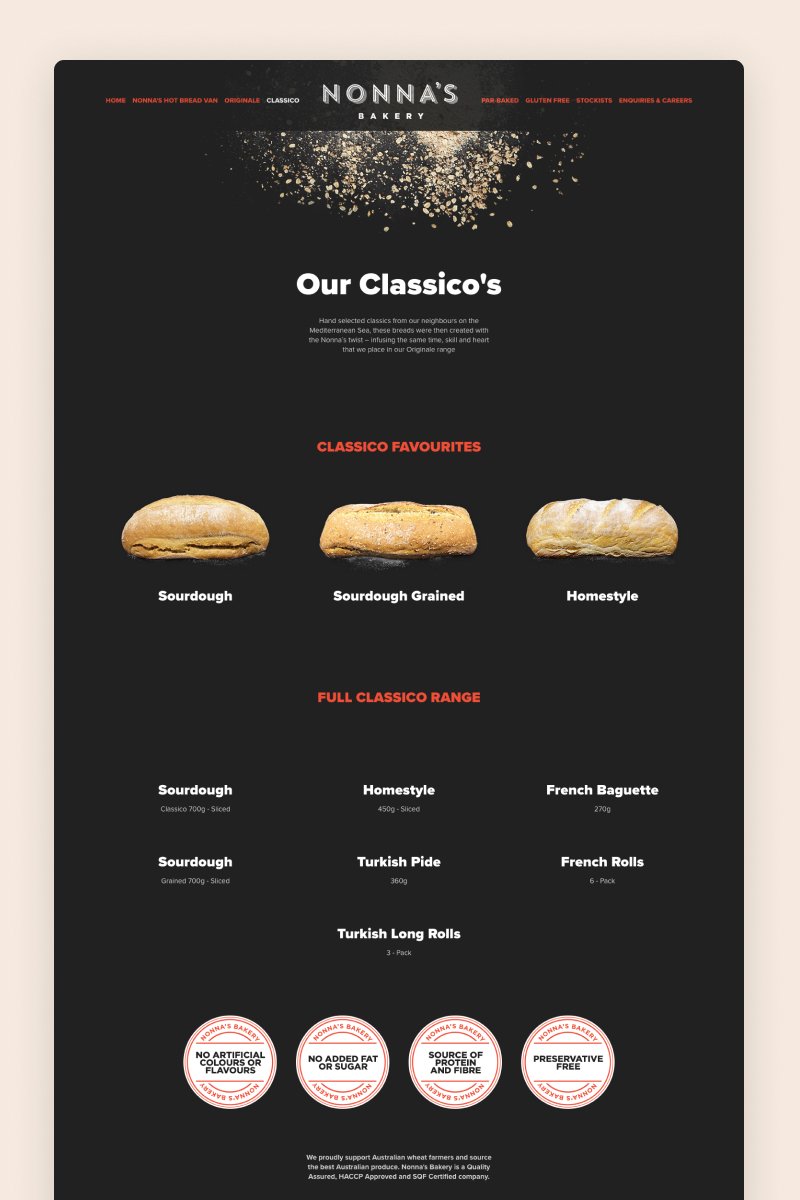
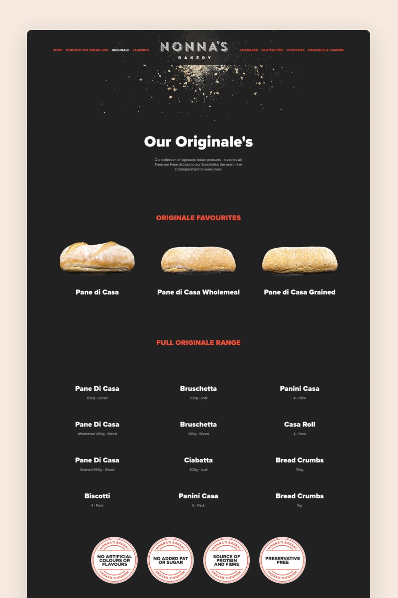
Nonna’s Bakery
Strangely enough, the website for Nonna’s Bakery is not what you would expect from your nonna. Its black background, red details, and large typography give the website a sense of strength and badassery that might take you off guard but make you want to know more.
Throughout the pages, the website includes gallery blocks everywhere to showcase the bakery’s bread offerings, as well as grid summary blocks to share their full range of products.
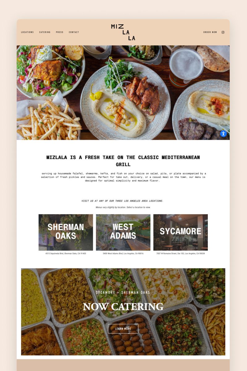
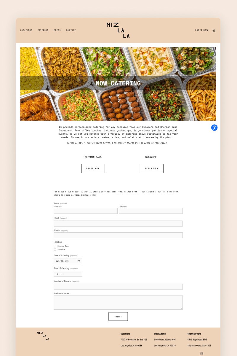
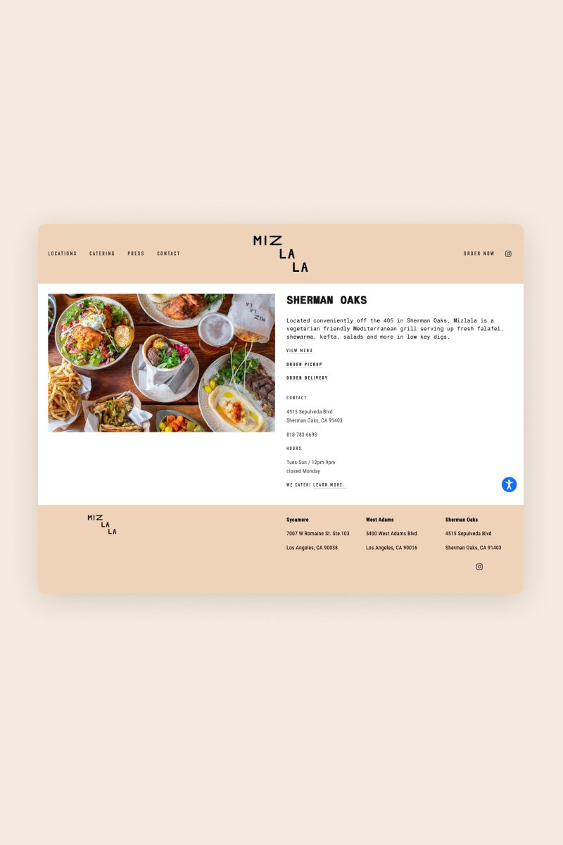
Mizlala
Mizlala’s website welcomes you with a stunning, appetite-inducing hero section where yummy food and popping colors are the main characters. Then, it keeps tempting visitors with more images and an Instagram carousel section to grow their engagement.
One of the most interesting features of this website is that it uses a summary block on its Press page to display glowing reviews and direct visitors to the relevant pages to read more.
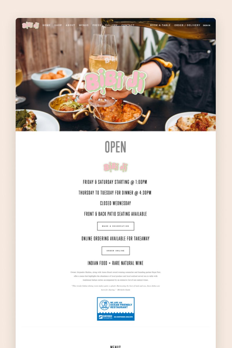
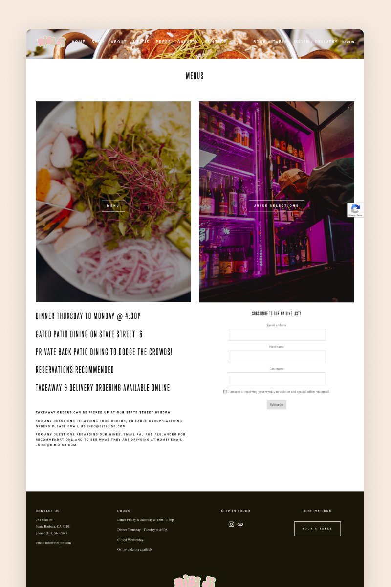
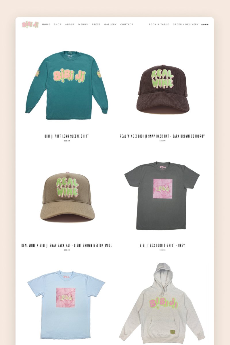
Bibi ji
With its full-bleed hero section and funky logo, the Bibi ji website immediately draws you in. It features a gallery page that uses a slideshow gallery block to display professional images of their dishes that would drive any visitor to tap on the “Book now” button.
Also, Bibi ji leverages Squarespace’s e-commerce capabilities to sell its merchandise, showcased in a convenient split grid.
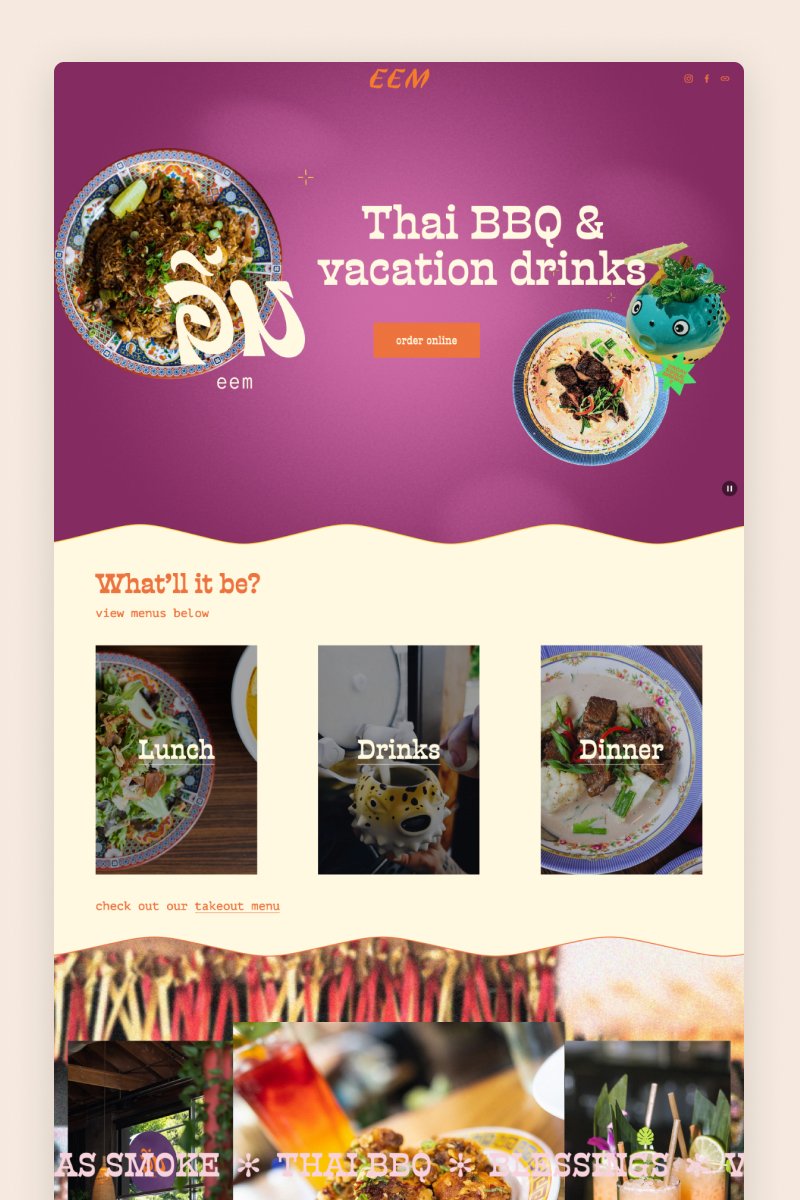
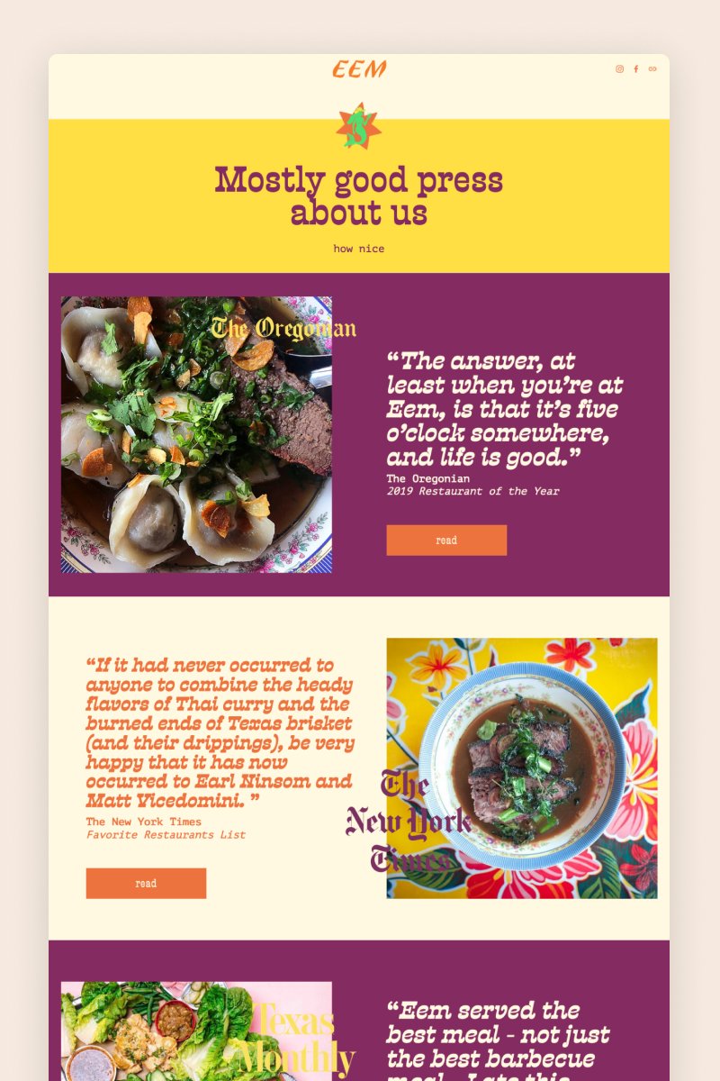
EEM
With its colorful palette and playful section divisions, the EEM website does a great job of strongly positioning this Thai BBQ PDX restaurant online. It uses every single Squarespace feature to its advantage, from Instagram blocks to animated text bars.
One key feature is that it's a short, effective one-pager and doesn’t have a navigation bar. Instead, it includes social media icons to engage visitors on their other channels.
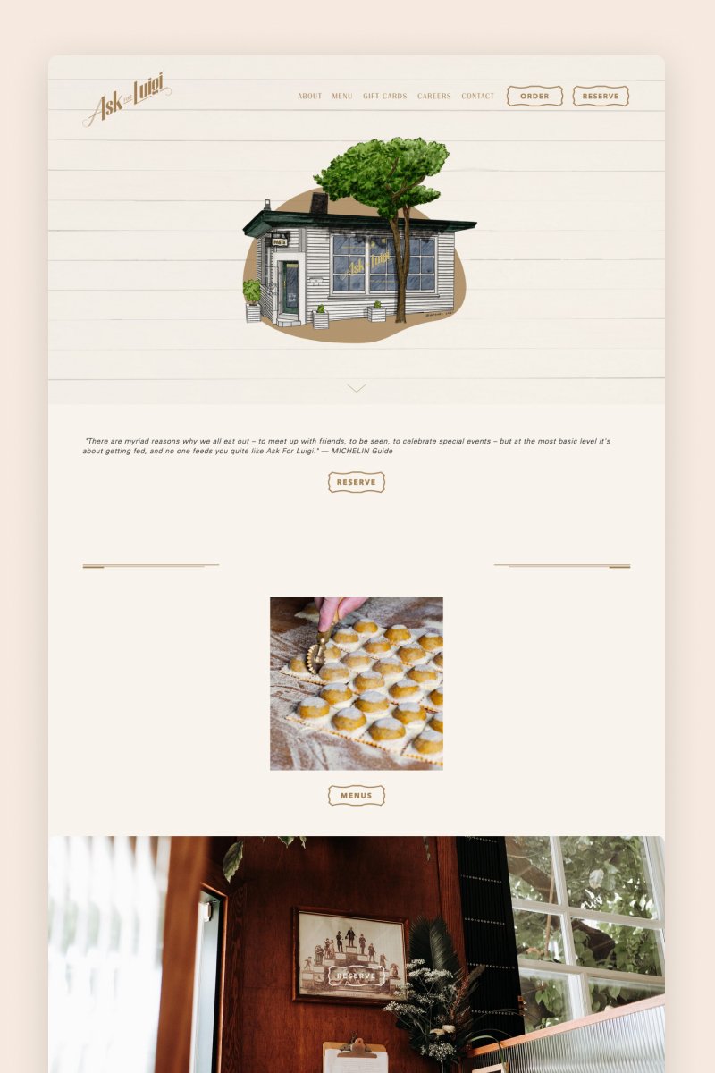
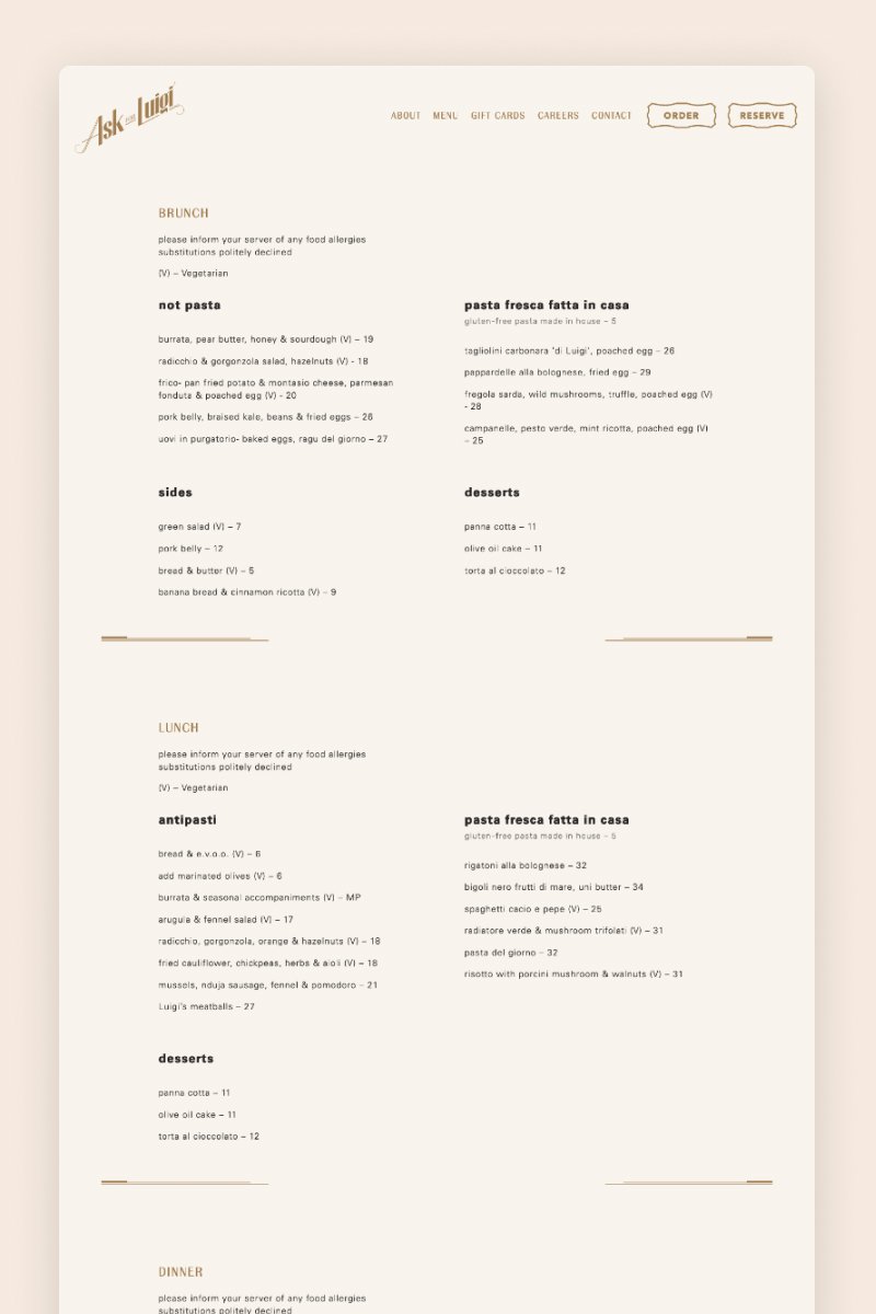
Ask for Luigi
The Ask for Luigi website starts out with a lovely illustration of the restaurant that sets the tone for the rest of the design. Styled in black, white, and brownish colors, it gives off a sophisticated yet warm vibe.
With its large images of yummy pasta and well-structured menus, this website instantly leads visitors to hit the “Order” or “Reserve” buttons.
Frequently asked questions
Is Squarespace good for a restaurant or café website?
Yes — Squarespace is a solid choice for a restaurant or café website. It offers:
A wide variety of visually appealing, restaurant-friendly templates.
Mobile-ready, responsive designs so that visitors on smartphones can easily browse your menu and book a table.
Built-in features that match what most restaurant websites need: menus, contact and location info, image galleries, reservation or ordering integrations, and even an online shop if you sell merchandise or gift cards.
In short — if you want a clean, professional web presence without needing to code from scratch, Squarespace makes it quite straightforward and flexible.
What should I include on my restaurant’s website?
To make your website effective and helpful to visitors, you’ll want to include at least the following pages/sections:
Homepage — with high-quality images (venue, signature dishes), a brief welcome message, and easy navigation.
About / Story — a bit about your restaurant: its concept, vibe, maybe your culinary philosophy or a short story behind the place.
Menu — with dish names, descriptions, prices, and ideally photos.
Contact / Location & Hours — address, map (or directions), business hours, phone number or email, maybe a contact form.
Reservations / Online Ordering — if you offer dine-in booking or delivery/takeout: an easy-to-use booking or ordering option.
Gallery / Images — photos of your dishes, interior, exterior — helps give visitors a sense of ambiance and what to expect visually.
Extras (optional but helpful): a blog/news section (for events, new dishes, specials), customer testimonials or reviews, links to your social media, ability to collect emails (newsletter), maybe a shop (for merchandise or gift cards).
How can I show the menu on Squarespace (so it looks good and is easy to update)?
You have several good ways to showcase your menu:
Use Squarespace’s built-in Menu Block — you can paste in your menu items (dish names, descriptions, prices), and the block will format them cleanly and adapt to your site design.
Use a gallery or summary block (with images + dish names) if you want to emphasize photos of your dishes — many restaurant sites combine text menus with a visual gallery for best effect.
If you offer multiple menus (e.g. breakfast, lunch, drinks, specials), you can use drop-down navigation or separate pages/sections for each — Squarespace supports this structure.
For frequent menu changes (daily specials, seasonal dishes, etc.), the simplicity of editing text or images through Squarespace’s editor makes updates easy and quick — no need to re-upload PDFs if you manage it through blocks.
Can I accept reservations or orders on my Squarespace site?
Yes — Squarespace supports integrations for reservations and online ordering. For example:
You can embed a booking widget (e.g. from Tock or OpenTable) so customers can reserve tables directly on your site.
For takeout or delivery, you can integrate ordering — either via 3rd-party services or using Squarespace’s commerce features / extensions.
Is Squarespace enough, or will I need extra tools or plugins?
That depends on how fancy or feature-rich you want your website to be. For a basic but professional restaurant site, Squarespace alone (with its templates, Menu Block, gallery, contact forms, booking/ordering integration) is enough. Many restaurants using Squarespace go with this all-in-one setup.
But if you plan:
A complex menu with frequent changes,
Multiple locations,
Advanced ecommerce (gift cards, merchandise, online store), or
Custom integrations (loyalty program, advanced booking system, POS sync, etc.), then you might need additional tools, plugins or third-party integrations beyond the basic Squarespace features.