40 Best Squarespace Font Pairings
Find a cool pair of fonts for your Squarespace website
A font is an element of design – it communicates a message, creates a mood, and consolidates the style of your brand. Without special training in design and typography, choosing and combining fonts for your project, brand, or website is a daunting task. We’re here to help!
We searched Squarespace’s vast font database and selected the best elegant font combinations for you. This carefully curated selection of fonts will look great in 2025 and 2026, but also will stay relevant in the years to come because these font pairings have timeless vibes about them. So you do not need to worry about changing fonts next year to be en vogue. These font combinations won’t go out of style in the foreseeable future.
Golden rules of font pairing
Before we start, let’s talk about the general rules in font pairing that will help you make decisions when choosing and styling fonts for your DIY Squarespace website.
Limit the number of fonts
The “Less is more” rule is very applicable to fonts in any design project. Ideally, you need to have only two fonts, three being an absolute maximum. Limiting the number of fonts will help keep things streamlined, easy-to-read, and consistent throughout your website. If not, the more fonts you use, the more busy and overwhelming your design will look for users.
Assign specific roles to your fonts: one is for headings, another one is for the main body of text, etc. This simple advice will help you tidy up your work and put you in charge of your project.
Create contrast
When choosing a font pair try to match contrasting fonts. Or if you stay within one font family, which is a great practice, make them contrasting. To achieve a sharper contrast, use size, letter spacing, color, and weight. The simplest contrast is the one created by font size, but go ahead and experiment with other styles too.
Use Serif + Sans Serif
Serif fonts are typefaces that have serifs, which are extra strokes on the ends of letters or symbols. These small strokes are usually attached to the end of larger strokes. A good practice of font pairing is to choose one font with serifs and another one without them. They tend to go together well. In our font pairs listicle below we mostly follow this time-proven formula. But we also make exceptions to the rule.
Prioritize legibility
Form follows function. And when the font is used on a website, it has a function to communicate your message. If you have a button with a CTA that says "Buy now", it leads a customer to a purchase. And the font on the button should be able to perform its task. In order to do that, first of all, it should be readable. Even if it means functionality over beauty, make sacrifices for the ultimate goal.
This applies to handwritten fonts. It is enticing to use them to elevate a website’s look, but they are sometimes hard to read, especially in longer chunks of text. Moreover, not everyone can read cursive or handwritten fonts, just because they’ve only learned to read and write in block letters in school. And they are harder to concentrate on for people with reading disorders, like dyslexia. To be inclusive, choose readable over fancy.
For some of the designs, we also list font style settings for Squarespace in the dropdowns, so that you can achieve the same look as on the example image. To implement these styles, go to Design > Site Styles > Fonts.
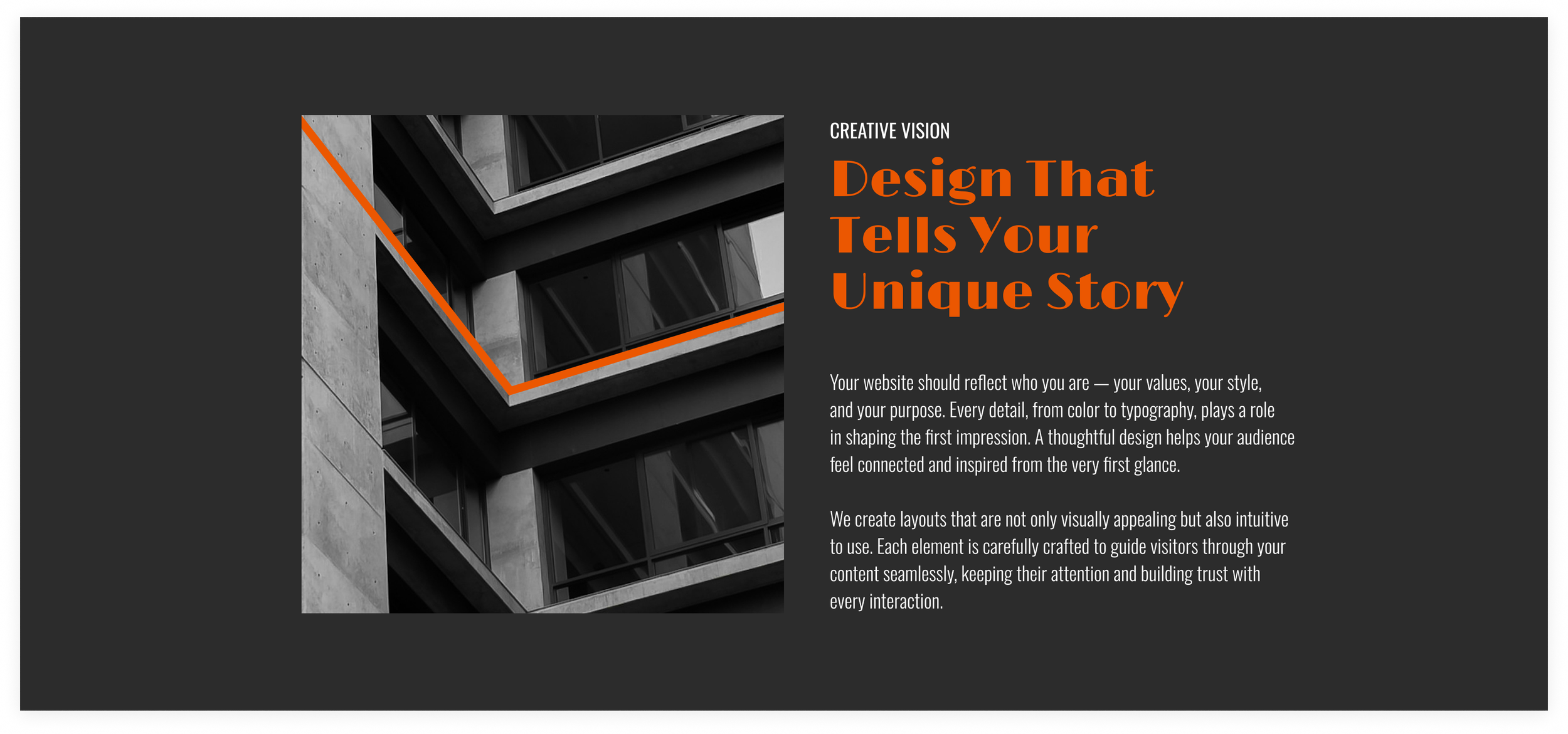
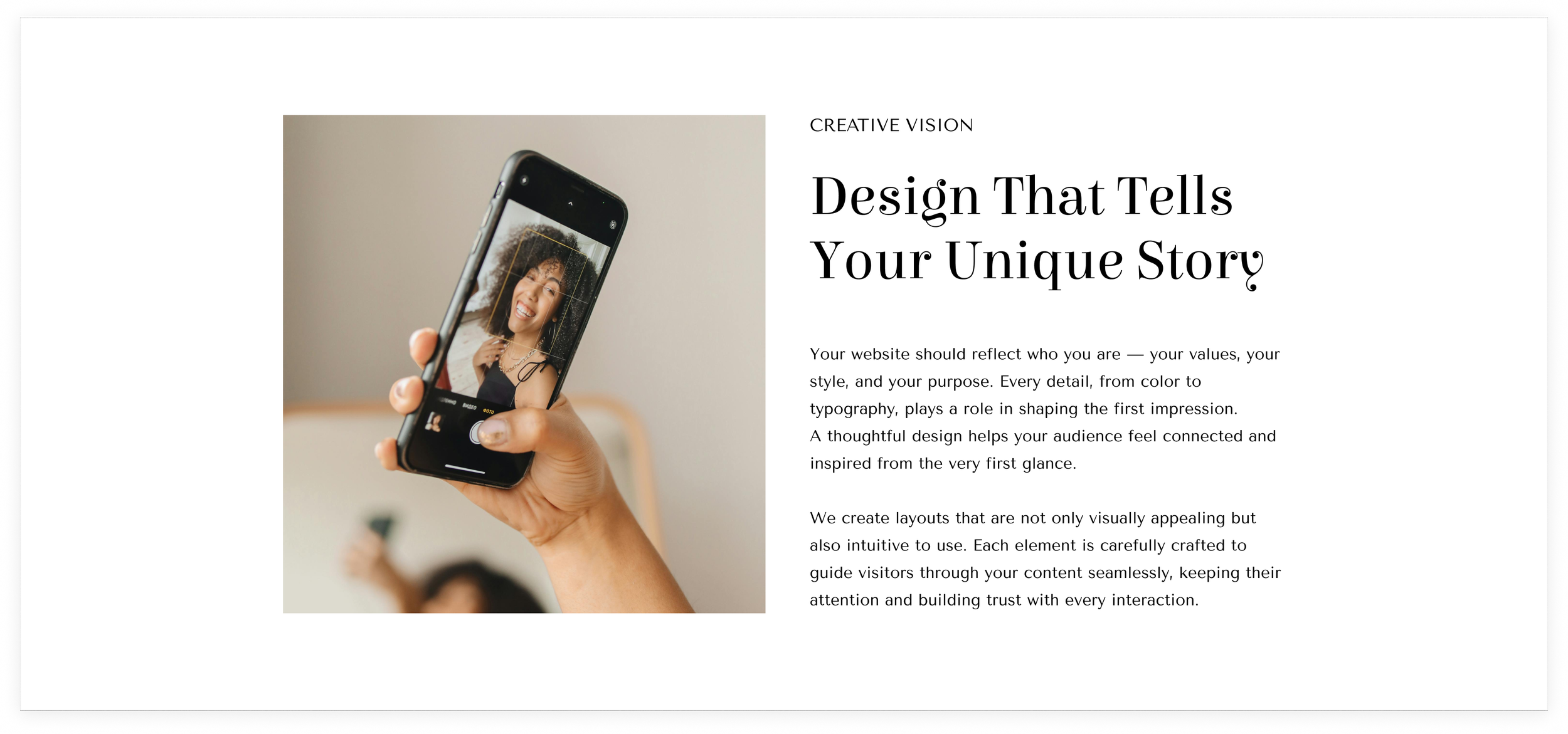
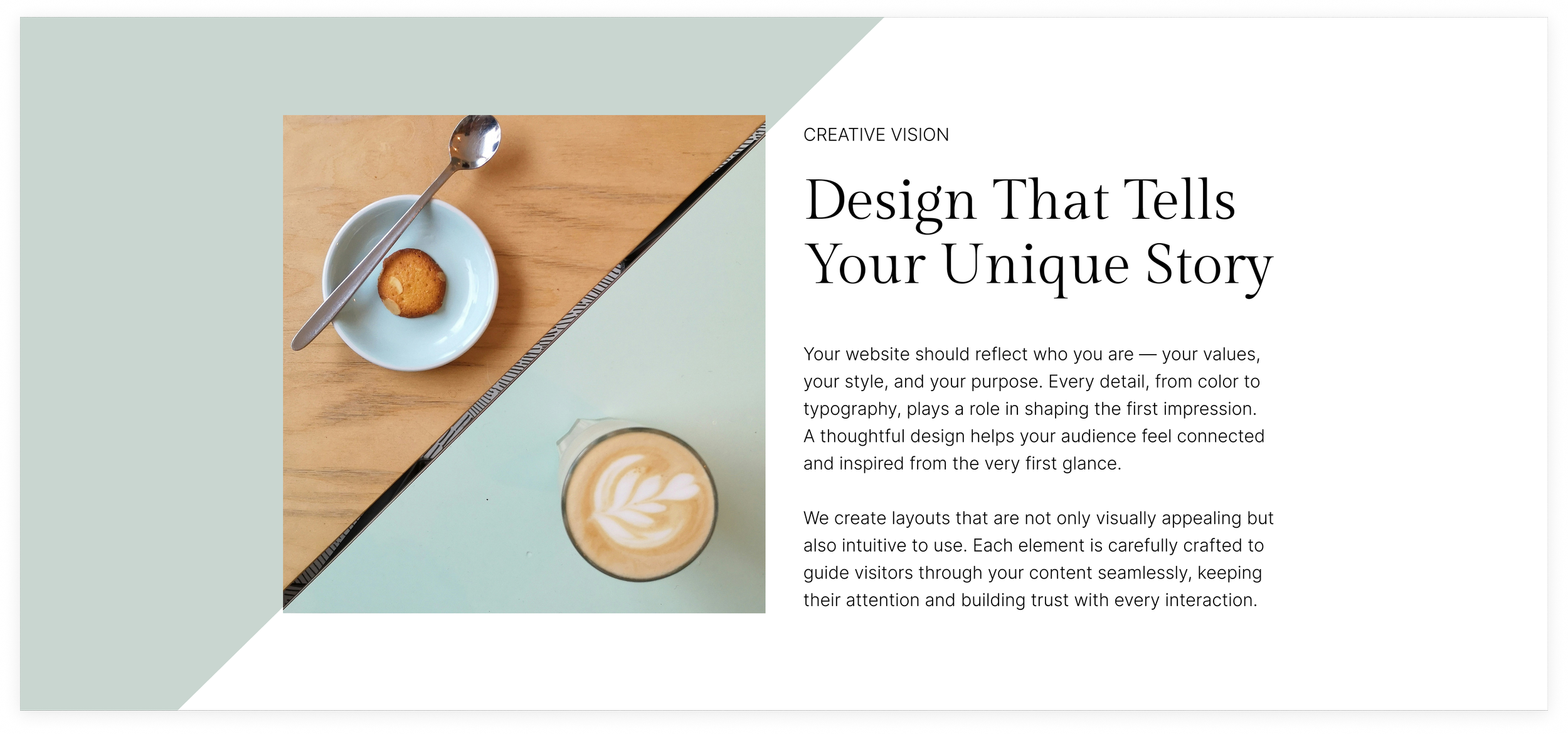
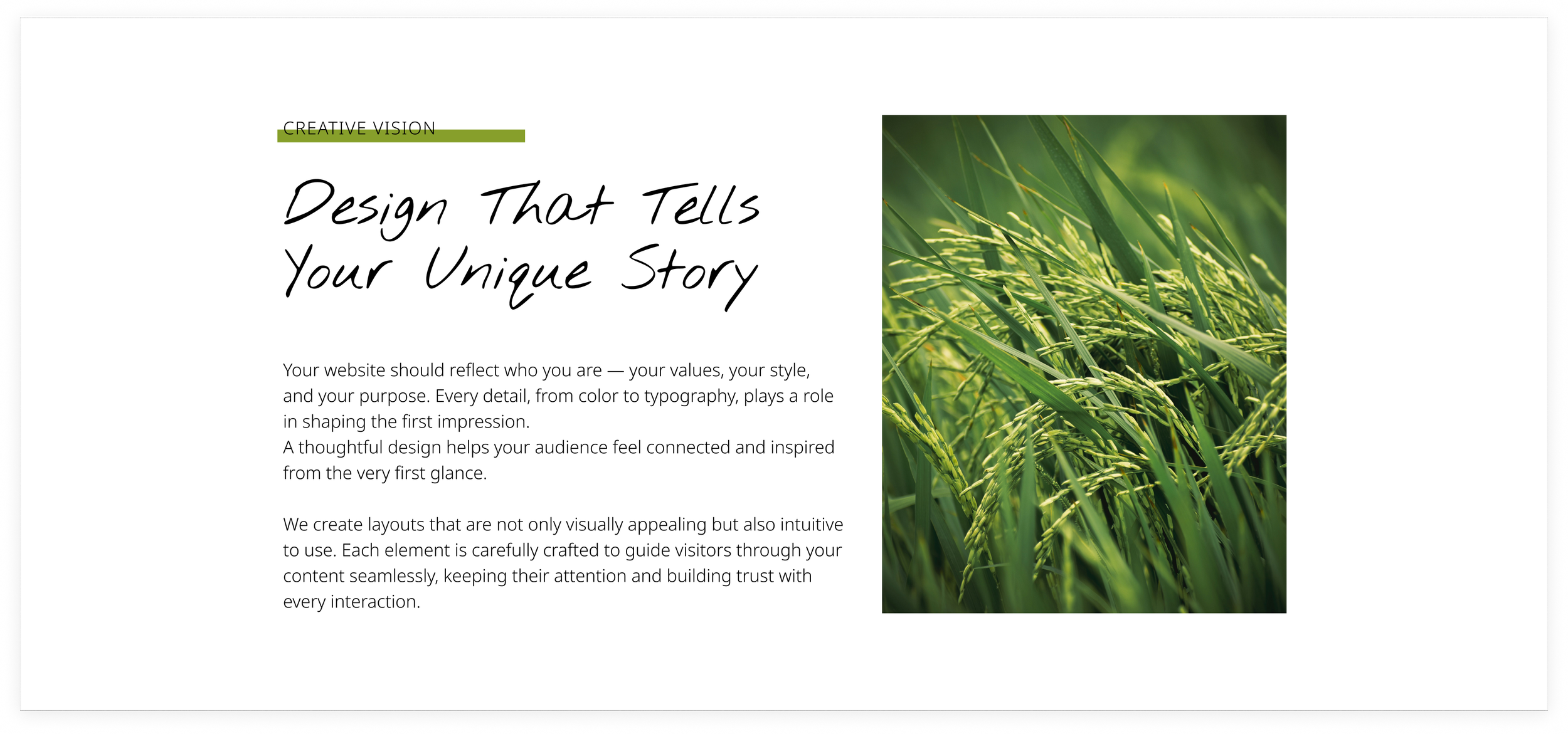
Alfa Slab One + Open Sans

This bold, attention-grabbing serif makes headlines impossible to ignore, while Open Sans keeps your body text clean, modern, and highly readable. Perfect for Squarespace sites that want a strong personality without sacrificing clarity – think creative portfolios, lifestyle blogs, or brands that want to make a statement while keeping content approachable.
Josefin Sans + Lato

With its geometric elegance, Josefin Sans makes headlines feel modern and refined, while Lato offers a friendly, versatile touch for body text. This pairing works beautifully on Squarespace sites that aim for a minimalist yet approachable look – think design studios, lifestyle blogs, or personal brands that want clean sophistication with effortless readability.
Abril Fatface + Merriweather Sans

Abril Fatface brings a touch of drama and elegance to your headlines, while Merriweather Sans keeps body text clean, approachable, and easy to read. This pairing is perfect for Squarespace sites that want a modern yet sophisticated feel – great for creative agencies, boutique brands, or blogs where style and clarity go hand in hand.
Limelight + Oswald
Limelight’s vintage flair instantly adds character to headlines, while Oswald grounds the layout with strong, readable paragraph text. Together, they strike a balance between retro charm and modern structure – perfect for Squarespace sites with a creative edge, like photographers, event planners, or lifestyle brands that love a bit of old-school glamour.
Dancing Script + Montserrat
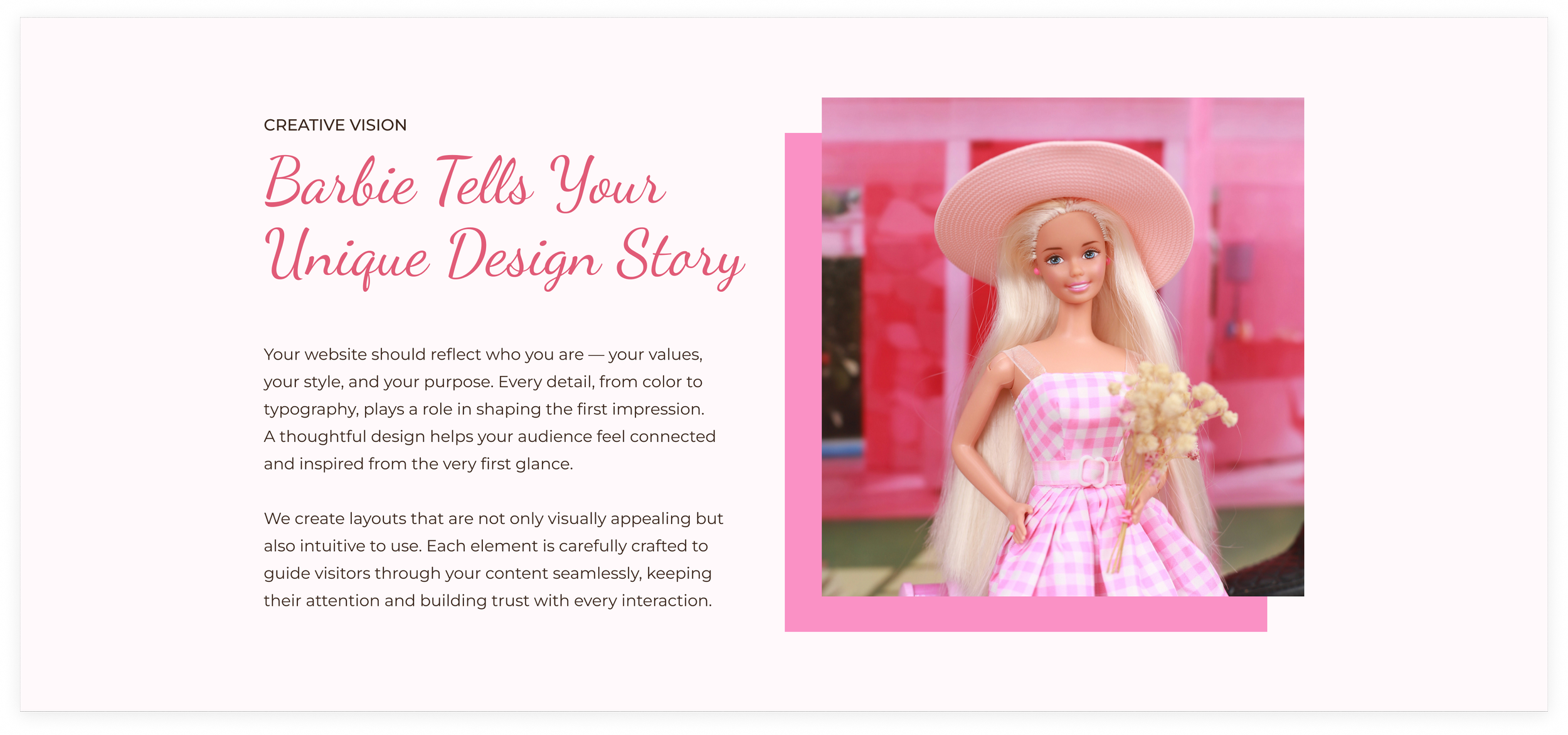
Dancing Script adds a personal, handwritten charm to headlines, while Montserrat keeps paragraphs structured and easy to read. This pairing feels warm and inviting – perfect for Squarespace websites in the wellness, lifestyle, or creative space that want to balance personality with polish.
Arima Madurai + Karla

Playful yet polished, Arima Madurai brings a soft, organic feel to headlines, while Karla keeps things grounded with clean, modern readability. It’s a balanced pairing that feels friendly and approachable – great for Squarespace sites in wellness, coaching, or creative industries that want to blend warmth with professionalism.
Gloock + Inter
Gloock’s high-contrast, editorial style gives headlines a bold, magazine-like presence, while Inter keeps paragraphs crisp and effortless to read. The result is sleek and contemporary – a perfect fit for Squarespace sites that want to feel elevated and design-forward without losing approachability.
Raleway + Open Sans

Crisp, modern, and endlessly versatile – Raleway and Open Sans are a classic pairing that never goes out of style. Raleway’s elegant lines make headlines feel intentional and refined, while Open Sans keeps paragraphs light and readable. Together, they’re a go-to combo for Squarespace sites that value simplicity, balance, and a polished, professional feel.
Corben + Forum + Meow Script
This playful trio gives Squarespace sites an instant personality boost. Corben makes headlines bold and approachable, Forum adds a friendly, rounded feel to body text, and Meow Script sprinkles in a whimsical, handwritten accent perfect for subheadings or callouts. Together, they’re ideal for creative brands, boutique shops, or lifestyle blogs that want to feel fun, unique, and full of character.
Elsie + Tenor Sans
Elsie brings charming, slightly vintage flair to headlines, while Tenor Sans keeps body text clean, modern, and highly readable. This pairing strikes a balance between personality and clarity – perfect for Squarespace sites that want to feel approachable, stylish, and a little playful, like creative portfolios, boutique brands, or lifestyle blogs.
Ultra + Arial

Ultra makes a bold statement with its heavy, slab-serif style, while Arial keeps the supporting text neutral and effortlessly readable. It’s a confident mix – perfect for Squarespace websites that want striking headlines without overcomplicating the rest of the layout. Great for agencies, personal brands, or portfolios that lean minimalist but still want impact.
Big Shoulders Display + Space Mono

Bold, structured, and full of attitude – Big Shoulders Display gives headlines a strong urban energy, while Space Mono brings a touch of modern quirk to the body text. Together, they create a design-forward look that feels creative yet grounded – perfect for Squarespace sites in tech, design, or creative industries that want to stand out with personality and precision.
Antic Didone + Commissioner

Antic Didone’s elegant contrast gives headlines a refined, high-fashion feel, while Commissioner keeps paragraphs crisp and contemporary. The pairing feels elevated yet effortless – perfect for Squarespace websites that lean editorial or creative, like photographers, stylists, or boutique brands that want a timeless, magazine-inspired look.
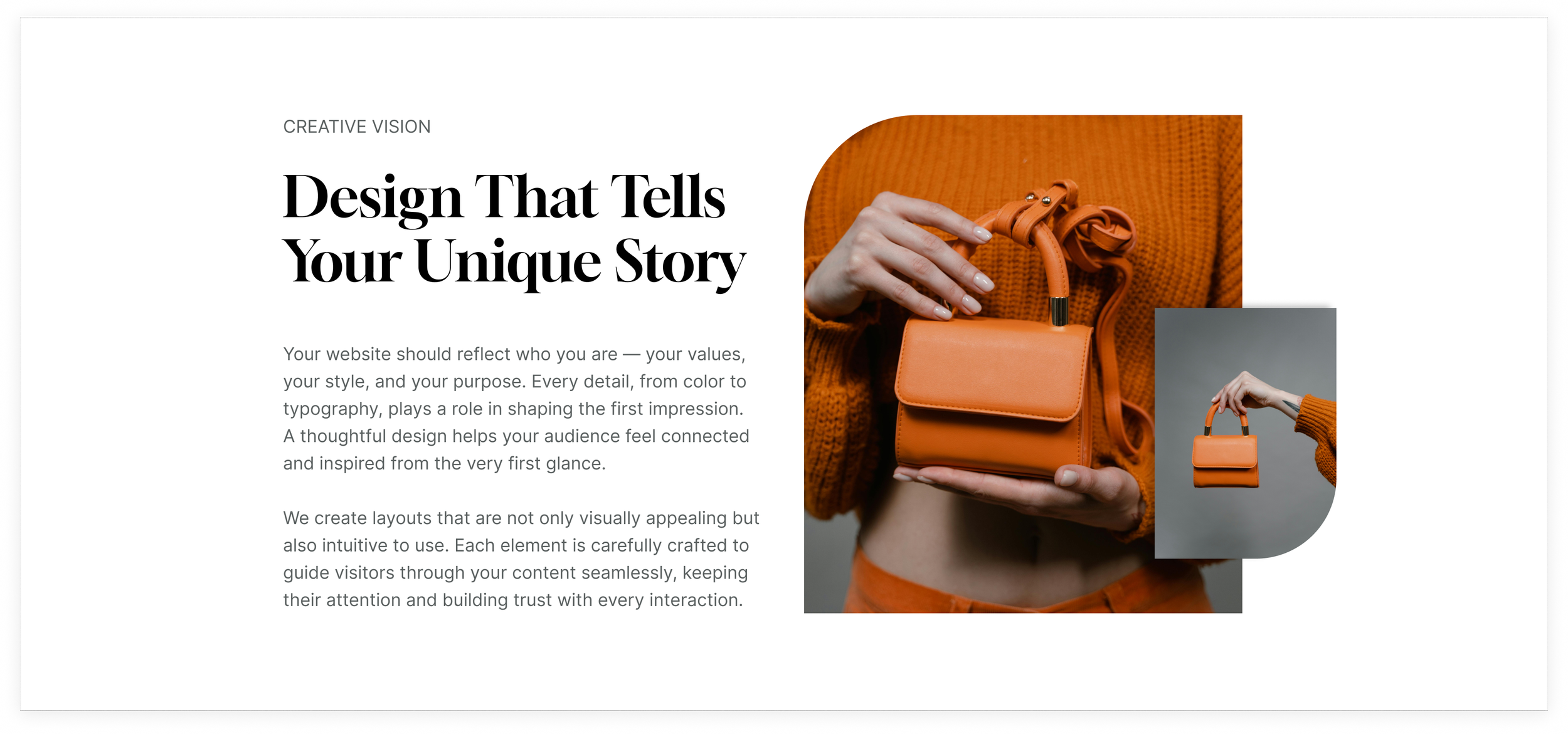
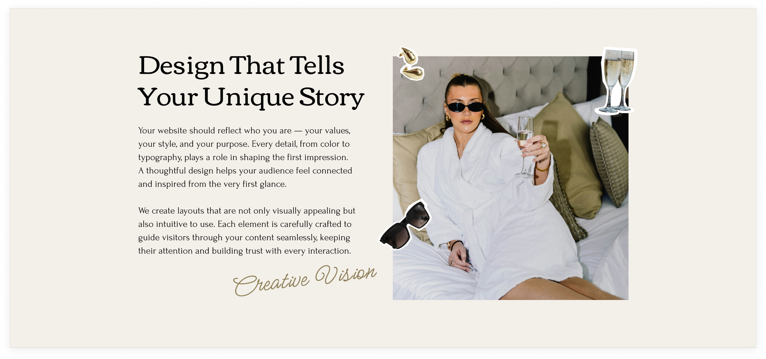
Barlow + Playfair Display

Barlow’s clean, versatile style gives layouts a modern foundation, while Playfair Display adds a touch of timeless elegance to headlines. Together, they strike a perfect balance between contemporary and classic – great for Squarespace sites that want a refined yet approachable look, from creative studios to small businesses with a polished edge.
Coiny + Poppins
Coiny brings playful, rounded energy to headlines, while Poppins keeps everything balanced with clean geometry and easy readability. The combo feels modern, cheerful, and full of personality – perfect for Squarespace sites that want to feel fresh and fun, like creative studios, lifestyle brands, or personal blogs with a bold, friendly vibe.
Cormorant Upright + Cormorant
Cormorant Upright gives headlines a classic, elegant presence, while Cormorant’s versatile style keeps body text graceful and readable. This pairing feels sophisticated and cohesive – perfect for Squarespace sites that want a refined, editorial look, from creative portfolios to boutique brands with a timeless aesthetic.
Darker Grotesque + Cutive Mono

Darker Grotesque grabs attention with bold, modern headlines, while Cutive Mono whispers a subtle, vintage-inspired charm in the body. The mix feels effortlessly stylish – perfect for Squarespace sites aiming for a contemporary design with just a touch of personality.
Federo + Work Sans
Federo’s rounded, friendly curves give headlines a cheerful energy, while Work Sans keeps paragraphs crisp and easygoing. Together, they strike a warm, approachable balance – perfect for Squarespace sites that want to feel lively without losing clarity, like creative studios or boutique lifestyle brands.
Gilda Display + Inter Light
Gilda Display carries a dramatic, vintage elegance that instantly draws the eye, while Inter Light whispers clarity and modern minimalism in the paragraphs. Together, they create a sophisticated rhythm – perfect for Squarespace sites that want a refined, editorial feel with a contemporary twist.
Gloock + Inter
Gloock commands attention with bold, editorial headlines, while Inter balances the design with calm, clean body text. The pairing feels modern and confident – perfect for Squarespace sites that want a polished, design-forward look without losing readability.
Spectral + Aktiv Grotesk Extended

This elegant combo will work well for lifestyle bloggers, skincare brands, or on any other website where the need for refined aesthetics is high. The pair can bring up a romantic, dreamy vibe when it is combined with floral, home office, or interior design images. Aim for white, light-beige, or pale pink backgrounds to add even more softness.
Spectral in the headlines is a beautiful serif design intended for screen-first environments. The Extended (wider) style of Aktiv Grotesk brings in a contemporary feel to the paragraphs.
-
Headings:
Family: Spectral;
Weight: 300;
Style: Normal;
Line Height: 1.2em;
Letter Spacing: -0.04em;
Text Transform: Capitalize;
Paragraphs:
Family: Aktiv Grotesk Extended;
Weight: 400;
Style: Normal;
Line Height: 1.6em;
Letter Spacing: 0em;
Text Transform: None.
Orpheus Pro + Neue Haas Grotesk

This font pair speaks classics. It will suit well-establish brands in the world of fashion, media, and high-end retail. When designing a website with this font pair, strive for minimalistic or even monochromatic color palettes. Combined with high-quality studio photos this typography will produce a stunning effect.
Orpheus Pro font in the headings has classic Roman proportions but also bears an Art Deco twist in it. Deco soft curves catch the eye and bring attention to the headlines.
Neue Haas Grotesk is a predecessor of Helvetica and its first version. It is a reliable, legible font for your paragraphs.
-
Headings:
Family: Orpheus Pro;
Weight: 400;
Style: Normal;
Line Height: 1.2em;
Letter Spacing: 0em;
Text Transform: None;
Paragraphs:
Family: Neue Haas Grotesk;
Weight: 400;
Style: Normal;
Line Height: 2.1em;
Letter Spacing: 0.05em;
Text Transform: None.
Ohno Blazeface + Aktiv Grotesk

This look is on the hip and playful side. The font pair can perfectly serve podcasters, coaches, and creative studios. Combine it with vivid color accents and funky patterns, cooling it all down with calm backgrounds.
Ohno Blazeface is a fun serif font in a fatface genre. With its organic forms, it is great for lively headlines. Good letterspacing makes it readable and chill. As its creators say: “Ohno is serious about having fun.” Since Ohno Blazeface has a lot of character we balanced it out with plain vanilla Aktiv Grotesk in the paragraphs.
-
Headings:
Family: Ohno Blazeface;
Weight: 400;
Style: Normal;
Line Height: 1.2em;
Letter Spacing: 0em;
Text Transform: None;
Paragraphs:
Family: Aktiv Grotesk;
Weight: 400;
Style: Normal;
Line Height: 2em.
Alfa Slab One + Open Sans

Alfa Slab One in combination with Open Sans creates a modern yet authoritative mood. This look will suit architectural bureaus, galleries, exhibition spaces, and visually-oriented creatives. Though quite imposing, the pair won’t drag attention away from the showcase of art or portfolio cases. You can throw in some cosmopolitan vibes by introducing contrasting backgrounds and abstract photography.
Alfa Slab One is designed with an extreme stem weight and big serifs. This attributes to its fat typewriter look. Open Sans, on the other hand, is quite neutral and is valued for its excellent readability due to the characteristics of its letterforms. Together they are a contemporary-looking power couple.
-
Headings:
Family: Alfa Slab One;
Weight: 400;
Style: Normal;
Line Height: 1.2em;
Letter Spacing: 0.03em;
Paragraphs:
Family: Open Sans;
Weight: 400;
Style: Normal;
Line Height: 2em;
Letter Spacing: 0.01em.
ITC Avant Garde Gothic Pro + Lora

This font pair is a good match for a journalist’s personal website or a street photographer. It can easily become a part of an authentic and bold design for a professional website. Add regular grids and geometric shapes with sharp corners, while, colorwise, strick to vivid, saturated colors. This design will also work for magazines and modern hair salons.
ITC Avant Garde was designed as a headline font. The original face was all uppercase, and we suggest you use it as it was intended. For this go to the Headline settings and choose uppercase in text transform dropdown. ICT Avant Garde is a classic look of the 70’s that featured in many of the ads designs. You may recognize it from the Adidas logo, though it is used in all lowercase there.
We balance ICTs statement uppercase look with a softer, contemporary serif Lora in paragraphs. Lora appears as a charming body text because it has roots in calligraphy. Its brushed curves give it sophistication and elegance.
-
Headings:
Family: ITC Avant Garde;
Weight: 700;
Style: Normal;
Line Height: 1em;
Letter Spacing: -0.05em;
Text Transform: Uppercase;
Paragraphs:
Family: Lora;
Weight: 400;
Style: Normal;
Line Height: 1.8em;
Letter Spacing: 0.02em;
Text Transform: None.
Agenda + IBM Plex Serif

When combined in use, these elegant typefaces exude clarity and beauty. Agenda and IBM Plex Serif delightfully blend with pale colors, soft textures, and romantic images. This font pair is a natural choice for home decorators, wedding photographers, florists, and writers.
Agenda as a headline font offers human warmth, while IBM Plex Serif is up to tell a story in paragraphs. Together they are able to lighten the atmosphere of your website design.
-
Headings:
Family: Agenda;
Weight: 100;
Style: Normal;
Line Height: 1.1em;
Letter Spacing: -0.01em;
Text Transform: None;
Paragraphs:
Family: IBM Plex Serif;
Weight: 400;
Style: Normal;
Line Height: 1.8em;
Letter Spacing: 0.02em;
Text Transform: None.
Input Serif Narrow + Input Sans

The fonts we use for this pair belong to the same Input family. This is a solid practice to use one font family in the design to achieve great results. After all, they were created to go together well and produce a cohesive look. Moreover, there are always enough styles in a font family to create a needed contrast between the headline and the body of text.
Input is a monospaced font family, meaning, that all of the letters and characters in it occupy the same amount of horizontal space. Monospaced fonts are a signature look of typewriters and computer code software. So this distinct look will work for copywriting agencies, web design studios, and software development companies. It all depends on the other design elements on your website. Combine this pair with high-tech, or futuristic images for a hip look. Or throw in some black&whites to set up the nostalgic beginning of the XX century atmosphere.
-
Headings:
Family: Input Serif Narrow;
Weight: 400;
Style: Normal;
Line Height: 1.4em;
Letter Spacing: -0.01em;
Text Transform: None;
Paragraphs:
Family: Input Sans;
Weight: 400;
Style: Normal;
Line Height: 1.8em;
Letter Spacing: -0.03em;
Text Transform: None.
IvyPresto Display + Adelle Sans

This font pair has an aura of luxury about it. It belongs to the websites of cosmetics brands, graphic designers, and digital marketing agencies, with an above-average price tag. Adding black to the design will introduce an atmosphere of timeless elegance and exclusivity.
IvyPresto Display allows a touch of festivity and joie de vivre in the headlines. We have put some of the words in italics to place the emphasis. IvyPresto Display is ideal for large-sized texts due to its high contrast and sharp details paired with a large x-height and narrow proportions.
We value Adelle Sans for its versatility and editorial application, which makes it a great candidate for the place in this font pair.
-
Headings:
Family: IvyPresto Display;
Weight: 600;
Style: Normal;
Line Height: 1.4em;
Letter Spacing: -0.02em;
Text Transform: None;
Paragraphs:
Family: Adelle Sans;
Weight: 400;
Style: Normal;
Line Height: 1.8em;
Letter Spacing: 0em;
Text Transform: None.
Forma DJR Display + Sutro

This font pair is generally neutral and formal, suited for someone who wants to be taken seriously. It is for those who wish to publish impactful projects and their voices to be heard. We envisage this font pair on websites of storytellers, photojournalists, as well as charities, and crowdfunders.
On your website use it with true-to-life reportage photography and neutral backgrounds. Forma DJR Display is suitable for bold editorial statements, while Sutro will do the job of telling your stories.
-
Headings:
Family: Forma DJR Display;
Weight: 700;
Style: Normal;
Line Height: 1.4em;
Letter Spacing: -0.01em;
Text Transform: None;
Paragraphs:
Family: Sutro;
Weight: 300;
Style: Normal;
Line Height: 1.8em;
Letter Spacing: 0em;
Text Transform: None.
JAF Lapture + Brandon Grotesk

With its gothic shapes and medieval flair, JAF Lapture definitely stands out in this pair. It sets the historical tone and encourages us to use it on a history podcast website, blog, or for themed events. However, it can work out for the less obvious uses like on the websites of law firms and architectural bureaus. It is easy to fall under the old-world charm of its gothic shapes.
Brandon Grotesk is extremely suitable for body copy on the web. Its sleek geometric shapes complement JAF Lapture's medieval character.
-
Headings:
Family: JAF Lapture;
Weight: 700;
Style: Normal;
Line Height: 1.1em;
Letter Spacing: -0.01em;
Text Transform: None;
Paragraphs:
Family: Brandon Grotesk;
Weight: 300;
Style: Normal;
Line Height: 1.3em;
Letter Spacing: 0em;
Text Transform: None.
Nimbus Sans Extended + Nimbus Sans

This combination is another great example of staying within one font family. Nimbus Sans Extended mixed with Nimbus Sans is a natural choice for when you need a modern eye-catching headline paired with legible Helvetica-like body text.
Extended headlines for fonts are widely used by branding agencies, ateliers, and web designers but will also benefit any present-day initiative, environmentalists, and human rights activists.
Depending on the usage the font pair will look great with animated voluminous gradients and gifs, or reportage photography.
-
Headings:
Family: Nimbus Sans Extended
Weight: 900;
Style: Normal;
Line Height: 0.9em;
Letter Spacing: -0.05em;
Text Transform: None;
Paragraphs:
Family: Nimbus Sans;
Weight: 300;
Style: Normal;
Line Height: 1.5em;
Letter Spacing: 0em;
Text Transform: None.
New Spirit Condensed + Helvetica Neue

This font pair will set the right tone for the small to medium family business centered around food production. We can easily see in on the website of traditional cheese makers, artisanal bakeries and wineries, and farmer’s markets. The New Spirit font in the headline exudes the sense of all things organic and homemade. Photographs of products and behind the scenes of the production process are essential. You might also want to add photographs of your team.
The headlines bring up the romance and nostalgic feeling about all things lost to industrialization and mass markets. They help you tap into the aesthetics of the good old days when things were produced locally, hand-made, and in small numbers. Helvetica Neue in the paragraphs is great for product descriptions and other heavy chunks of text on the website.
-
Headings:
Family: New Spirit Condensed;
Weight: 600;
Style: Normal;
Line Height: 1.2em;
Letter Spacing: -0.04em;
Text Transform: None;
Paragraphs:
Family: Helvetica Neue;
Weight: 400;
Style: Normal;
Line Height: 1.6em;
Letter Spacing: 0.01em;
Text Transform: None.
Halyard Micro + Europa

It wasn’t a hard decision to make to combine Halyard Micro and Europa together because they complement each other so well. Halyard Micro has a very romantic and pleasantly distinctive look vaguely reminding us of the letter stencils. Its expressiveness is fit for website headlines. Europe is a clean and modern font that displays any text with style.
This pair will help highlight individuality and emphasize the professionalism of PR specialists, brand managers, or any other specialists in communications.
-
Headings:
Family: Halyard Micro;
Weight: 500;
Style: Normal;
Line Height: 1.2em;
Letter Spacing: -0.08em;
Text Transform: Capitalize;
Paragraphs:
Family: Europa;
Weight: 400;
Style: Normal;
Line Height: 1.5em;
Letter Spacing: 0.04em;
Text Transform: None.
Bree + Karmina Sans

Bree and Karmina Sans together will give your website a lively appearance. They are created by the same designers and foundry. And because they have the same mastermind these two work together great. From its looks, we can see that Bree is influenced by handwriting, but it is nothing like a decorative font – it is reliable and legible. Karmina Sans is stylistically close to its headline partner making the pair feel chic.
This artsy couple will make a great addition to a consultant or mentor website.
-
Headings:
Family: Bree;
Weight: 600;
Style: Normal;
Line Height: 1.2em;
Letter Spacing: 0em;
Text Transform: Capitalize;
Paragraphs:
Family: Karmina Sans;
Weight: 400;
Style: Normal;
Line Height: 1.5em;
Letter Spacing: 0em;
Text Transform: None.
Coranto 2 + Boreal

Coranto 2 is a newsface you’d expect to see in print. It is indeed, a font that was designed with print materials in mind, but it is valued by web designers for its elegance and refinement too. Boreal in paragraphs offers a clean, approachable atmosphere due to its welcoming identity.
Together they can star on the photography websites of any niche, boudoir, and wedding in particular.
-
Headings:
Family: Coranta 2;
Weight: 400;
Style: Normal;
Line Height: 1.2em;
Letter Spacing: -0.03em;
Text Transform: None;
Paragraphs:
Family: Boreal;
Weight: 400;
Style: Normal;
Line Height: 1.8em;
Letter Spacing: 0em;
Text Transform: None.
Bely Display + FF Basic Gothic Pro

Bely Display and FF Basic Gothic Pro offer an eye-catching contrast because they are so different from each other. Belly Display is a fearless font with adventurous forms – the rectangular serifs, reduced to hairlines, counterweight the dashing triangles of the design. It will look great on advertising and packaging or in the headlines of the websites for restaurants, coffee shops, and bakeries.
On the other hand, FF Basic Gothic Pro has a functional, simple look, where the letters are trimmed to their basic forms. Despite its minimalism, it is delightful to look at and hides a few quirks here and there.
-
Headings:
Family: Bely Display;
Weight: 400;
Style: Normal;
Line Height: 1.2em;
Letter Spacing: 0em;
Text Transform: None;
Paragraphs:
Family: FF Basic Gothic Pro;
Weight: 400;
Style: Normal;
Line Height: 1.8em;
Letter Spacing: 0em;
Text Transform: None.
Din Condensed + FF Tisa Pro

Put Din Condensed and FF Tisa Pro together and you will have a sharp combination of fonts that would look great on advertising and marketing agencies' websites. The condensed style of Din allows more characters to be packed into a line, and therefore you can have longer headings. Even though it is more on the uncomplicated, unadorned side, Din Condensed feels neither neutral nor plain. It sends a message of confidence and professionalism to the website visitors.
-
Headings:
Family: Din Condensed;
Weight: 400;
Style: Normal;
Line Height: 1em;
Letter Spacing: -0.03em;
Text Transform: Uppercase;
Paragraphs:
Family: FF Tisa Pro;
Weight: 400;
Style: Normal;
Line Height: 1.8em;
Letter Spacing: 0em;
Text Transform: None.
Manteiga Gorda + Halyard Text

The marriage of Manteiga Gorda and Halyard results in a playful look fit for fun and laid-back designs. The duties are split: Manteiga is responsible for the entertainment, while Halyard is a workhorse responsible for utility.
Manteiga Gorda is a brush font that puts it on the decorative side of things. Spacing is ultra-tight so do not make your headlines too small, but make them as big as you want. To spice things up, you might even want to add some color to it.
We suggest this font pair to florists, bloggers, and event organizers.
-
Headings:
Family: Manteiga Gorda;
Weight: 400;
Style: Normal;
Line Height: 1em;
Letter Spacing: 0em;
Text Transform: None;
Paragraphs:
Family: Halyard Text;
Weight: 400;
Style: Normal;
Line Height: 1.8em;
Letter Spacing: 0em;
Text Transform: None.
Ambroise STD + Brandon Grotesk

The design of the Ambroise font was highly influenced by the French 19th-century typography and it projects the atmosphere of the time. Brandon Grotesque in paragraphs has a functional look and a warm touch. The geometric forms of these two fonts can bring a lot of grace to any design.
The pair’s sophisticated look will work great for the brands which provide high-end services.
-
Headings:
Family: Ambroise STD;
Weight: 700;
Style: Normal;
Line Height: 1em;
Letter Spacing: 0em;
Text Transform: Uppercase;
Paragraphs:
Family: Brandon Grotesk;
Weight: 400;
Style: Normal;
Line Height: 1.5em;
Letter Spacing: 0em;
Text Transform: None.
Frequently asked questions
Can I use more than two fonts on my Squarespace site?
Technically, yes! Squarespace lets you mix multiple fonts, but we usually recommend sticking to two primary fonts – one for headlines and one for body text. This keeps your site looking clean and cohesive. If you want a third “accent” font for buttons or callouts, make sure it complements your main pair without overwhelming your design. But as we mentioned earlier, when it comes to fonts, “Less is more”.
Do Squarespace font pairings affect website speed or performance?
Not significantly. Squarespace loads web-safe and Google Fonts efficiently, so adding stylish fonts won’t slow down your site. The key is to choose fonts thoughtfully – too many heavy or exotic fonts could slightly impact loading, but standard combinations like the ones in our guide are safe and fast.
Can I customize font weights, sizes, and spacing in Squarespace?
Absolutely! Squarespace’s Site Styles panel gives you full control over font sizes, line heights, letter spacing, and weights. This means you can fine-tune your headings and paragraphs to match your brand’s look perfectly, while keeping everything readable and visually balanced.
Can you recommend handwriting fonts for the embellishment?
Sure! In this blog post, we gathered 12 pretty script fonts available on Squarespace.
Can I add custom fonts to my Squarespace Website?
Yes, you can! We have a tutorial on this on our blog. Find instructions on how to add custom fonts to your Squarespace website here.