Getting Design Inspiration from the Best: Top Squarespace Websites built by Squarespace Designers
Looking at professional websites on Squarespace designers made for themselves or for their core businesses
Who are the most knowledgeable and skilled people in terms of designing Squarespace websites? Small web agencies and individual Squarespace designers themselves! They’ve spent hundreeds of hours learning ins and outs of the platform and fine-tuning their design style and craft. In this article we’re looking at some of the most interesting and innovative designers to see how the experts themselves leverage Squarespace to create their websites for themselves or for their businesses.
Applet Studio
You’ve been here before – because it is our website. Through several iterations of our Squarespace website which we first published back in 2018 we aimed to keep the same vibe of professionals in web design. We gave it a few refurbishments but overall our brand was always recognizable online. Take a tour around our website to see how we organized our blog, showcase, courses, and Squarespace template shop.
Clare Butler
Clare Butler’s website is a stylish design that combines stunning typography with beautifully framed images and subtle rosy tones. It plays with overlapping elements and animation, and it includes CTAs in all the right places to drive conversions.
Jodi Neufeld
Jodi Neufeld’s website leverages some of Squarespace’s best features to create a well-rounded digital presence. It boasts a neat layout and original structure, with arch-shaped images and dynamic animations. It also includes scrolling text blocks here and there.
GoLive
The website for GoLive includes a big, eye-catching announcement bar at the top, featuring an image and a CTA button. It plays with overlapping elements, dynamic effects, and progressive loading to create a website that invites visitors to keep scrolling.
Devon Stank
Devon Stank’s website is stylish and professional. Its hero section features a shadowed video and a button inviting visitors to watch it in full. The site relies heavily on images but includes effective copy telling visitors exactly what they need to know about the designer’s services.
Launch It Girl
The Launch It Girl website combines hip typography and bright colors to create a fresh online presence. Images are displayed in irregular shapes and accompanied by large scrolling announcement bars. With minimal but effective copy and a clean aesthetic, this website is a great example of Squarespace’s potential.
Revamp Design Studio
Revamp Design Studio’s website plays with scrolling effects, leaving some elements fixed while others move as you scroll down. It’s a bold website with minimal copy but heavy imagery that conveys the brand’s personality effectively.
Squarestylist
The Squarestylist website is bold and strong. It includes outstanding scrolling effects that keep visitors engaged, as well as images that align perfectly with the brand and unconventional layouts that show a lot of personality. It’s a testament to how much a designer can achieve with Squarespace.
June Mango
The website for June Mango merges heavy imagery and a soft color palette into a stunning online presence. Leveraging Squarespace’s e-commerce capabilities, it includes a shop where visitors can get their services.
Kayleigh Noele
Kayleigh’s website has a very straightforward minimalistic header menu with only three options in it, which makes users choose exactly what they need without extra wandering around her website. Tilted section borders and stylish right-side menu make her website stand out from the competition.
Christy Price
With an eye-catching typewriting effect in the hero section, Christy Price’s website stops you in your tracks and makes you stay. This website harmoniously combines different types of Squarespace blocks. It features a drop-down FAQ section and a floating and rotating button, immediately catching visitors’ attention.
Sam Crawford
Sam Crawford’s website boasts a stunning hero section with a granular, animated effect. It introduces Sam in a split section with a short bio and a picture and displays Google reviews in a stunning grid. It also includes an AI-generated summary of the reviews that visitors will surely remember.
Ruth Gaunt
Ruth Gaunt’s website uses a full-bleed hero section to create a beautiful, overlaying effect with her picture. Styled in gray and white, it features animated elements that bring the website to life, as well as scrolling effects and CTAs in all the right places.
Minimist
The Minimist website is designed in black and white with splashes of color through images here and there. One of the most interesting features is its circular cursor that changes color as you move it through the website.
Ashley Srokozs
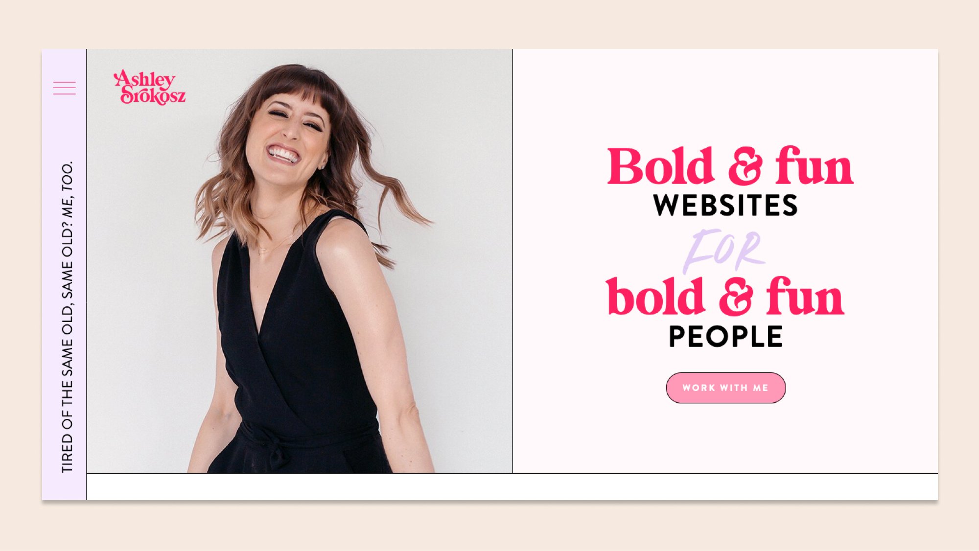
Ashley Srokozs’s website plays with split sections and several Squarespace blocks to create a modern website that still feels welcoming. Its sidebar and full-screen menu stand out as the most prominent features, as well as its bright colors and playful aesthetic.
Jaks Digital
The Jaks Digital website is a testament to straight lines and clearly divided sections, all styled in soft green and gray. It features a newsletter block, an Instagram block, a blog page turned into a portfolio, and a stunning About page.
January Made Design
The January Made Design website features a clean and spacious layout. It welcomes visitors with large images and a small hero statement animated with a typewriter effect. Its earthy tones and on-brand images convey the brand’s personality effectively.
Kurly Creative
The website for Kurly Creative is bubbly and playful. It features a bright color palette, fun graphic elements, big section titles, and incredibly engaging copy. It displays testimonials in an effective way and includes a newsletter section offering a free template to subscribers.
Made by NF
The Made by NF website features soft colors, on-brand images, and some stunning dynamic elements. It includes a split-screen scrolling effect, with one side fixed as you scroll down, adding a playful and engaging touch to the site.
Sage and Square
The Sage and Square website combines delicate typography with subtle animated elements to create a calming website that aligns with their brand. It features an Instagram block above a beautifully designed footer, as well as a blog page turned into a portfolio.
Hey Sara Schultz
The website for Hey Sara Schultz is incredibly engaging and dynamic. It features everything from scrolling gallery blocks and summary blocks to split sections, videos, and an Instagram block. It also leverages Squarespace members’ only functionality to create an exclusive space for her community.
Taylor Web Design
The website for Taylor Web Design features cheerful typography and fun graphic elements. It includes gallery blocks to display services and other information, as well as a newsletter block to invite visitors to sign up. It also features a contact form at the footer offering visitors a website project planner.
Wilson and Ward
The Wilson and Ward website features a full-fledged, nature-themed video hero section that immediately catches visitors’ attention. It also includes some interesting elements like scrolling announcement bars, an Instagram block, and an entire page dedicated to testimonials.
Big Cat Creative
The Big Cat Creative website is stylish and modern. One of its most appealing features is its hovering round menu button on the right-top corner. It also displays templates in a very original way, in a slideshow format but with all images joined together.
Eleanor Mayrhofer
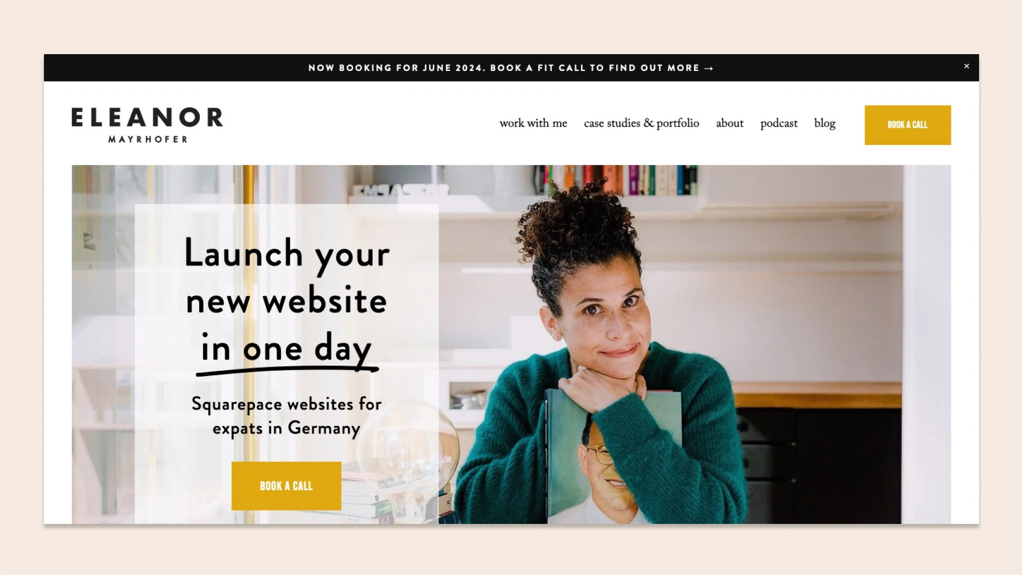
Eleanor Mayrhofer’s website is cheerful and well-structured. It displays testimonials in a carousel summary block with images to build trust and includes a big, scroll-stopping newsletter block to invite visitors to sign up. It also uses a pop-up to build its email list through a lead magnet.
Monforte Studio
The website for Monforte Studio is bold and unapologetic. It features large typography, strong and bright colors, and an animated icon to make a statement. It also includes a scrolling announcement bar inviting you to their Instagram, right above an Instagram block.
Happy Little Websites
Happy Little Websites’s site is a creative testament to how versatile Squarespace can be. It features bright colors and fun-shaped images, as well as a visible scrolling bar that feels almost vintage. With animated clouds that hover as you scroll, the website feels quirky and intriguing.
Simple and Soulful
The website for Simple and Soulful is sleek and professional. It features a creative scrolling effect that reveals different elements as you go further down the page. Also, it includes a helpful “Start here” page where visitors can head to get the design process rolling.
The Square Agency
The website for The Square Agency features interesting design elements, including a cursor that changes into a circle as you hover over their portfolio section on the home page. It's a simple but effective design that includes many animated elements that keep the visitor engaged.
Willful Studio
The website for the Willful Studio is modern, bold, and packed with unapologetic copy that visitors simply cannot ignore. It uses green color accents and images with rounded corners throughout her website to make the design cohesive.
David and George
David and George’s website is a stunning testament to minimalist design. It welcomes visitors with hero section with white background that features only their logo, the navigation bar, and their statement. Then, as you scroll down, you find yourself immersed in full-blown images.
Agave Studio
The Agave Studio website welcomes visitors with a split hero section and a strategically placed CTA. The structure mostly alternates between on-brand images and text, but also includes gallery blocks here and there. The website also shows visitors a pop-up offering them to subscribe to their newsletter.
Selah Creative Co.
With sleek and modern design, the Selah Creative Co. website boasts eye-catching animation and a well-structured layout. Its beautifully designed footer has all the information visitors need, including strategically placed CTAs to drive engagement and conversions.
Made by Dave
Made by Dave has leveraged Squarespace to create a modern and sleek website. It features limited copy and heavy imagery, as well as animated titles for all sections. They also created a stunning portfolio using a blog page, which helps them showcase their work seamlessly.
Eleanor Stones
Eleanor Stones’s website features a split hero section and a scrolling announcement bar to wow visitors as soon as they enter the website. With its rosy color palette, it reflects Eleanor’s brand seamlessly. The website also features a pop-up to promote her lead magnet.
Justin Mabee Design
Justin Mabee’s website is designed in black and white, with splashes of blue in CTAs and buttons. It features a carousel summary block to display testimonials, and a drop-down FAQ section tackling any doubts visitors may have.
Kirsty M. Design
The website for Kirsty M. Design neatly displays her services and offerings using Squarespace’s gallery and summary blocks. It features several images and overlaying elements and also includes a newsletter block where users can sign up to receive design tips twice a month.
Websites by Elise
Websites by Elise boasts a gorgeous Squarespace website with animated elements and a harmonious color palette. It features testimonials and leverages the platform’s accordion blocks to include a drop-down FAQ section.
Goodwin Creative
The Goodwin Creative website features an unconventional structure packed with on-brand images. It’s designed in lovely tones of green and displays testimonials in a summary block to build trust in visitors. It also uses a blog page as a functional portfolio.
Danae Bloise
Danae Bloise’s website combines a subtle color palette and lovely graphic elements to reflect her sustainability mission. It features a scrolling announcement bar, round buttons, and unconventional layouts, displaying all the possibilities Squarespace has to offer.
Elizabeth Ellery
Elizabeth Ellery’s website leverages Squarespace to create a gorgeous and well-structured website. The way she displays testimonials on the homepage is one of its most interesting features: the testimonials include an image of the website she built and the person she built it for, creating a sense of trust and closeness with clients.
Simply Website Design
The website for Simply Website Design is bold and immediately catches your attention. It features a bright color palette, bold typography, and big headings and sections that occupy the entire page but still feel neat and functional.
Freya Rose Tanner
The Freya Rose Tanner website combines rosy and terracotta tones with stunning typography and copy you simply cannot ignore. It includes several images arranged in cool layouts, an Instagram block at the footer, testimonials, and an announcement bar at the top, leveraging all Squarespace has to offer.
Kristine Neil
Kristine Neil’s website features heavy imagery and a scrolling gallery section showing all the amazing places where she has been featured. It also includes a pop-up offering visitors her free SEO audit and a very well-structured layout that makes for a pleasant user experience.
Lauren Taylar
Lauren Taylar’s website combines some of Squarespace’s best features: It includes gallery and summary blocks to display services, testimonials, and images; it features an Instagram block to drive engagement to that platform; and it leverages a blog page as a portfolio.
Share Your Magic
The Share Your Magic website is a feminine site styled in pink and light blue. With overlapping elements, strategically placed CTAs, and several images of the person behind the business, it does a great job of engaging visitors and inviting them to work with the brand.
By Rosanna
Rosanna’s website features a spacious layout and a subtle color palette that create a modern and fresh website. A nice touch is that it displays Rosanna’s logo as it loads. It also features some of Squarespace’s best functionalities, like Instagram and newsletter blocks, to provide a well-rounded experience for visitors.
Floating Lotus Design
The Floating Lotus Design website welcomes visitors with a split hero section featuring a picture of the designer behind the business and compelling copy. It uses a gallery block to display the places where the studio has been featured and includes a live chat functionality.
The Square Genius
The website for The Square Genius features playful typography, a business-like color palette, and a neat layout. It displays testimonials and reviews from Google and even features a shop, leveraging Squarespace’s e-commerce functionality.
Backyard Creative
The Backyard Creative website stands out for its neat design, its clever use of graphic elements, and its subtle animations. Testimonials are displayed large and proud on a slideshow summary block followed by examples of the websites this studio has created.


