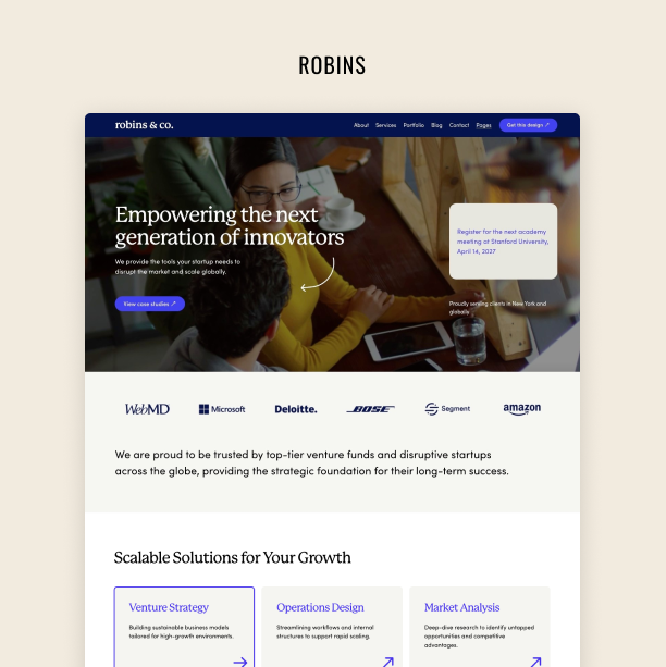
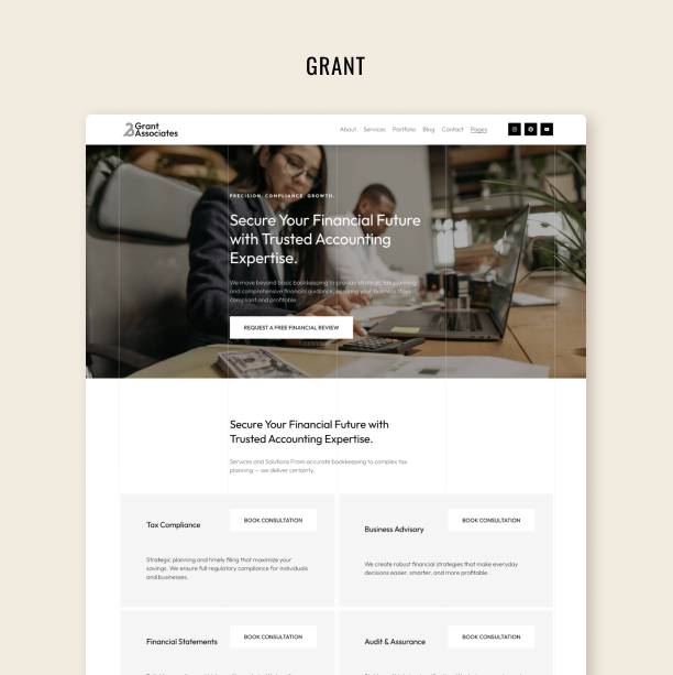
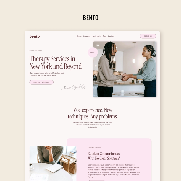
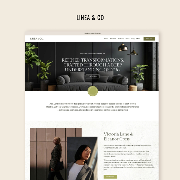
How to Breathe New Life Into Your Website’s Home Page
What to do when you feel things are starting to be a little outdated
The online world doesn’t stand still. If your website has been idling on the digital highway for the past year or more, it may be time to roll up your sleeves and give it a well-deserved makeover or at least a halfhearted weekend facelift. After all, a stagnant website risks falling out of step with your audience's changing needs and expectations.
So, let's breathe new life into your online home! In this article, we'll explore 9 simple yet effective strategies to revitalize your website’s home page and ensure it aligns seamlessly with your business objectives and goals. From refining your messaging to enhancing visual appeal, these steps will help you elevate your website's performance and stand out to your dream clients.
Try Squarespace for free – and save 10% when you purchase a subscription with code APPLET10
9 Strategies to Refresh Your Home Page
Let's dive into these nine actionable tactics to update your home page and leave a lasting impression on your audience:
Update your content
Your website's copy is its voice; it’s how you convey your brand's message and values to visitors. However, if your home page content has stagnated, you risk falling behind competitors who prioritize freshness – or even worse, you risk your copy not reflecting your business's current state and personality.
Does your home page copy reflect your brand's identity and values? Take some time to inject a fresh perspective into your content by updating it with recent news or events relevant to your business. Remember, beyond showcasing your offering, your website is a platform to express your business’s unique personality. So, don't hold back – let its authentic voice shine through and captivate your audience.
A good idea to automatically keep things fresh on your homepage content-wise – is to add a summary block with your recent blog posts, podcast episodes, or events. Sure thing, it works only if you update your blog/podcast regularly (which you should do anyway as a part of your content strategy). To add a summary block on a Squarespace website click a plus icon in the top left corner of a section in the page editing mode. Choose a summary block; in the design tab, you can find what works best for you – be it a carousel, or a grid. Modify till you like the way it looks. In the content tab, you have to choose the source page (blog or a podcast) and you also can select only one category, instead of all the blog posts to be shown, meaning you can demonstrate only the most popular content, or posts on one topic.
Find this section in our Perfectionist Squarespace template
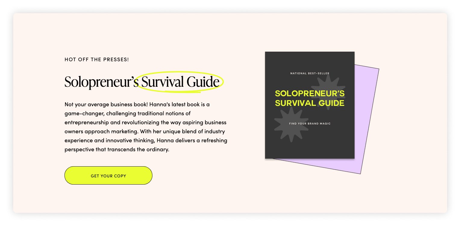
2. Refresh your lead magnet
Ensure your website’s lead magnet remains compelling and relevant by refreshing it from time to time and adding new ideas or valuable tips and data. Start by checking if it aligns with current audience needs and preferences and update the content to offer fresh insights or perspectives, expanding its value proposition.
Check out this lead magnet design in the Squarsepace Tempate Perfectionist in our shop.
You can also experiment with different formats to cater to new audience preferences, such as ebooks, webinars, or templates. Feature the updated lead magnet prominently on your home page and throughout your website with persuasive copy and a visually appealing design. By refreshing your lead magnet, you can reengage your audience and lay the groundwork for driving conversions and nurturing meaningful relationships.
3. Add or update testimonials
Elevate your home page's persuasion power by giving your testimonials section a makeover – or adding one in the first place! Begin by assessing the effectiveness of your current testimonials. Are they still relevant and impactful?
Consider contacting satisfied clients for updated feedback reflecting recent experiences or outcomes. Encourage them to share their success stories or specific results achieved through their partnership with your brand. And once you've curated a robust selection of testimonials, strategically integrate them into your home page. Utilize compelling visuals and persuasive language to highlight these testimonials, making them impossible to miss.
This testimonial slider is a part of our Perfectionist Squarespace Template.
Elevating your testimonials bolsters trust and credibility and provides social proof that resonates with potential customers. Take some time to showcase the authentic voices of your satisfied clients, and watch as your conversions and customer relationships flourish.
4. Include a chatbot
Enhance your website's functionality by incorporating a chatbot. This virtual assistant acts as a programmable curator, offering prompt responses to simple queries about your products or services. Think of it as a round-the-clock customer support representative who engages with visitors even outside of regular business hours. Check out live chatbots of our choice here.
A chatbot is invaluable for covering and expanding on topics beyond your home page's content. While it may lack the personal touch of human interaction, a chatbot prompts engagement from customers and can help resolve minor issues in real-time. This accessibility and responsiveness can significantly impact customer satisfaction and loyalty, influencing their decision to return for future interactions with your business.
5. Freshen up images
For entrepreneurs with content-rich websites, updating images is a crucial yet often overlooked task. Your home page's images capture visitors' attention and communicate your brand identity. Take the opportunity to review and refresh your home page images to ensure they align with your brand and adequately represent it.
Begin by evaluating your current home page images. Do they accurately reflect the essence of your brand and the solutions you offer? Consider whether they effectively communicate the unique value proposition that sets your brand apart from competitors and whether they resonate with your target audience.
Then, explore ways to update the home page images to better suit your brand's messaging and customer aspirations. This could involve selecting new images that convey the desired tone, emotions, and aesthetics or editing the existing image to enhance its impact and relevance. Or if it is a personal brand, consider putting a new photoshoot on your calendar. Pay attention to visual elements such as color palette, composition, and subject matter to ensure consistency with your brand identity and messaging.
6. Review your CTAs
Breathe new life into your home page by reviewing your call to action (CTA) buttons or forms and making sure they are placed at all the right corners. A simple yet effective tactic is to bring the CTA for your best-selling products or services to the forefront, ensuring it is prominently displayed on your home page.
Many small businesses unintentionally bury their CTAs toward the end of their home pages, where they may go unnoticed by visitors who don't scroll to the bottom. Instead, prioritize placing your CTAs above the fold – the visible part of your site that visitors see without scrolling.
Whether it's a prominent "Buy Now" button for e-commerce sites or a lead generation contact form for service-based businesses, positioning your CTAs in a prominent location on your home page increases visibility and encourages immediate action from visitors. By making it effortless for users to engage with your desired action, you can boost sales, leads, and overall conversions on your website.
7. Refresh your colors and fonts
If you’re feeling extra bold or your current home page design no longer aligns with your brand's personality, it's time to consider changing your colors and fonts. Just as a fresh coat of paint transforms a home exterior, updating your website's theme, colors, and fonts can rejuvenate its appearance and reinforce your brand image. This tactic becomes particularly impactful when your existing design fails to reflect your evolving brand identity.
Most website platforms – like Squarespace – offer user-friendly tools for customizing themes, colors, and fonts, making experimentation easy and reversible. Don't hesitate to explore Squarespace Templates in our shop. These babes have color palettes and font styles tastefully chosen for you by our web designer, so you can be sure they look great.
8. Keep banners and pop-ups up to date
Ensure your website stays fresh and engaging by regularly updating announcement banners and pop-up messages. Banners and pop-ups are often one of the first things visitors notice, so it’s crucial that the info you display is current and relevant. Otherwise, customers might take off and go find what they need somewhere else.
By refreshing banners and pop-up announcements on a regular basis, you can maintain relevance and capture visitors' attention with the latest news, offers, or updates from your brand. Also, timely and informative pop-up messages provide additional opportunities to engage visitors and drive conversions.
Whether you're promoting new products, announcing special promotions, or sharing important updates, keeping banners and pop-ups current ensures that visitors are always informed and encouraged to take action. With strategic updates, you can maximize the impact of these key elements and enhance the overall effectiveness of your website in driving engagement and achieving your business objectives.
9. Don’t overlook your mobile presence
Today, over half of product and service searches occur on mobile devices. So, after sprucing up your homepage with the tips we've covered, it's essential to double-check that your mobile version still shines.
Remember, Google favors mobile-friendly sites, so optimizing your mobile version keeps you in the search engine's good books. You risk losing potential customers who can't navigate your site on their phones by neglecting mobile optimization.
Take a quick peek at your mobile site post-refresh to ensure everything looks and functions smoothly. It's a simple step that can go a long way in keeping your audience engaged and driving conversions.
To check the mobile version of your website on Squarespace find the mobile icon in the top right corner on any page of your website in admin mode.
Refreshing your website's home page can bring new life into your online presence and elevate your brand. By implementing the strategies discussed, from updating copy and images to optimizing banners and ensuring mobile compatibility, you can create a captivating digital storefront that resonates with your audience and drives meaningful engagement.
Remember, your website serves as the cornerstone of your online identity, making it essential to regularly review and revamp its elements to stay relevant in a rapidly evolving digital landscape. Whether you're showcasing new products, announcing promotions, or sharing your brand story, your homepage should reflect the latest developments and effectively communicate your unique value proposition.
So, roll up your sleeves, dive into the refresh process, and watch as your revamped homepage captivates visitors and propels your business forward in the digital realm.

