Signs That Your Squarespace Website Is Outdated

Design matters – we can all agree here. But how do you tell if your Squarespace website is designed well and will attract that sweet new lead or a sale? Is it colors, fonts, layout? Images vs graphics or illustrations? Is it showing calls to action first and doing your business pitch later (down the main home page), or is it vice versa – grabbing visitor attention first by a catchy statement and calling to action later? How do you decide?
Okay, those are a lot of questions. Let’s take a quick breather and unpack this piece by piece – we’re sure you have many other things on your plate to worry about in your business besides evaluating if your website both looks and functions well.
In this article we explore some of the typical signs that your Squarespace website might not be well-designed to help you plan your redesign or facelift. We’re also going to talk about outdated websites and how to fix those. If you find you have some of the below apply to your website, don’t panic! At Applet Studio, we offer a selection of stylish and highly functional SEO-friendly custom Squarespace templates and are always happy to help.
Repeating, mundane layout
Is the same layout repeated over and over again on your website? Does it lack the “wow” element you need to get a firm hold on your visitors’ attention? Then, it might be time for an update. Contrast and variety are key to keeping your audience from getting bored.
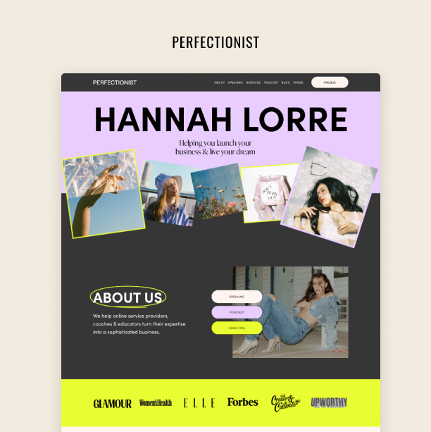
Take a look at this website, for example:

It uses a very simple layout that doesn’t really elicit any emotions or responses from visitors. Apart from that, the copy does not align properly with the images, which makes it look a bit messy.

This one is simply flooded with copy and follows a very predictable layout. In fact, it has little to no variation throughout the rest of the pages. The chances of visitors reading through all that copy without some visual elements to spice things up are little to none.
2. Cluttered design
Contrast and variety are essential in a well-rounded and modern website design. But that doesn’t mean it has to be cluttered.
Websites shouldn’t be treated like a dumpster where you just throw in a bunch of stuff and expect it to do the trick. Instead, it’s important to be careful in selecting what elements you’ll include, and make sure you purposefully leave blank spaces to give visitors some room with all that content.
If your website doesn’t follow those basic rules, it might be time to get in touch with your go-to designer.
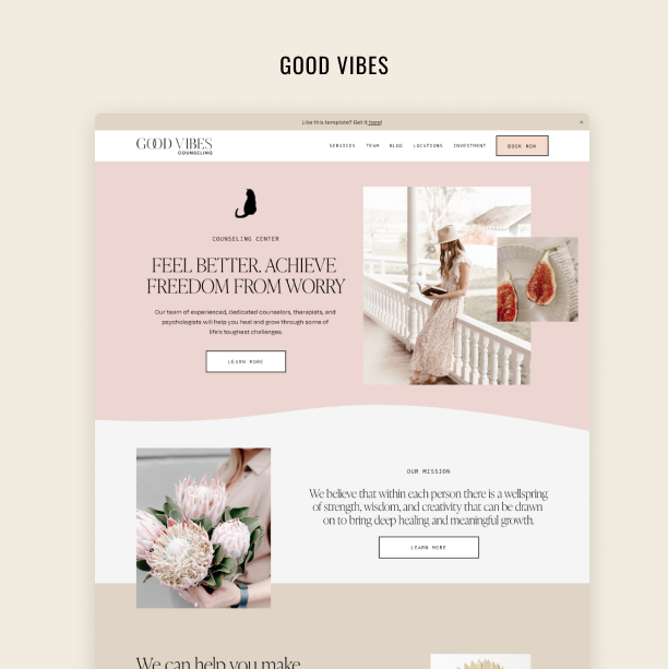
Take a look at this footer. It has an Instagram block, a banner advertising a freebie, a search bar, random copy, and social media icons. On top of that, it’s rather disorganized and could use better structure. This all adds to a somewhat messy experience for visitors and does not look very professional.

In our next example, as visitors scroll down this website, they are bombarded with too much stuff: several images, large titles, videos, flashy graphics, and overlapping elements. Too much information, too little white space.

3. Too many fonts
Too many fonts will make your website look amateurish and old-fashioned. As with everything in the design, you need to strike a balance. The golden rule is to use two, maximum tree fonts.
Actually, you can use even one font family, but with different styles and font sizes. Just make your titles and body of text contrasting enough. Using one font family is a safe choice for a non-designer and will guarantee you visual consistency. Check out more advice in our blog 20 Best Squarespace Font Pairings.

This website uses one font all over: in the titles, CTAs, body text. As there is not enough contrast, it comes across as rather dull and might bore visitors. We could add another font here, or make headlines bigger or bolder.

This website, on the other hand, is overdoing it. There are at least four different fonts styles. It looks a bit clumsy, and it lacks the professionalism that the website clearly seeks to convey.
4. Inconsistent photos
The visual elements of your website play a key role in engaging visitors. And nothing drives them away as stock images, and inconsistent, amateurish photos.

This team’s photos have different backgrounds, dress codes, and lighting. A team photoshoot can be a solution. If hiring a photographer is not on a budget for you, there are other options to tidy things up. Ask your team members to take the photos on the same kind of background from the same angle. If you have an office, do the photos in one place e.g. the same wall, with the same lightning and with one camera. Color-correct and crop the photos, so that they look similar afterwards.
If your team members work from home or even in different countries, the least you can do is to crop the photos and make them black & white.
Stock images if used incorrectly, can ruin your website. When choosing stock photos try to find photos that follow a certain visual line and are consistent with the look and feel of your website. You can create a moodboad, or a guided collection of images on photostock, to help you out. Look for images that have the same colors, tones, and color-correct them before uploading them to the website.

5. A graveyard of logos
A disorganized and uneven logo section is also a red flag. Avoid burdening your website with a graveyard of logos of different sizes — or worse, pixelated.
Use a graphic design tool like Figma to make the logos approximately the same size before uploading them to the website. In the same tool experiment with their position next to each other, add them in a neat layout, a grid. Also, always ask your partners for a logo with a transparent background.

6. No visual alignment
All the elements of the website should take their place on the page for a reason. Their placement should not be random, it abides laws of visual design.
If it sounds too complicated, try to have one consistent logic in how you align elements on your page – blocks, buttons, text. Generally, alignment to the left is preferred and alignment to the right is considered barbaric unless you know exactly why you are doing it. You can allow yourself to center the titles.

7. Outdated or cluttered navigation
The way you structure your website’s navigation plays an essential role in your visitors’ browsing experience. It should be user-friendly, intuitive, and helpful for people so that they can find what they are looking for.

This navigation bar is too cluttered and disorganized, it even has three lines.
You should also avoid lengthy dropdowns in the main navigation.
8. Boring, generic copy
Last but not least, let’s talk copy. Users’ attention span is shortening, and your copy needs to keep up with this trend. So, you need to make sure your website copy is short and captivating enough to catch and retain your visitors’ valuable attention.
That means that all your long, boring, and generic copy must go.
Let’s look at some examples:

Text is also an element of design. Long and wide paragraphs are the enemy of conversion rates. Chances that a visitor will read through all that information are very slim. Even your FAQ section should be short and sweet. Otherwise, you risk losing people’s attention.
Another issue that shows your website needs some re-doing is broken layouts due to never-ending copy:

Finally, it’s good practice to avoid using long copy in wide paragraphs that are not broken down into logical sections. For instance:

By organizing information under subheadings and splitting paragraphs into digestible bits, you’ll present your visitors with a website that’s a lot more user-friendly and easy to navigate.
Final Words
Websites age really fast. So, if you want to stay relevant online, your Squarespace website will need a facelift every couple of years.
The newest version of Squarespace 7.1 supports all modern design trends. So, we strongly recommend you update the site if you still have an old version. This way, it’ll be easier to keep up with the times!