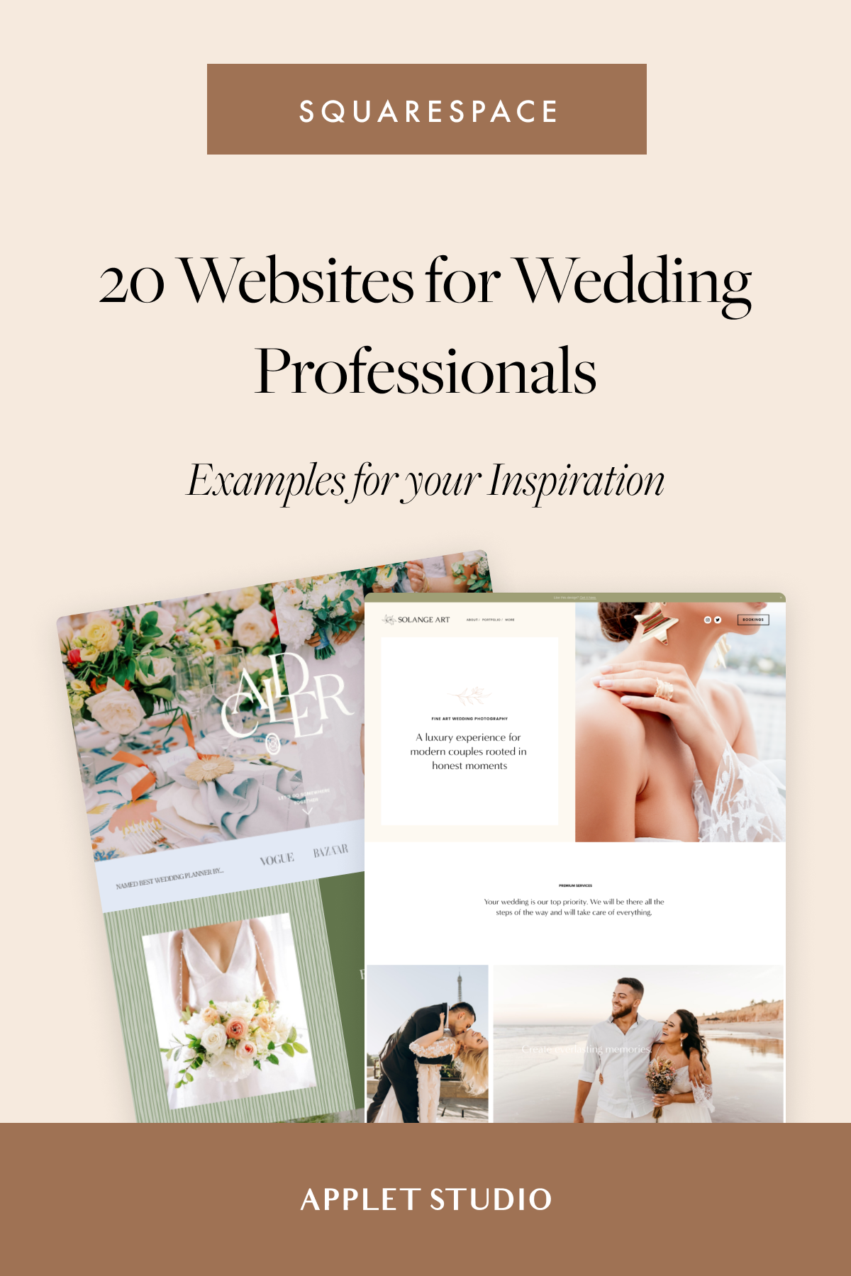
Inspirational Squarespace Websites for Wedding Professionals
Gorgeous Squarespace website examples for wedding event planners

Weddings are special occasions. And if your business revolves around them, your website should be special too.
Squarespace is flexible enough to adapt to any sort of business — including wedding planning, photography, and catering — and has all the features needed to turn it into an outstanding tool for building a solid website for your brand.
To help you find inspiration and discover how to leverage those features, we’ve gathered some amazing wedding websites designed with Squarespace. Let’s check them out!
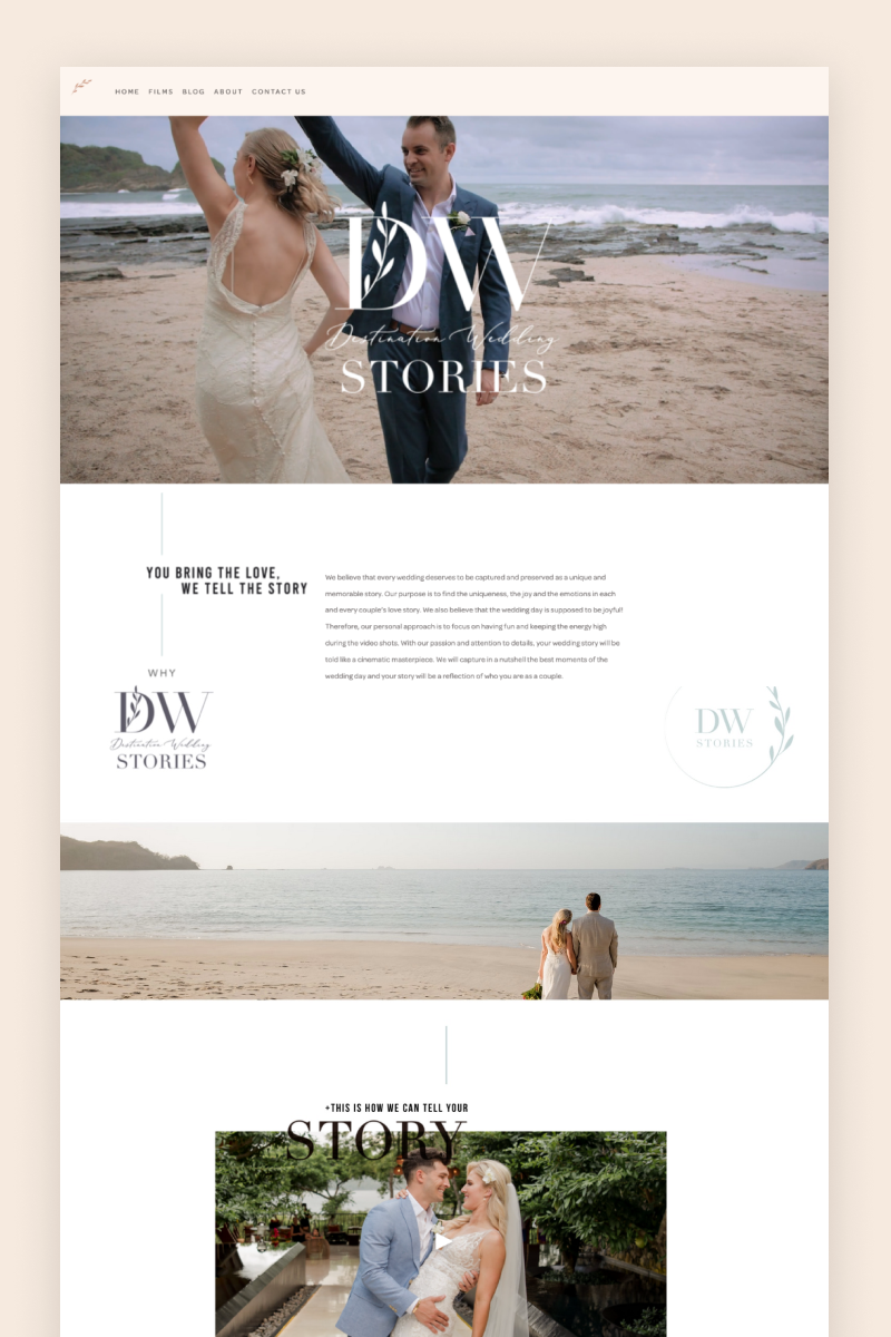
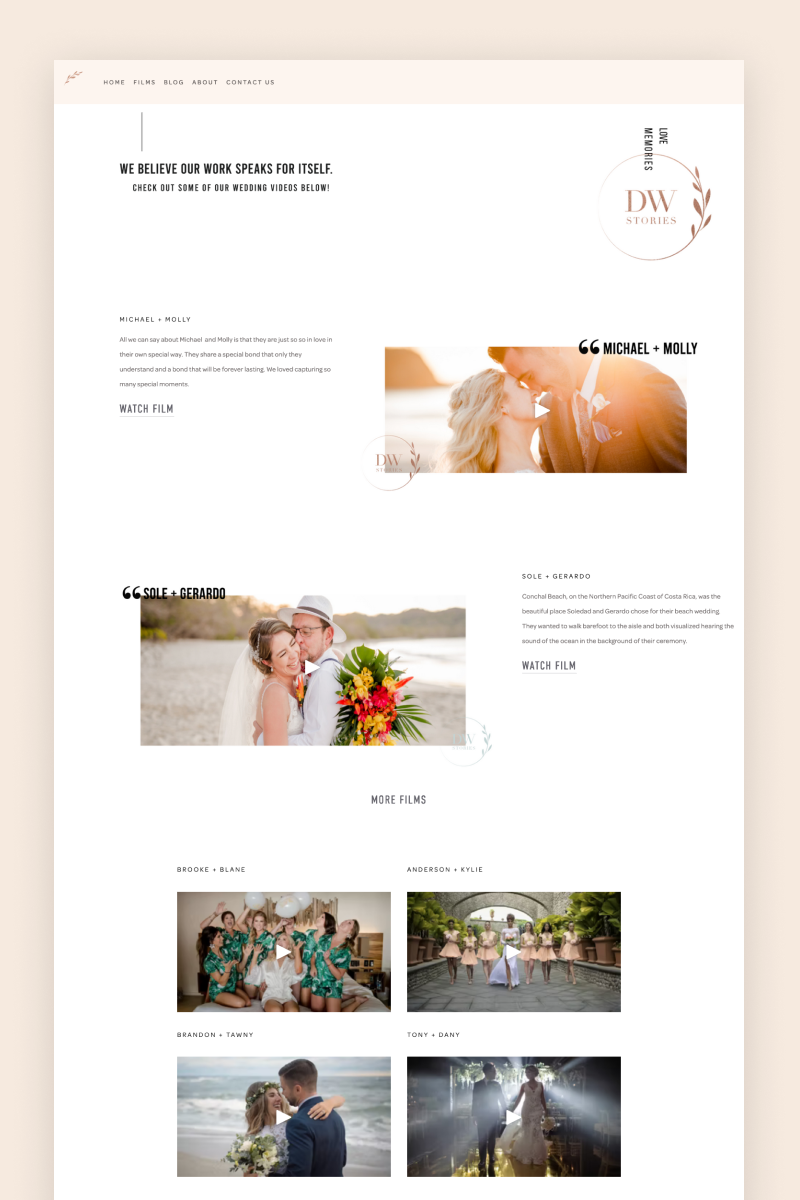
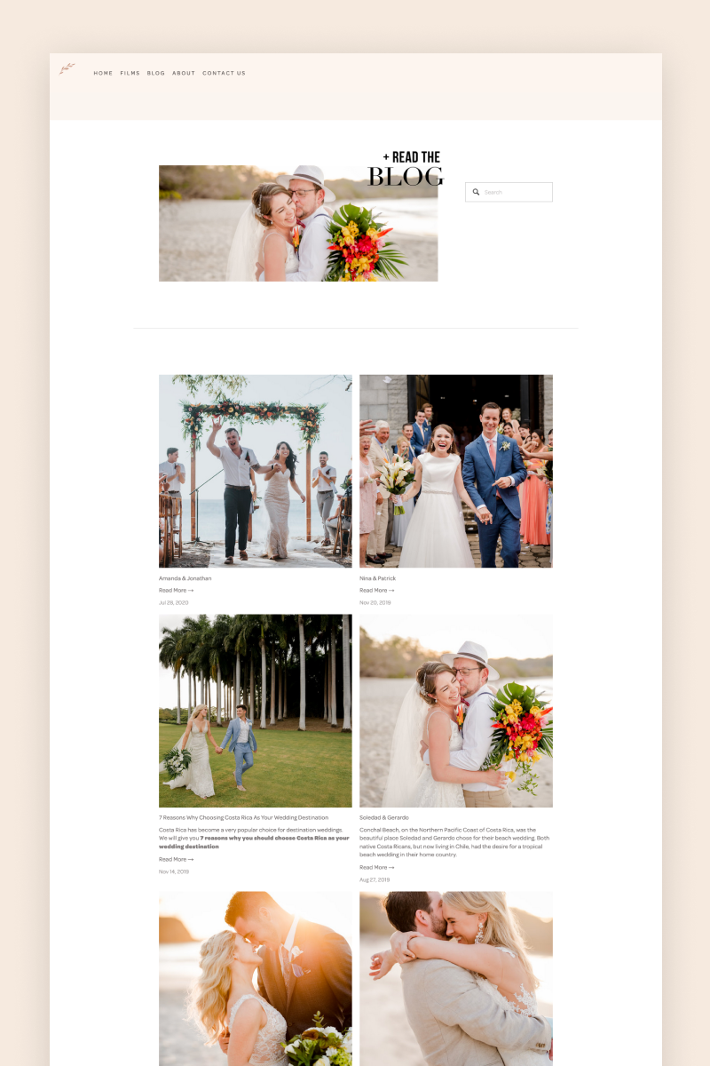
Destination Wedding Stories
Destination Wedding Stories’ website does not beat around the bush. It welcomes visitors with an eye-catching, video-based hero section that shows what this wedding filmmaking team can do. Wrapped in sandy tones with delicate splashes of light blue, the website features graceful animations and a clear, open layout that serves as the perfect host for the business’s online presence.
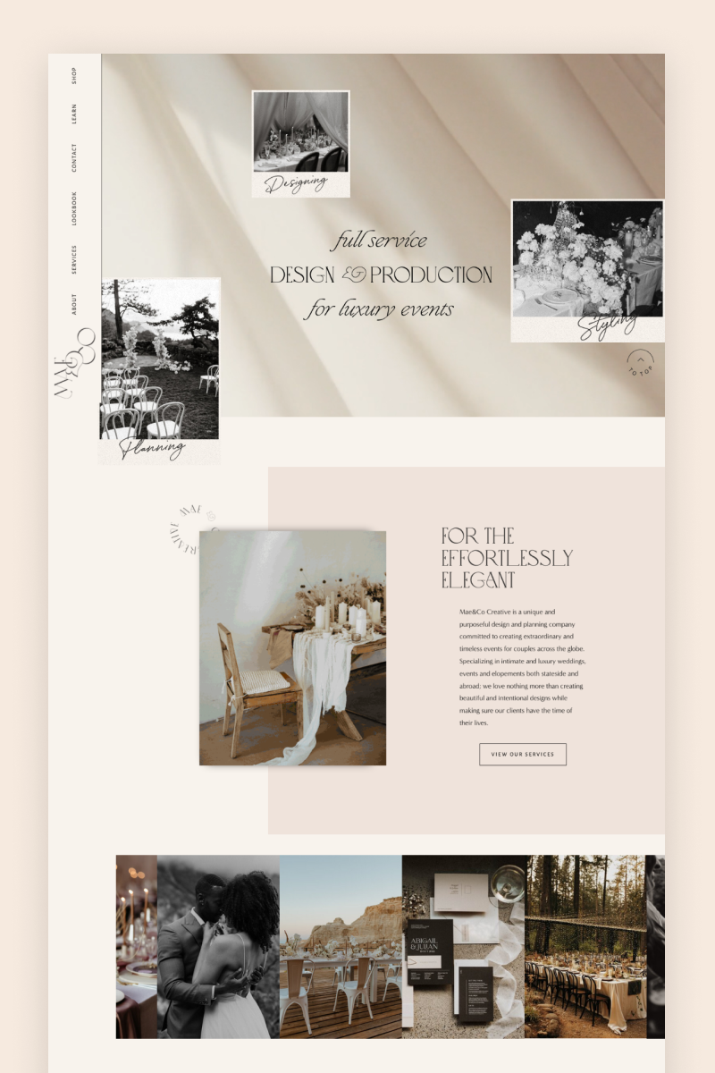

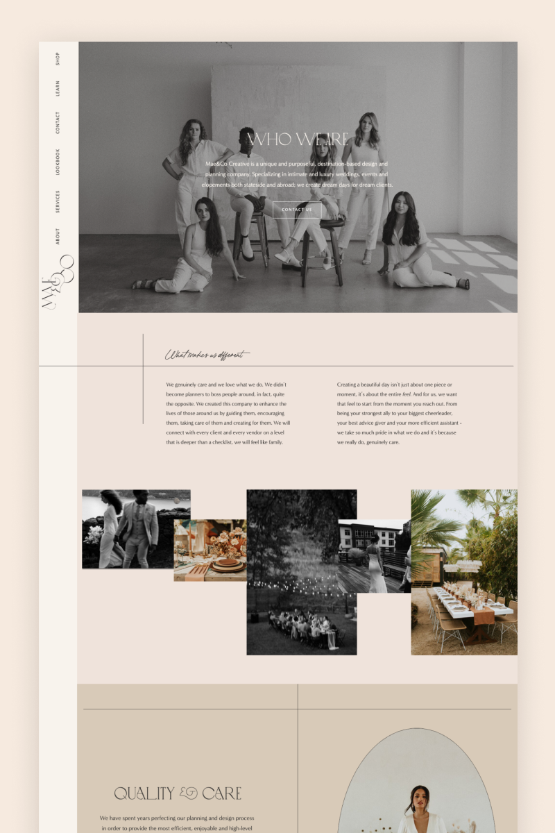
Mae&Co Creative
Effortlessly classy, the Mae&Co Creative website does a great job of conveying luxury and elegance. It leverages an interactive image carousel to illustrate their wedding planning experience and a blog that showcases their portfolio. As social proof is everything, Mae&Co uses a custom testimonial block where visitors can swipe through compliments and thank yous from their previous clients.

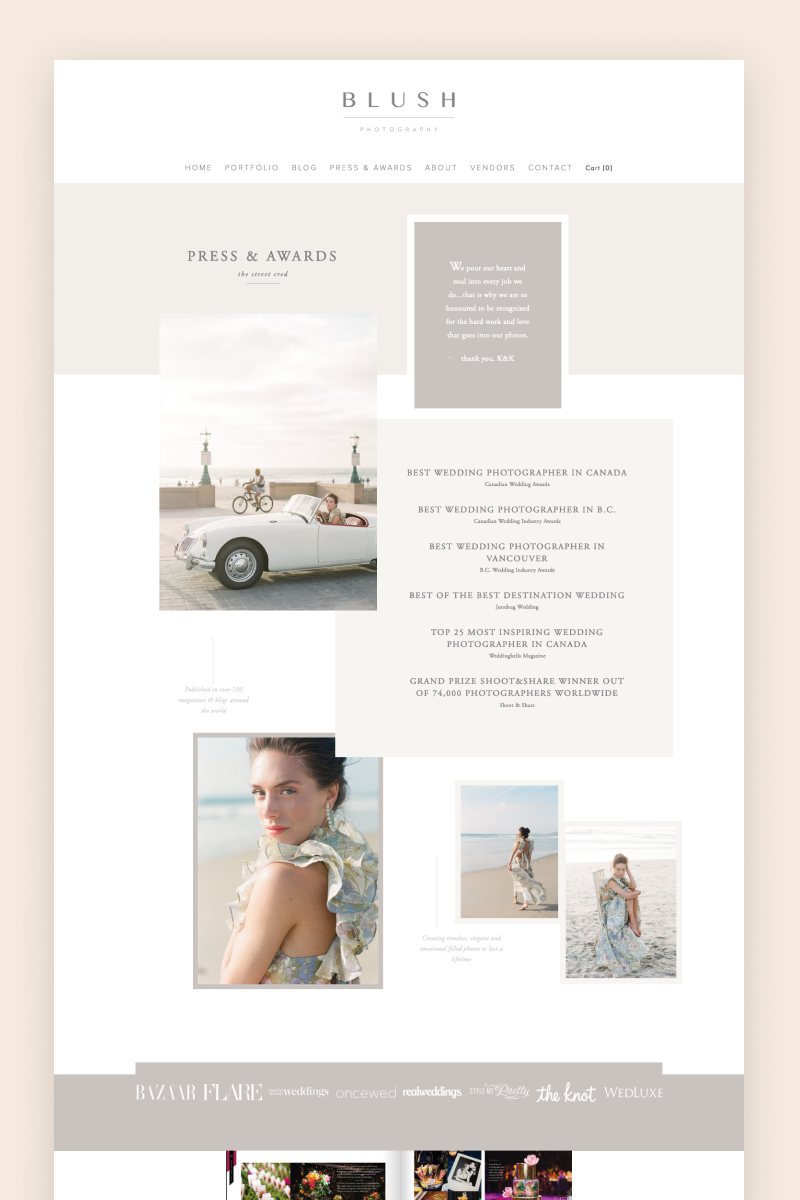
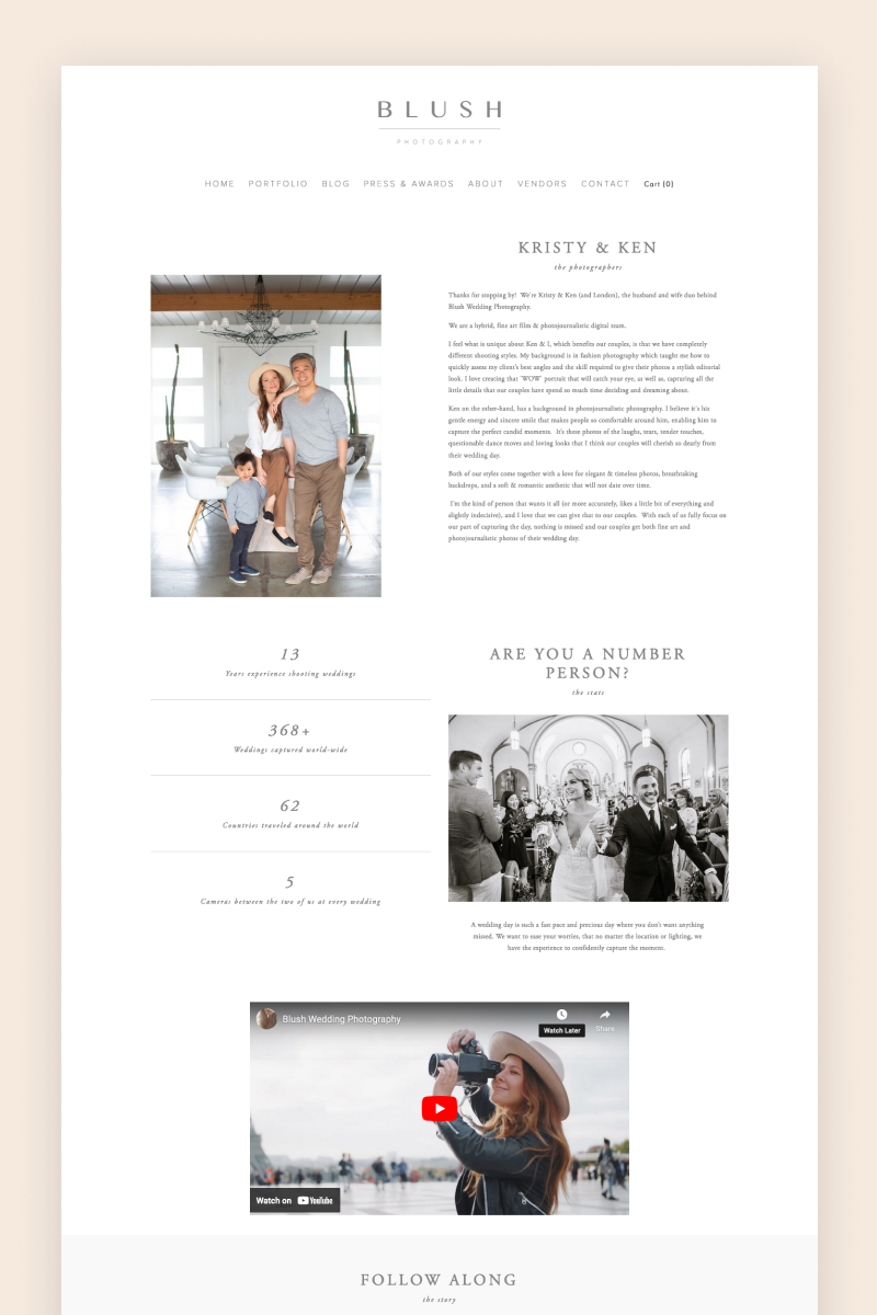
Blush Photography
Blush harnesses Squarespace’s features to build a visually stunning website that clearly shows their photography expertise. Below an impressive hero section, visitors will find a subtle navigation bar and a portfolio built with a summary block that leads to different blog pages. One of the most striking details of this website is the testimonials section: right next to each client’s comments, it includes some of the images taken at that wedding.
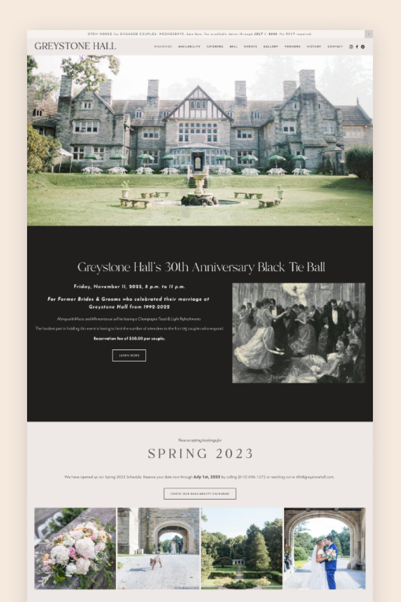
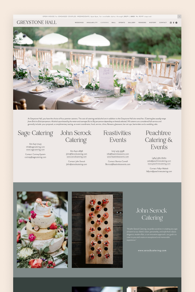
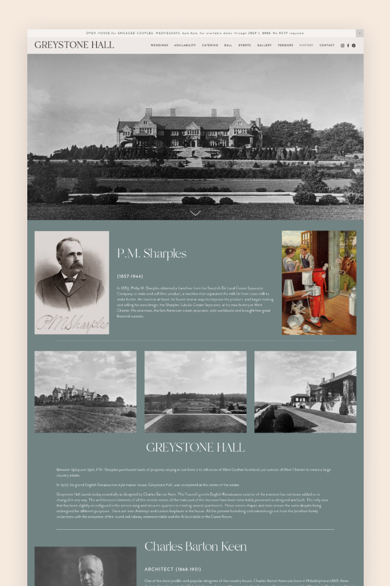
Greystone Hall
The Greystone Hall is a venue for wedding ceremonies and receptions. Their website features an image-heavy layout styled in different tones of grey. Apart from strategic CTAs and a stunning video feature, it includes testimonials scattered on every corner. On top of that, the website makes great use of Squarespace’s announcement bar feature to share relevant information with visitors.
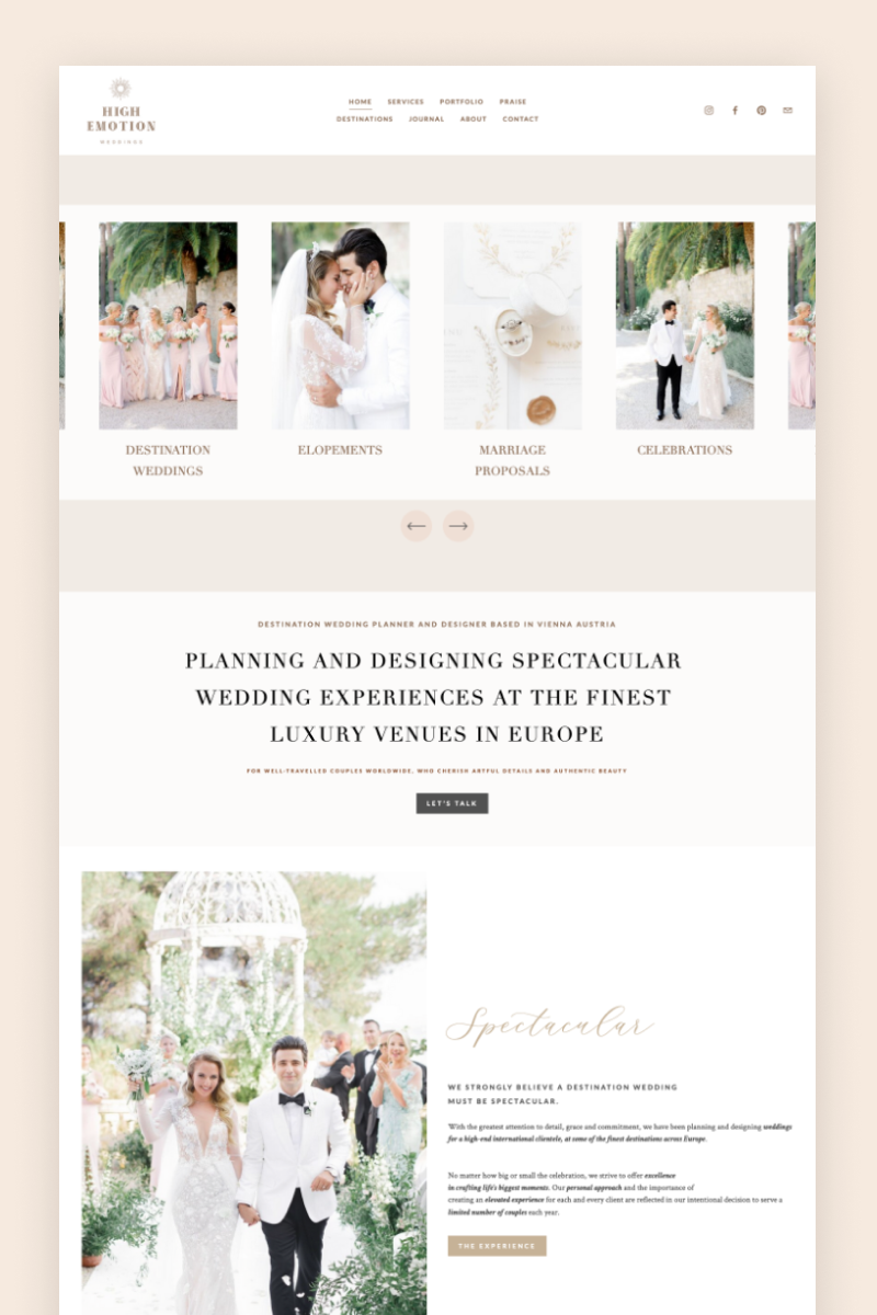
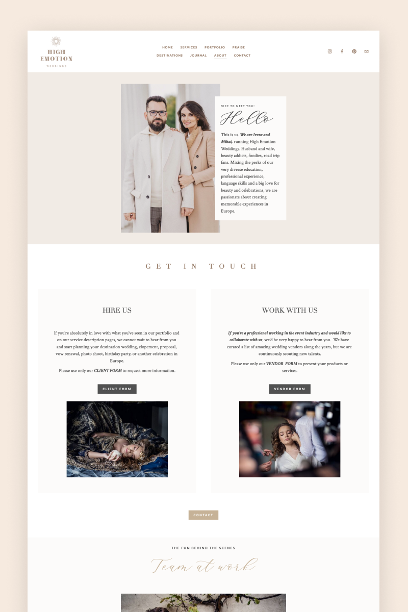

High Emotions Weddings
The High Emotions is a full-service destination wedding planning and design company. Their website displays large, appealing images immersed in a spacious layout. As visitors enter the website, they see a carousel block listing the services provided by the business. When they scroll down, they find further insights into High Emotions’ offering, as well as an animated gallery block showing gorgeous images of client weddings and a blog summary block at the bottom.
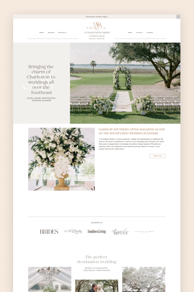
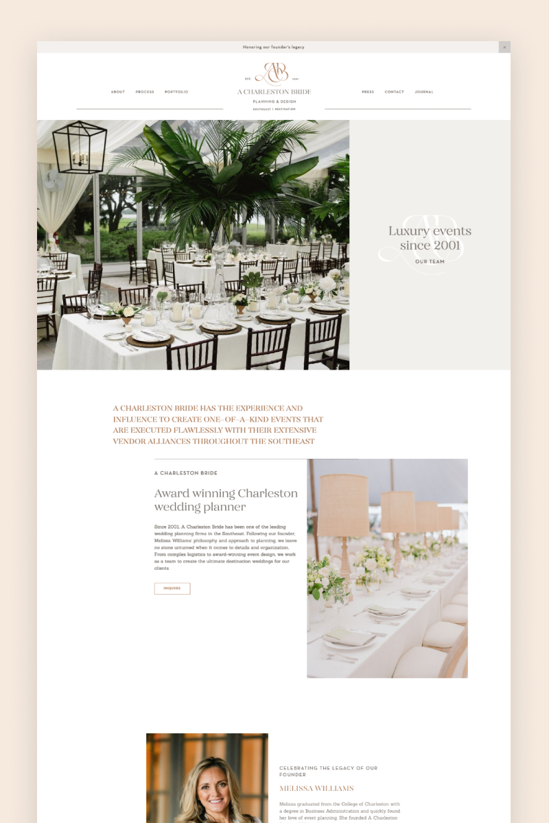
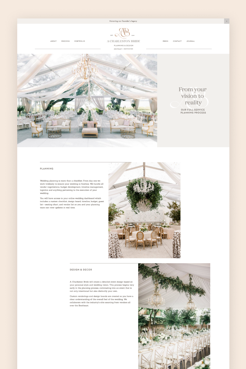
A Charleston Bride
Delicate and well-structured, the website for A Charleston Bride starts out with a simple but effective hero section that features a large picture next to an eye-catching headline in a charming font. With earthy tones and subtle touches of pine green, the website features several content blocks to display images with overlaying text, as well as an elegantly organized footer with relevant links and information.
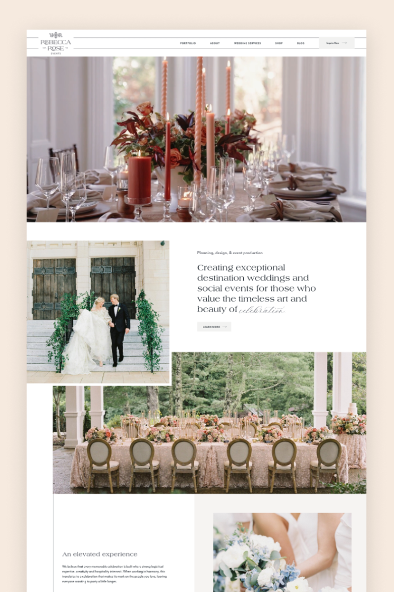
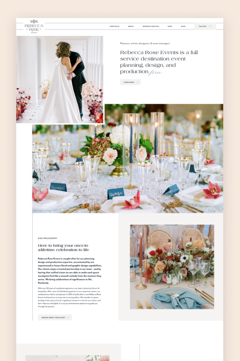

Rebecca Rose Events
The Rebecca Rose is a planner specializing in destination weddings and social events. Her website has a monochromatic design, with only the images bringing color to the table. The hero section is made up of a video showing captivating wedding scenes that can immediately catch any couple’s attention. As they scroll down, they can find quotes and descriptions of Rebecca Rose’s services paired up with cleverly placed images, as well as a portfolio and testimonials.
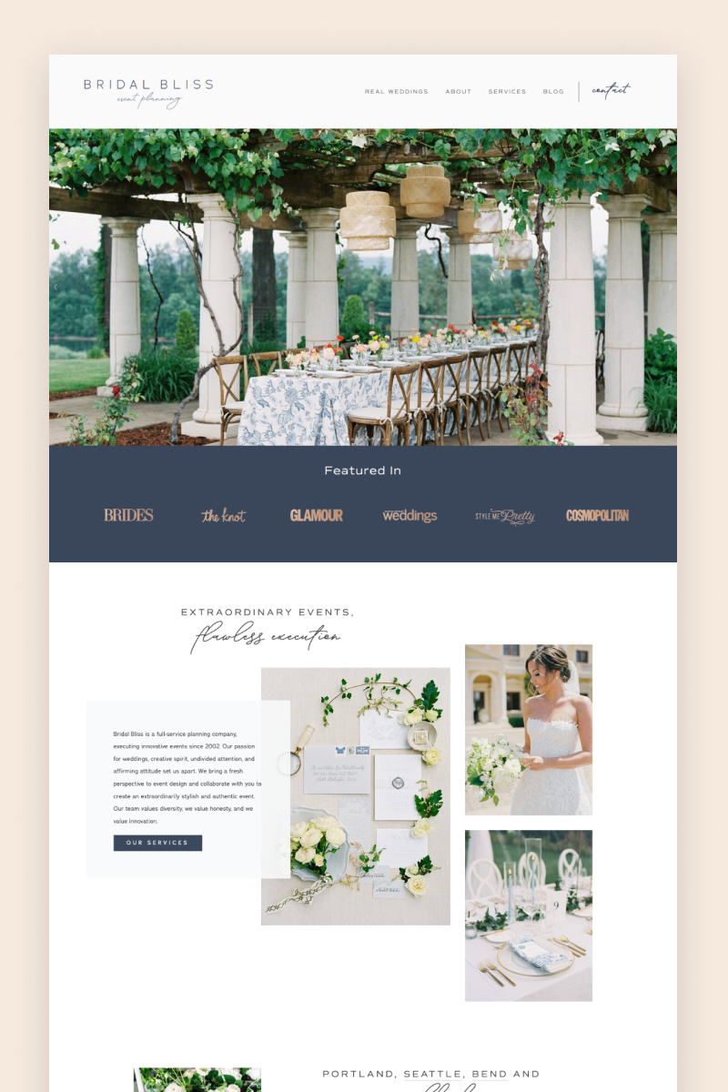
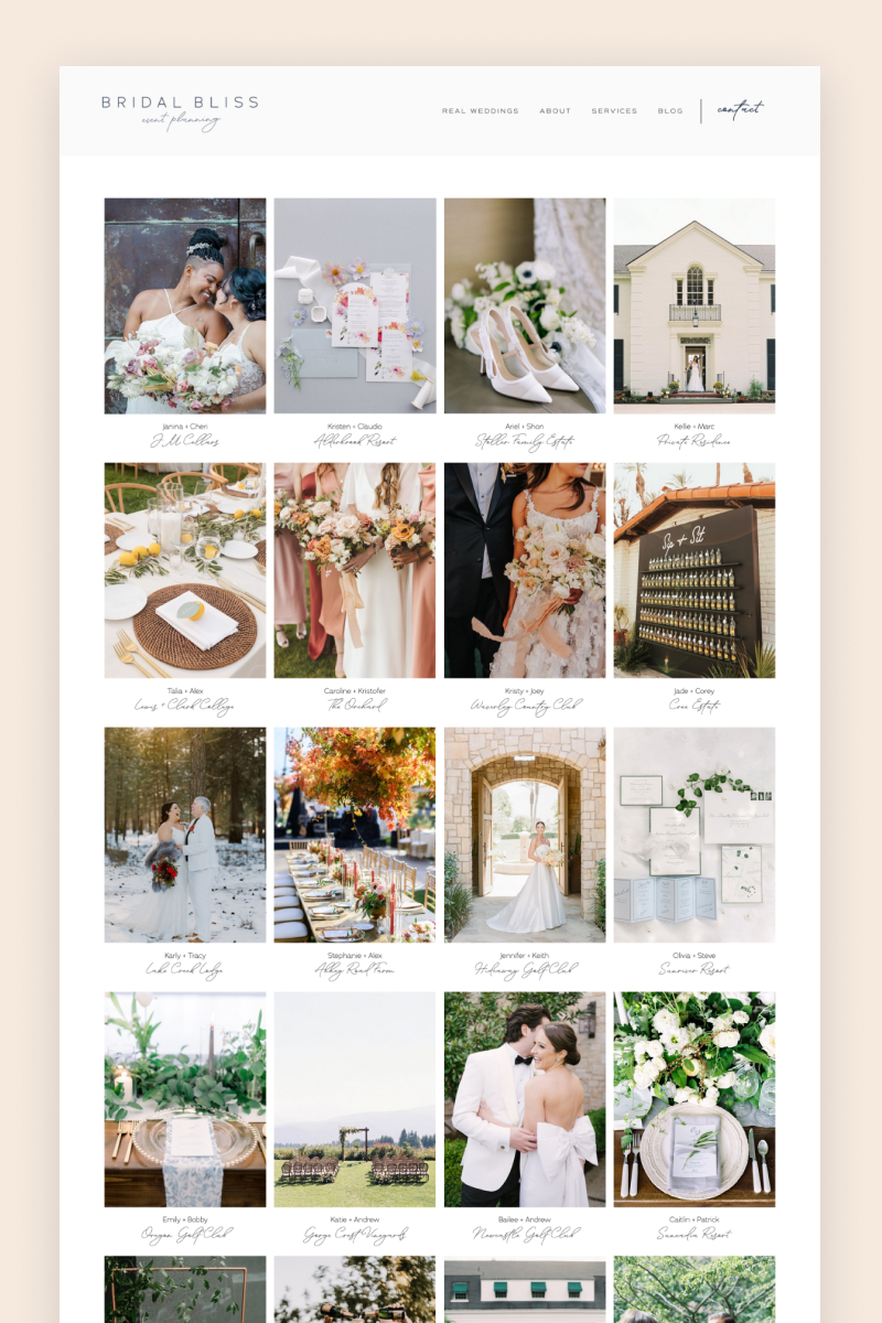
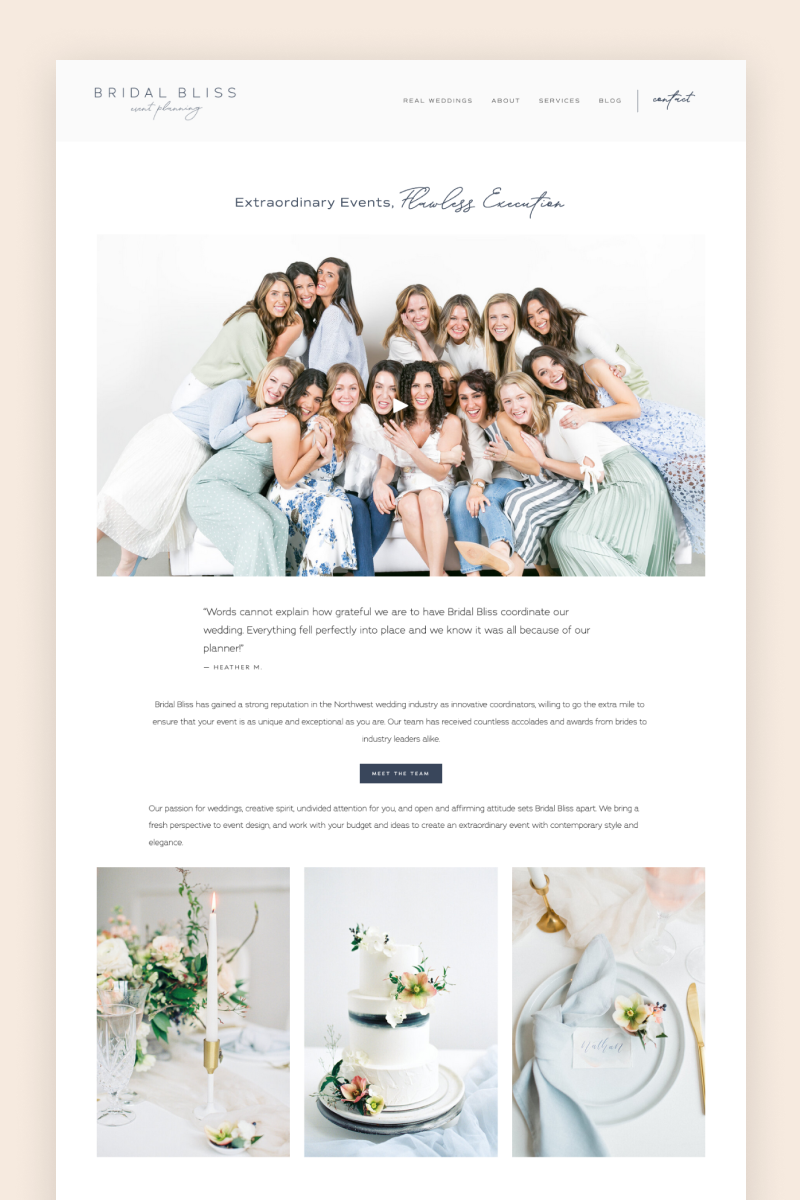
Bridal Bliss
Bridal Bliss draws you in with a full-bleed, slideshow-type hero section followed by a “featured in” section that helps establish authority from the start. Styled in different shades of blue, the website’s layout is organized beautifully to maximize space while maintaining a sense of openness. Their blog is repurposed to show the portfolio. The company devotes extra attention to present the team of planners by placing photos of everyone as well as videos and photos of a group photoshoot.
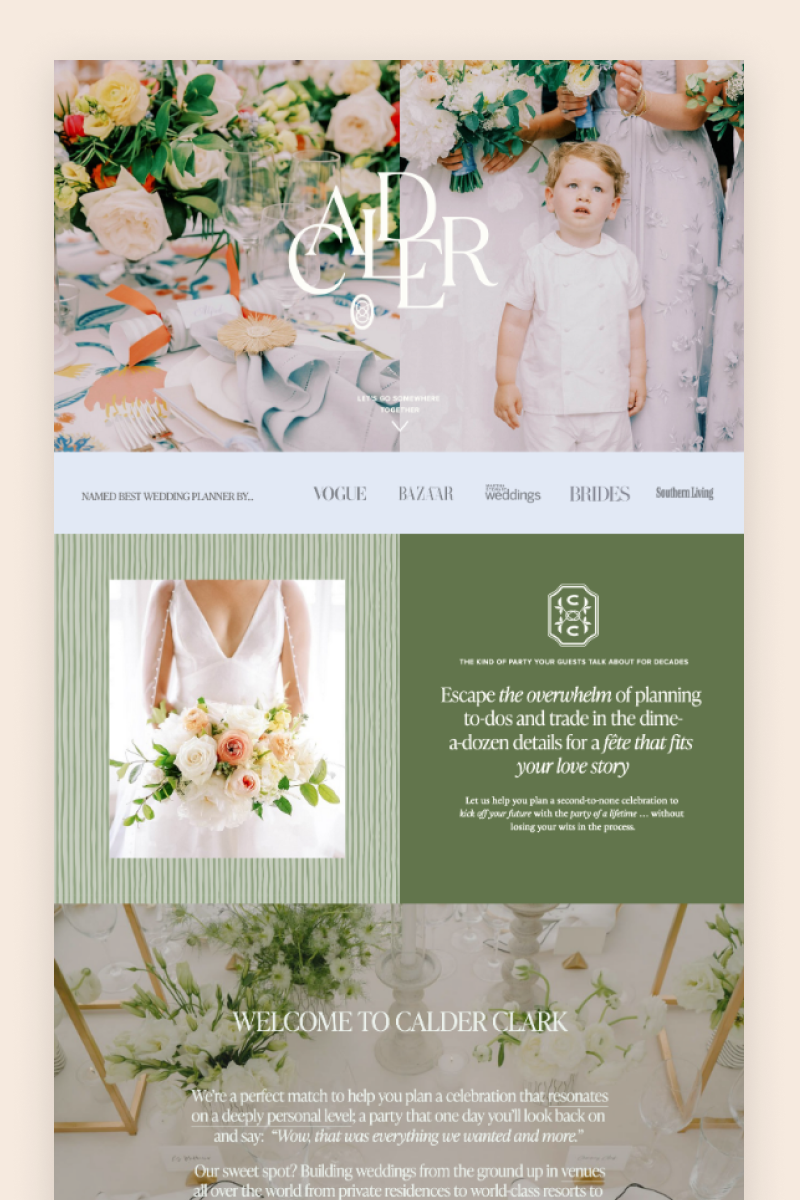
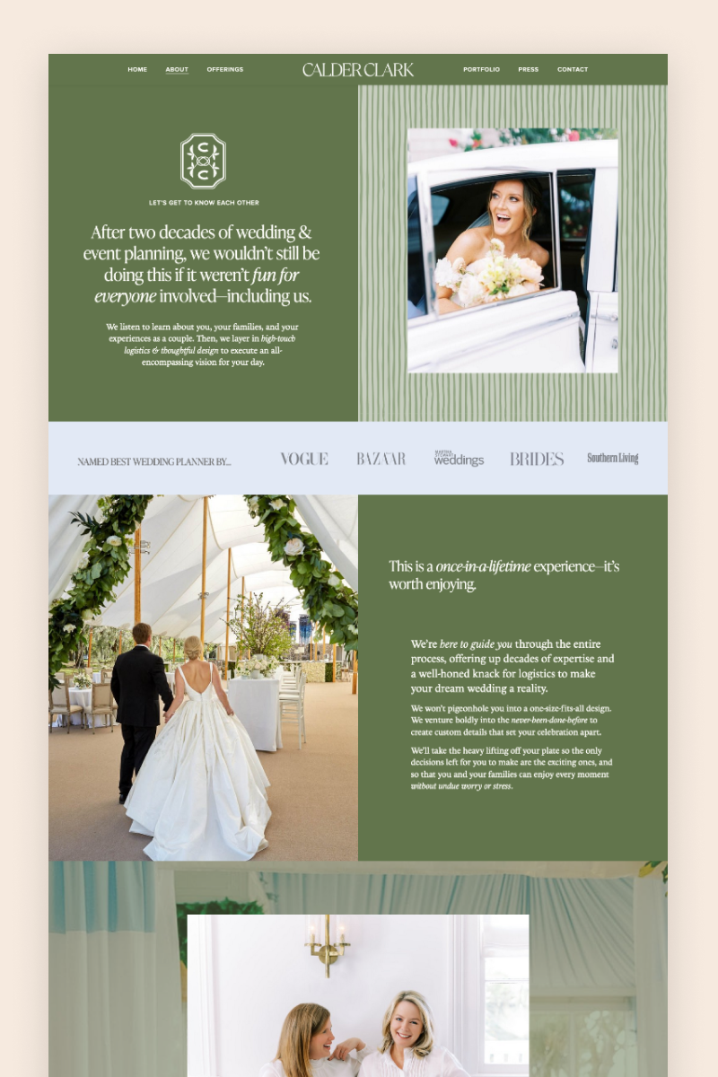

Calder Clark
Calder’s website is stunning. The browsing experience begins with a full-bleed, image-packed hero section that gently transitions into a gorgeous layout with moss-green details and reassuring copy in all the right places. The website uses a gallery grid to proudly display the organizations that have recognized the business as well as a blog to showcase an extensive portfolio.
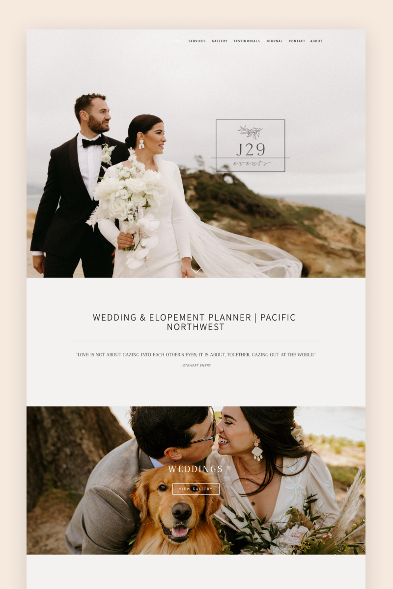
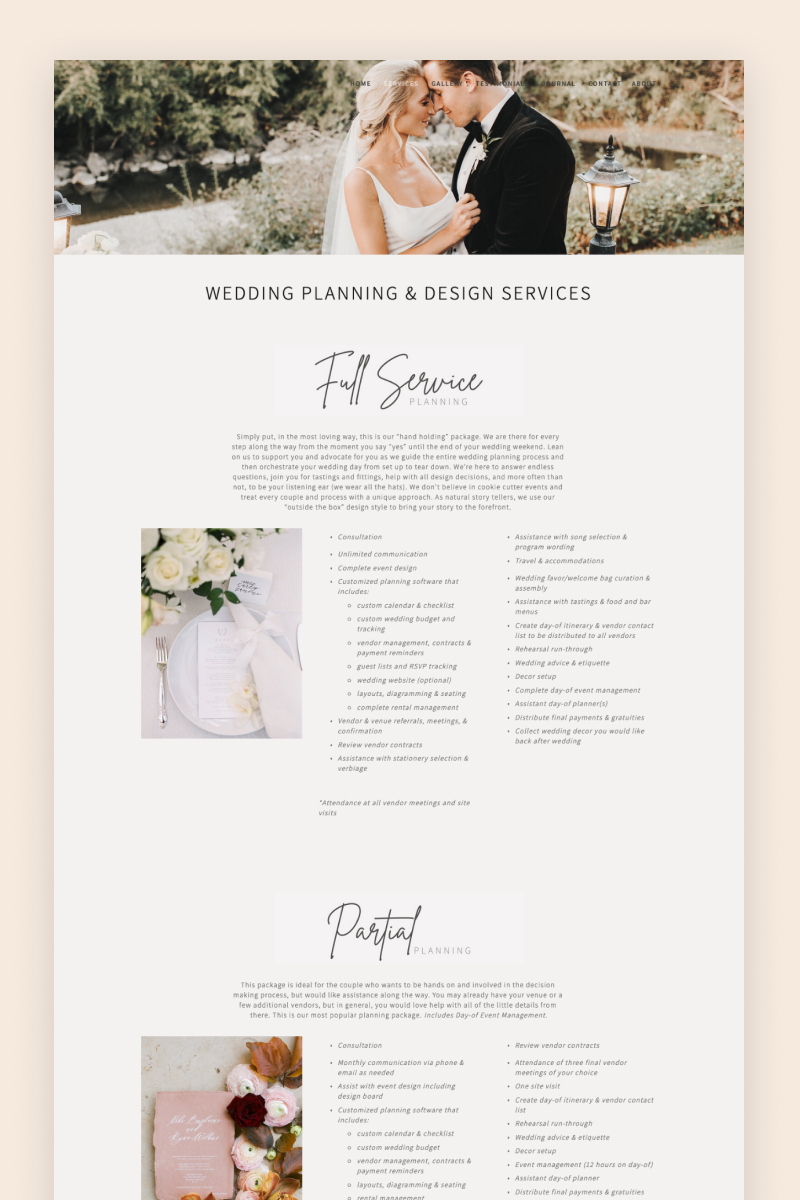
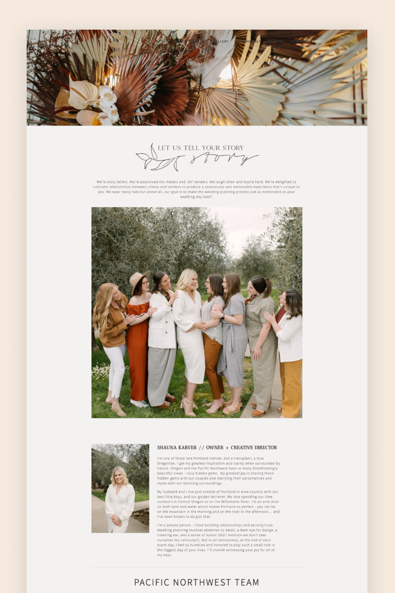
J29 Events
The J29 website feels spacious and flows seamlessly. It’s styled over a white background serving as the perfect setting for appealing images of elopements and weddings. It clearly conveys the J29 mission by alternating between animated, image-heavy sections and clean, more airy spaces with key details about the planning services the business provides. Reaching the end of the home page, a big but classy CTA invites visitors to check availability, nudging them toward conversion.
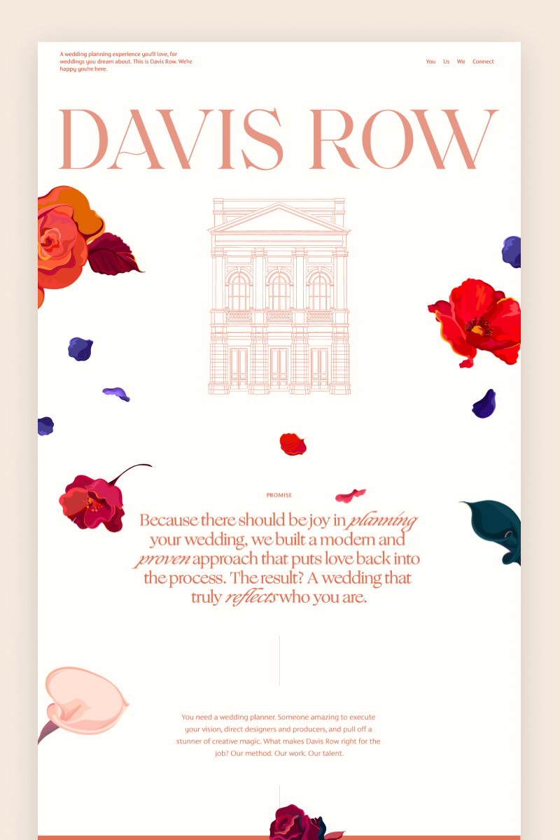
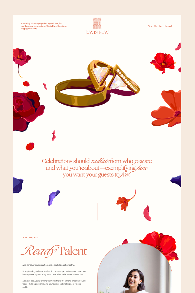
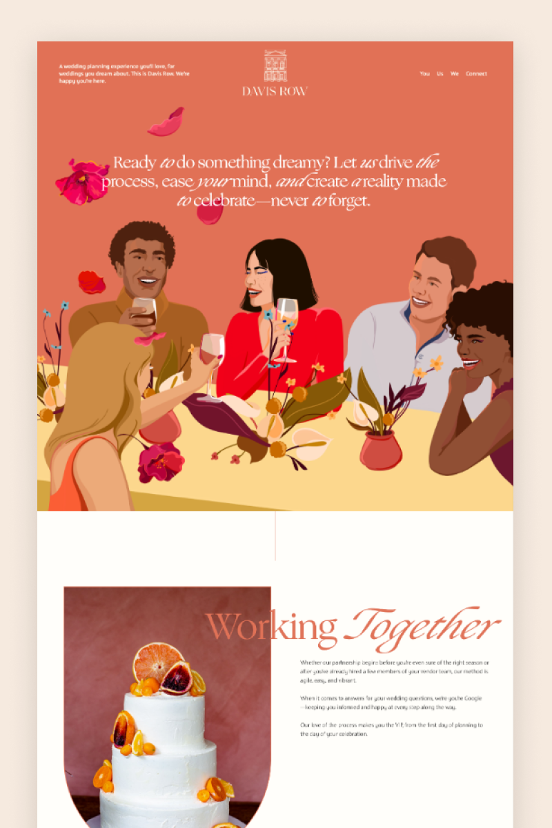
Davis Row
Davis Row’s website is a flowery dream. With botanic colorful illustrations everywhere, it seamlessly leads visitors through the peachy layout, making them want to keep on scrolling. Under a large “Our World” headline, the website shows inspiring wedding pictures followed by a “Featured in” section organized in a sliding image block. It also includes a summary block that links directly to their blog and a newsletter form in the footer.
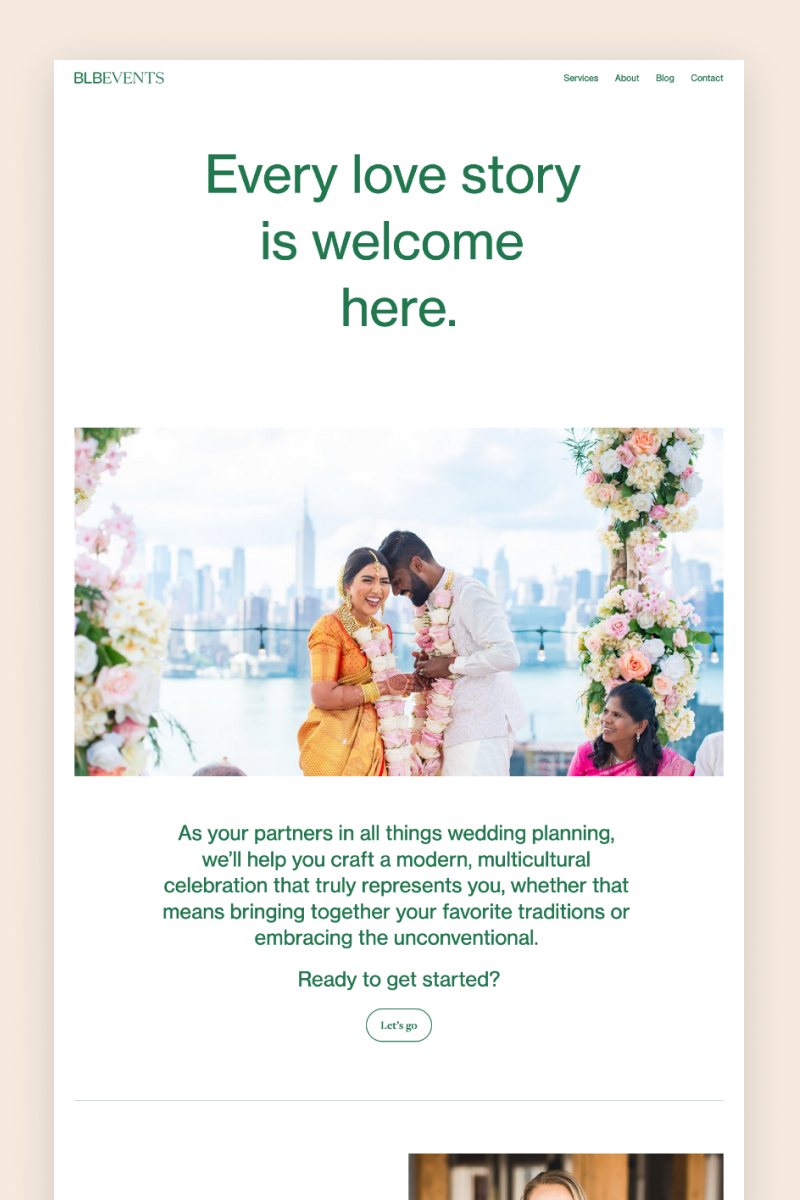
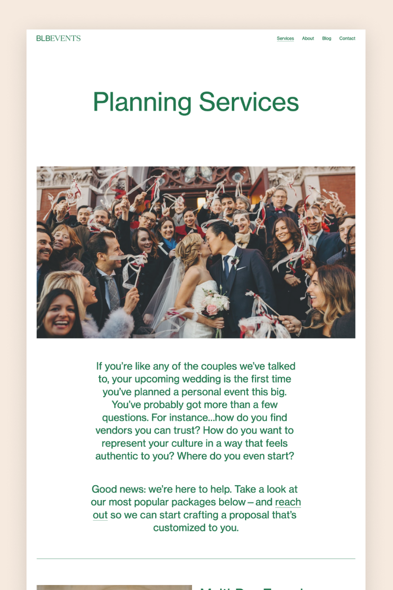
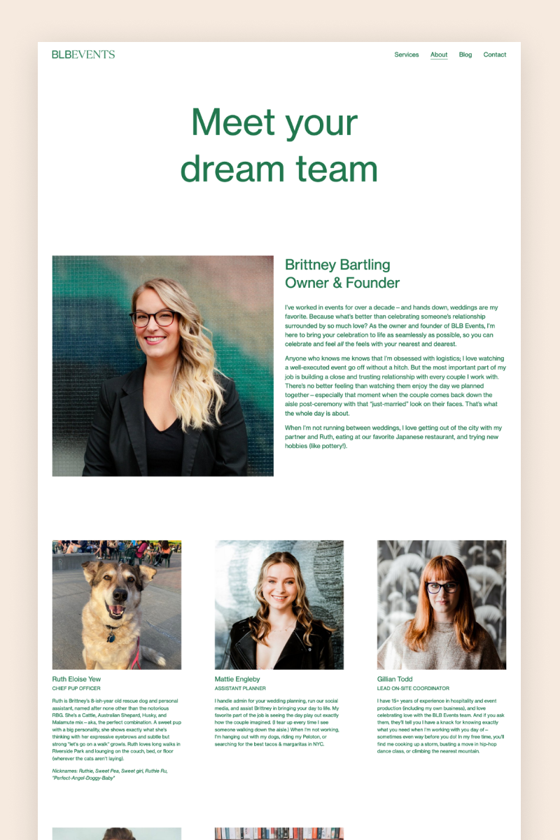
BLB Events
The BLB Events website is pleasantly simple and straightforward. They’ve done an awesome job of building something special with the simplest Squarespace tools. With green details over a white background, the website includes all the basics: a sliding image carousel, testimonials, a summary block section linking to different blog posts, and a newsletter form on the footer.
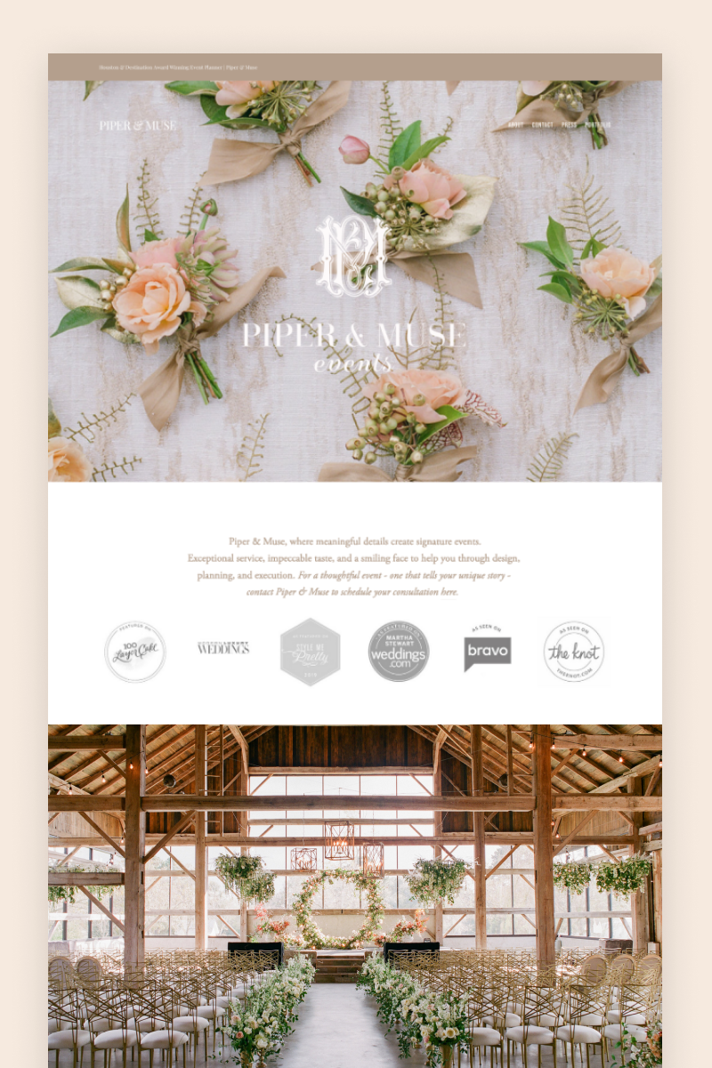
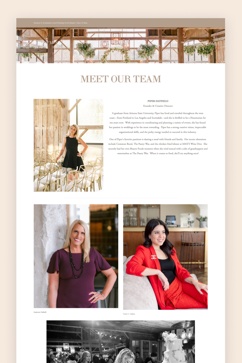

Piper & Muse
The Piper & Muse website features large imagery, delicate fonts, and a rosy color palette, all of which add to a visually appealing design. To showcase their work, the team at Piper & Muse harnessed Squarespace’s blog functionality and turned it into a comprehensive portfolio, packed with images and details of their previous projects.
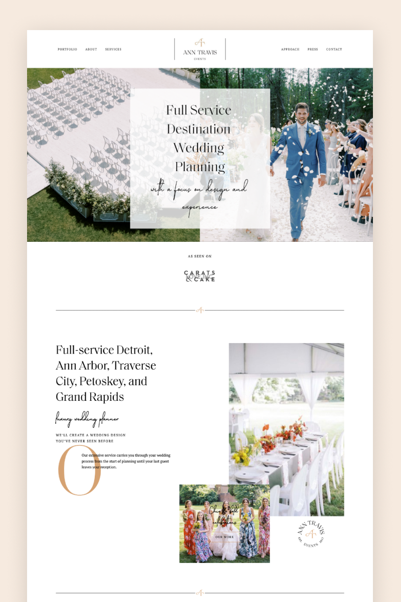


Ann Travis
Ann Travis’s website comes across as elegant and clean, boasting the overlapping text, classy fonts, and on-brand images. It features an animated gallery block that serves as an “As seen in” section and another one that links to the portfolio. Each past project has its own dedicated gallery page showing images of the event.


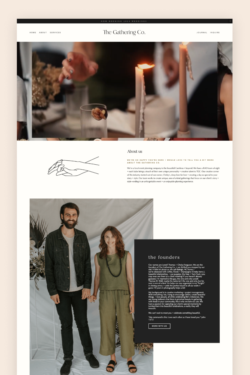
The Gathering Co.
Featuring subtle earthy tones and arch-shaped images, this website invites visitors in with a slideshow hero section that shows the team at work. They kept it short and sweet in terms of testimonials: the website includes a full-bleed section with the image of a lovely bride and a short comment on their services, accompanied by a CTA offering visitors to read more.
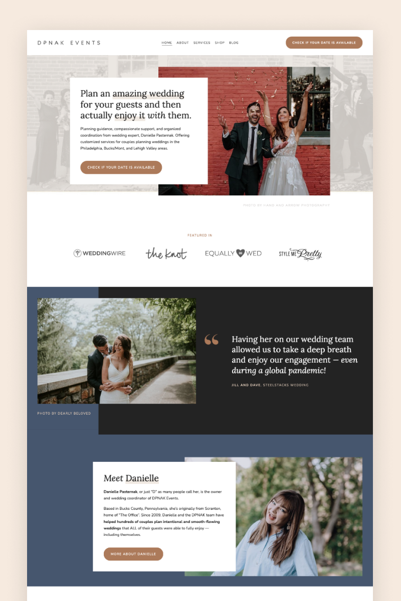
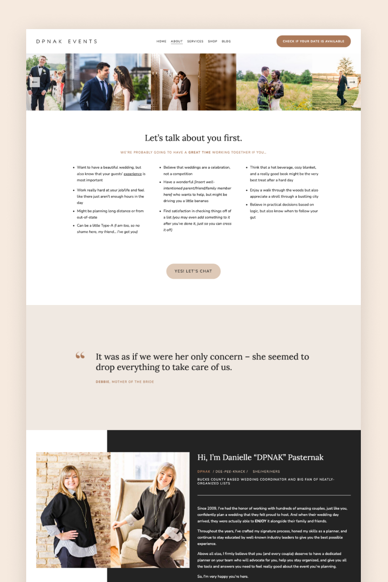
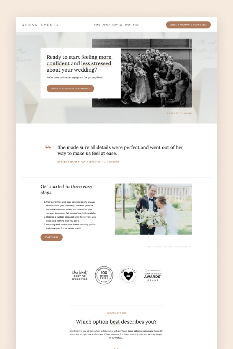
DPNAK Events
The DPNAK website is modern and well-structured. It combines tones of blue and gray with splashes of beige here and there, and it features overlapping elements that serve as a great background for wedding images. It also includes several quote blocks and a summary block to showcase the services provided, as well as a blog page with insights and inspiring case studies.
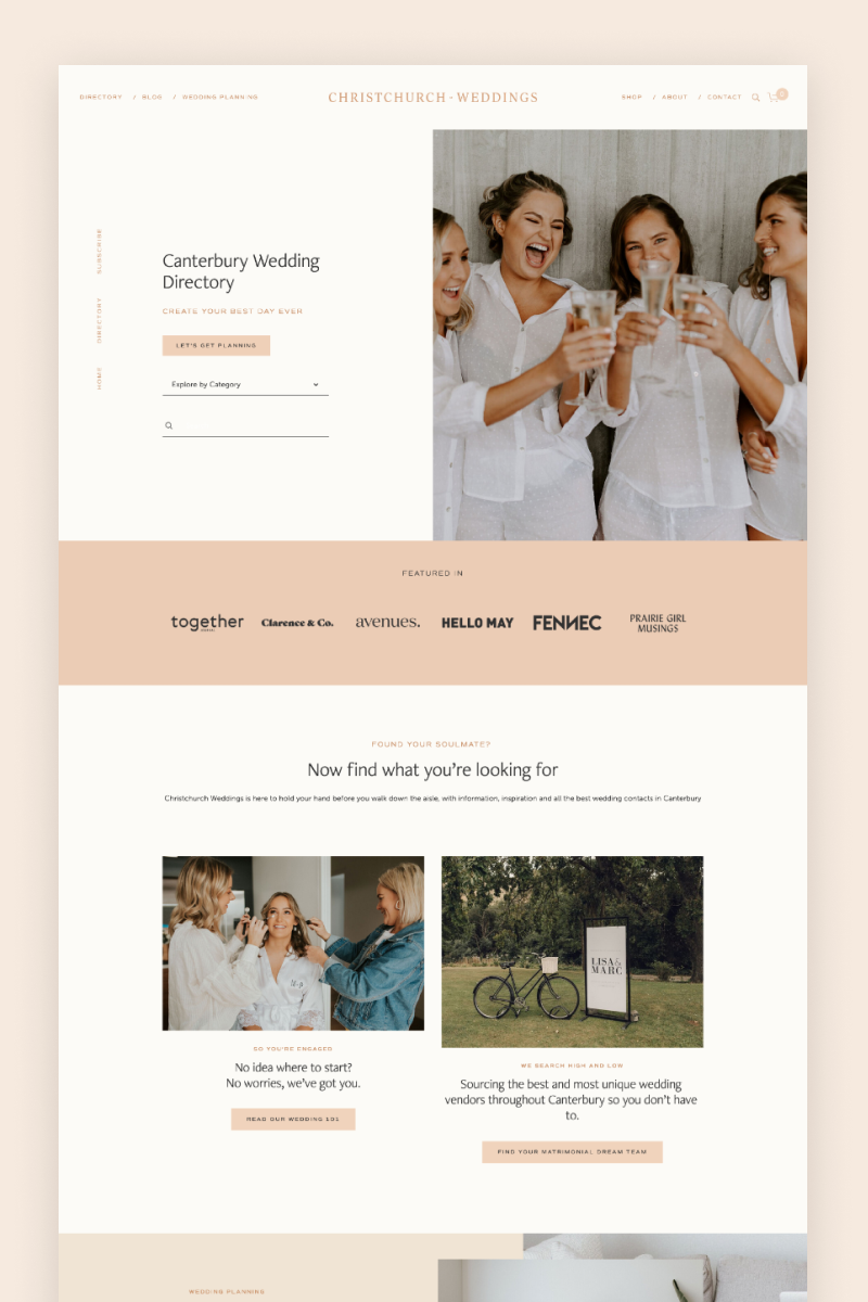
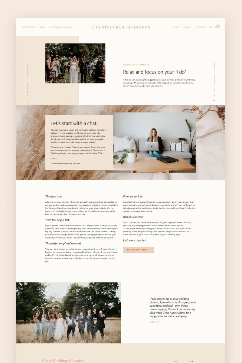
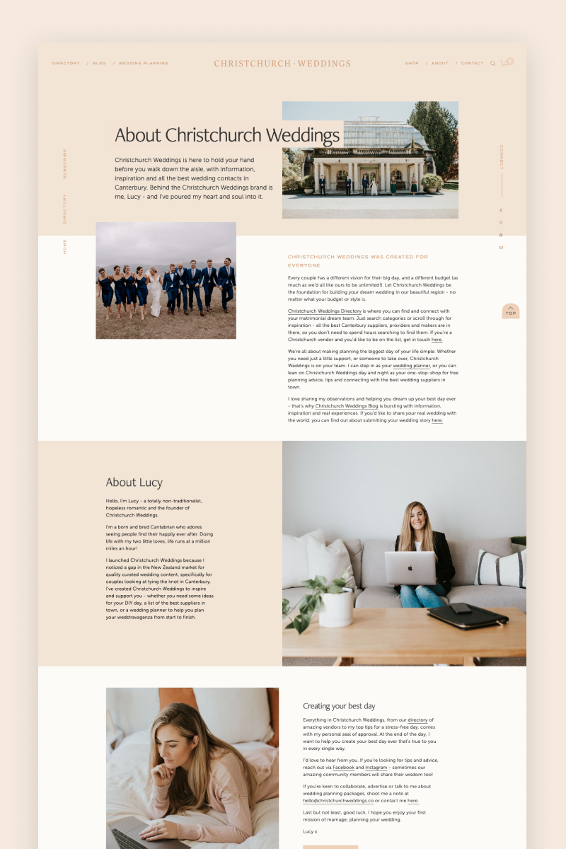
Christchurch Weddings
Feminine and elegant, the Christchurch Weddings website immediately invites visitors to jump into planning mode with a directory search section at the top. On the sides, it includes fixed navigation bars with social media links and links to pages that visitors might want to check out as they scroll down. The website also uses a slideshow gallery block to show some of the best projects by CW, and it features an Instagram gallery that blends naturally in the footer.

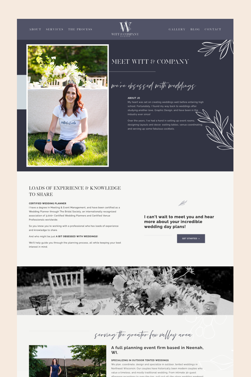
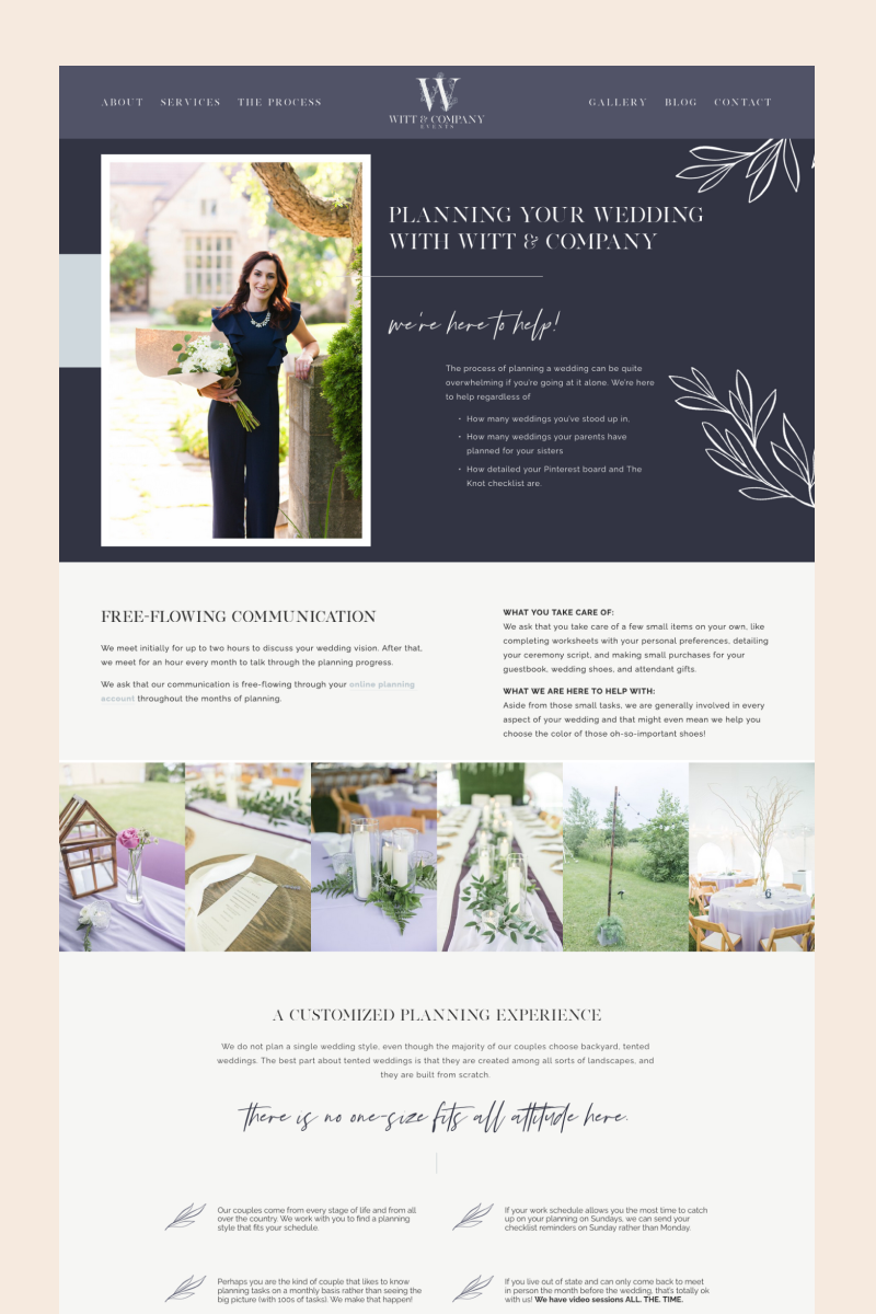
Witt & Company Events
The Witt & Company website features botanic illustrations and a handwritten font to create a romantic atmosphere. A step-by-step overview of the planning process organized in a summary block and a gallery of images from previous projects serve as the preamble for the blog section, which gives brides access to relevant info and valuable tips.

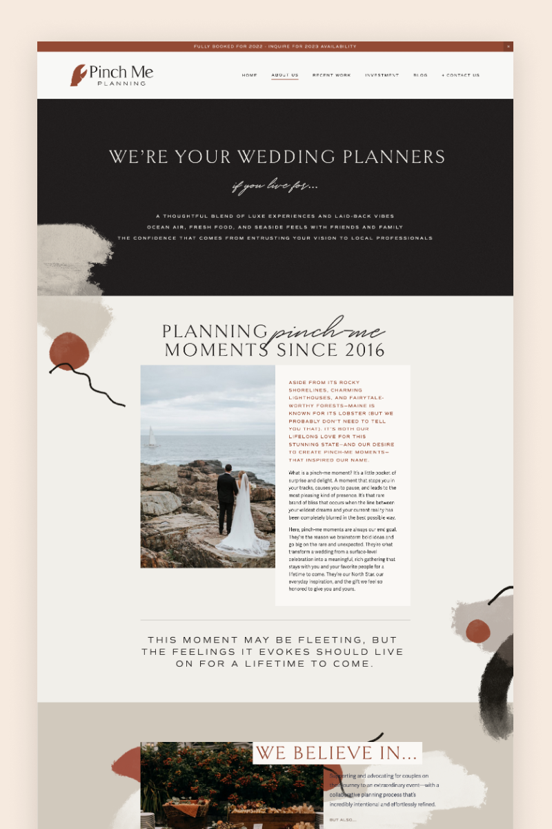
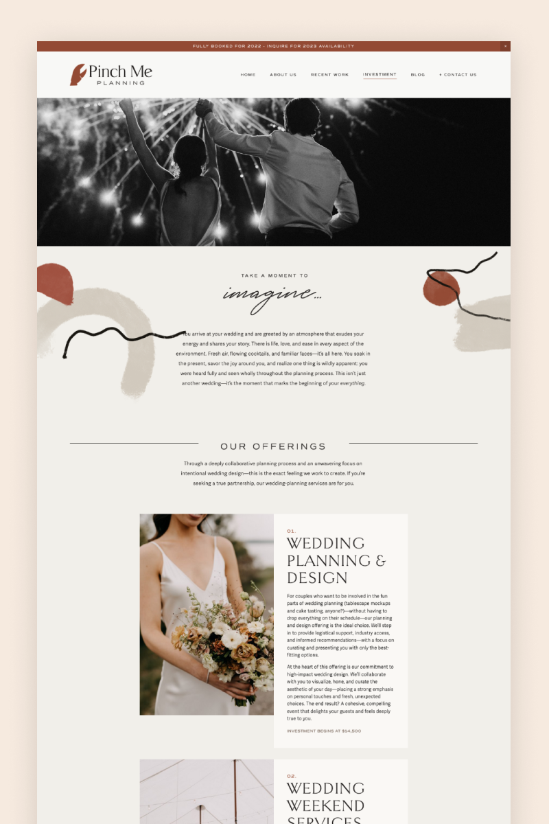
Pinch Me
The Pinch Me website brings together a nice terracotta palette, watercolor brush strokes, and a perfect font match. It has on-brand images, and CTAs that you just can’t miss, as well as an Instagram block on the footer for those who need more proof of their wedding planning expertise. At the top, Pinch Me features an announcement bar proudly telling visitors they are fully booked. They also have two blogs: one for portfolio, and another one filled with useful content to draw in the right audience to the website.
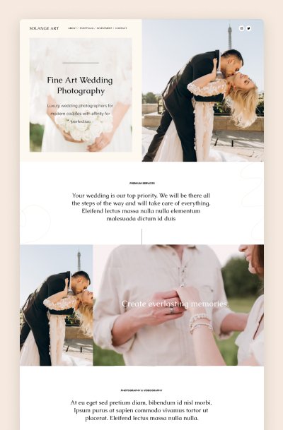
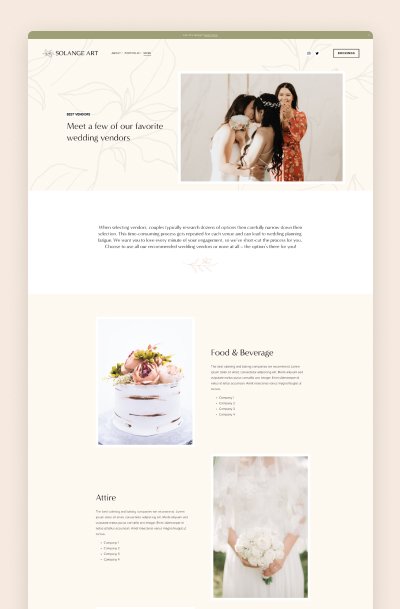
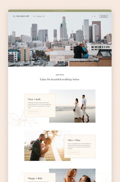
Solange - Squarespace 7.1 Template for Wedding and Family Photographers
Solange is a timeless and elegant design for wedding industry professionals - photographers & wedding planners. This premium Squarespace template offers high-end and polished design for industry leaders and trend-setters.
This template includes six unique high-converting layouts for Squarespace 7.1. Shop pages are easy to add & customize!
Solange features unique customizations of summary blocks, split sections, galleries, and image layouts. The package also includes source files in Figma that will let you customize the template’s graphics easily and for free. We include a complete walk-through on setting up your graphics. It is a clean and modern brand & Squarespace design for wedding industry professionals: wedding photographers, wedding planners, florists, etc