Nine Amazing Creative Businesses Using Our Premium Squarespace Templates
This Template Is Great, But Will My Website Look Great Too? Totally!
Premium Squarespace Templates are not only about pretty looks, they can power up your marketing efforts. Easy to use too: take a template, swap photos and copy for your own et voilà! Your website is ready to go.
We’ve been on a market for a while now, but the way our customers transform their websites with our templates never ceases to amaze us. Let us show you some of their results.
Marjolein Kok, the financial coach
Marjolein is a financial coach that helps young women take charge of their finances. She uses our template Lora, which is a sound choice for digital consultancies.
Marjolein makes a maximum use of split sections layout to present herself and her business. She changes Lora’s signature deep yellow to a softer paler tone and adds many bright and light-colored photographs that suit the overall palette of the website. The lemony colors feel fresh and energizing. She stylizes images of her blog and Instagram feed in the same colors and fonts as her website, which gives her business an overall neat, put together look.
We like the way she uses her photos very much. She doesn’t take stock photos, which gives her website a very intimate, personalized look. After visiting the website, it feels like you’ve met Marjolein in person, rather than digitally.
Briana Jenkins, the yoga teacher
Briana Jenkins is a certified Mental Health Peer Specialist and a 200-hour Trauma-informed Yoga Teacher. For her website she chooses our template Boho Social, and God, she makes the best out of it.
From the website's original color palette she decides to concentrate on deep yellow, taupe and white. She throws the green into the equation by adding photos of herself in lush greenery. Those photos really compliment the design and vice versa. As always, a photo session does the job. We advise you to take Briana’s example and treat yourself to a photo shoot. Your photos will be in the same style, with a thought-through concept and can be easily edited to look the same way. And did you notice the little illustrations around the website? Four angled stars and dashed circles look like magic effects.
Dan and Ish, the photographers
Juniper and Fog is a website of two Seattle-based photographers, Dan and Ish. They specialize in everything tagged “love”: stories, elopements, engagements, weddings. For their website they choose our template Boho Social (God, it is popular this year!)
The first association that comes to mind after hearing the business name Juniper and Fog is of an autumn forest in good weather and a hiking trip. You get the idea. Well, this is how they made their website look. The template’s palette embraces new colors like deep brown, pink beige and all things pastel. This goes along perfectly with film-looking photos. The whole experience of the website makes you turn on Ben Howard’s “Old Pine” and go hiking. Juniper and Fog took some of our graphic elements and added a lot of their own. Look at the sweet marriage in the result.
Noël Cosgrove, the boudoir photographer
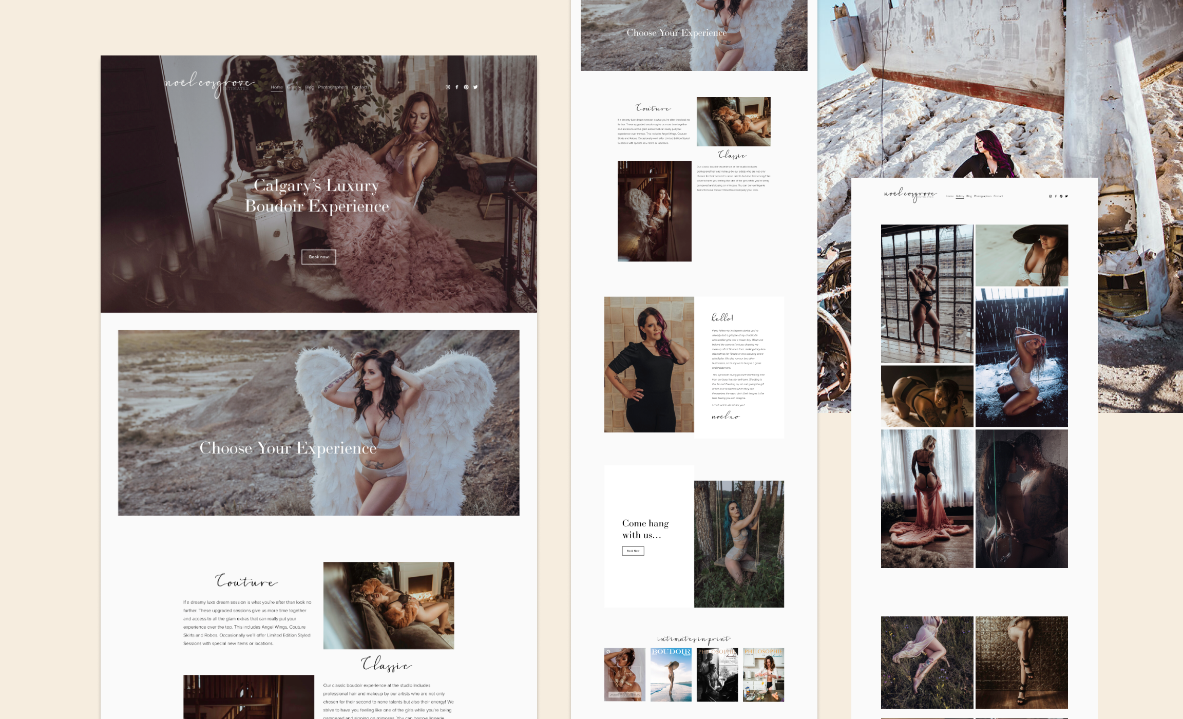
Noël Cosgrove is a Canadian boudoir photographer, who is all about giving women an opportunity for self-love. For her website, she chooses our template Rosee.
From the first sight, the website looks a lot different from the original template. That is because Noël switches to a black and white color scheme to underline the luxury feeling of her services. She also leverages template’s full-bleed images and adds her own flair by using a decorative font, the same one she uses in her logo.
Mystrie, the calligrapher
Mystrie is an Australian calligrapher who shares the beauty of calligraphy with modern romantics to celebrate love and spread meaningful messages. Mystrie bought a template Rosee from us and does a fine job of making it fit her needs as a professional.
The website focuses on sophisticated typography. Mystrie is a lettering artist and the website mirrors her occupation perfectly. Look at the way Mystrie uses textured backgrounds to create airy, weightless and feminine layouts. Texture on photographs plays a big role in creating the atmosphere of the calligraphy classroom too – you can see paper, wood, ink in the pictures. Somehow those textures almost teleport you right into her class.
Jolene Barker, the photographer
Jolene Barker is a lifestyle and wedding photographer based in Canada. Her website is a Hustle&Heart template put to work.
Jolene makes a good use of overlay images and collages, which are truly the heart of this template. Her website is full of attention-grabbing pictures on every page, which gives her the opportunity to showcase her work to potential customers.
Muted but deep color palette gives the website a high-end professional look. White and light pink with a beige tint remind us of the solemnity of a wedding ceremony.
Natasha Sonia Alford, the journalist
Natasha Sonia Alford is an award-winning journalist, digital host, and millennial media executive. For her website she hired Creative Summer Company who chose to work with our template Boho Social.
This is a website of a young and ambitious professional, who firmly stands on her own two feet. And her website depicts this perfectly. To the yellow of the website’s palette designer adds the deep forest green color on the homepage leaving lots of white and beige space to breeze. Adding many photos of yourself to the website is always a great idea, especially if a website functions as your business card. Natasha uses her website to show her portfolio, and the website gives her lots of opportunities to do just that.
Fashion and Beauty, the branding firm
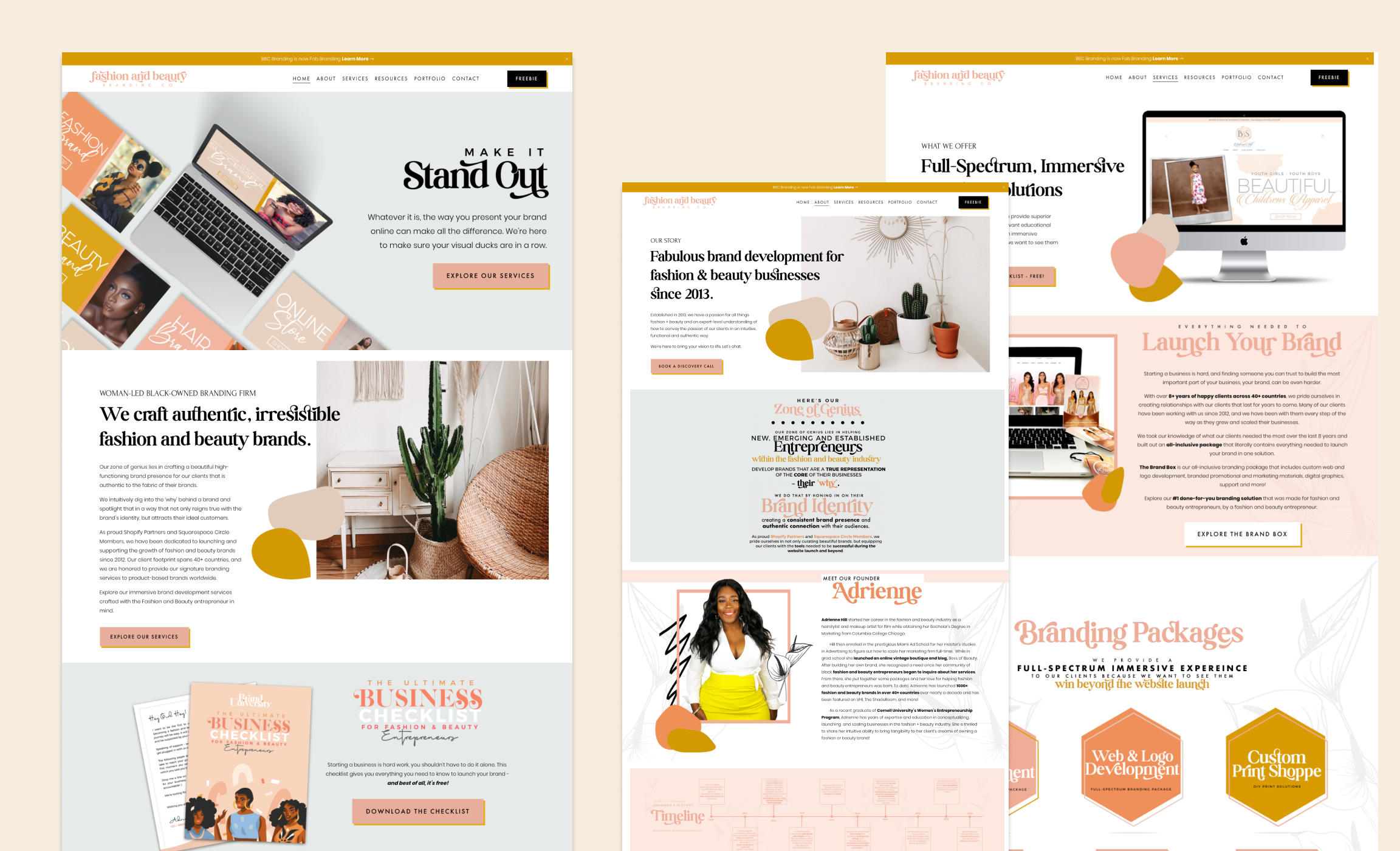
Fashion and Beauty is a woman-led black-owned branding firm from the US. For their website their choice fell on our template Boho Social.
When customizing the website, they poured in even more groovy colors, which were template’s signature feature. Lots of peach and gold look friendly, the website smiles back at you. Look at how the curvaceous decorative font in the headlines and in the logo create the funky vibes. The things are also spiced up with beautiful sketches of calla lilies. Look at the CEO of the company Adrienne, she is vibing on this website.
Platform, the civic leadership platform
Platform is a Canadian civic leadership platform for young Black, Indigenous, and racialized women & gender-diverse people. Our template Lora is the template of their choice for the website.
Template Lora usually finds its devotees among young and independent women. This is exactly the case. Platform made good use of template’s split sections. Bold eye-popping colors make the website look very energetic and modern. Also, don’t you just love illustrated portraits of the organization’s members? They looks so much more interesting than regular photo portraits.
Got interested in Premium Squarespace templates? Browse through our shop. And learn how to customize a premium Squarespace template. Got questions? Want to participate in our customer spotlight? Send us an email or DM us on Instagram!


