Feminine and Refined Web Design for Your Inspiration in 2025
Peek behind the scenes of Applet Studio creative process
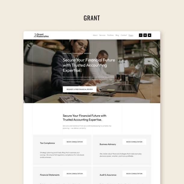
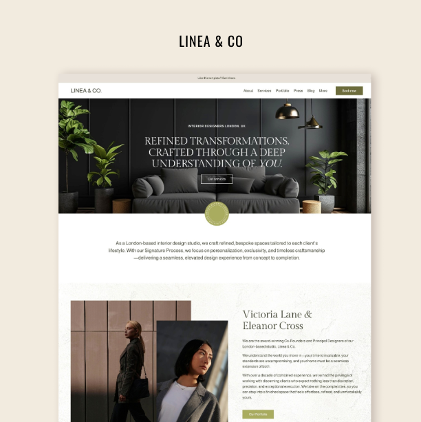
As a web design agency, we produce design concepts all the time. We provide clients with several design options to choose from on every project. Due to their large quantity, the majority of the concepts never see the light of day because they are never published. Today we are sharing some of them for your inspiration.
A website concept is the first two or three screens of the homepage, and they usually set the mood for the whole website. Together with a client, we search for the idea that would work for them while going through a bunch of different designs. These are not something created out of thin air, as by the time we create concepts clients have submitted the majority of materials from their side e.g. – photos, copy, and mood board. I have a whole module in which I explain my entire concept design creation process and communication with clients at this stage in my Client Work Remastered course. Check it out if you are interested, I spill all the beans there.
It’s important to note that, website concepts are not full-blown website prototypes but all of them feature: a key visual, color palette, font pair, buttons, menu & navigation, block of text, decorations such as graphic elements, lines, shapes, etc.
Although we call all the designs featured in this blog post feminine, you will find that they all differ. There is no single concept of femininity, thus enjoy diversity.
If you want to see concepts and mood boards in more detail, we put them on this Pinterest board for you.
Boho Squarespace Website for a Wedding Photographer
Tessa Lange is an Arizona-based natural light wedding photographer who shot over 200 weddings and has a lot of experience in the field. In this 2022 project, we created a new brand identity for Tessa to reflect her warm and cheerful personality and highlight the quality of her work.
In these examples, concepts are not that much different from the end product, because Tessa asked us to combine three concepts together. That is why you can see the elements of all the concepts in the final work.
The designs are boho-inspired and include a warm color palette consisting of mustard yellow, peach pink, light pink, and warm brown.
You can also see that we explore different logo variations and decorative elements.
Here is the final product in the portfolio blog post. Need a boho-styled Squarespace template – check out Boho Social in our shop.
Classy Squarespace Website for an Attorney
Here you can see how we explore different possible looks for the homepage of a law property firm. The Carter Firm’s website is one of our custom projects of late 2022. Isaro Carter, the firm's founder, is the attorney for creatives and business owners. Based in New York City, her practice covers the intersection of intellectual property law and entertainment law.
The final website is in the same mood as this bunch of concepts. With cappuccino, beige, and ink-blue colors we aimed for a high-end, classic palette. You will find black and white photos skillfully mixed with color ones to bring out the "big city life" style. We also put some of the photographs in sleek black frames to play up the atmosphere.
In the concepts, we include different asymmetrical split sections, variations of the color palette, collages, and underlines.
Want your business to have a high-end and bossy look? Check out the Lora Squarespace Template in our shop.
Try Squarespace for free – and save 10% when you purchase a subscription with code APPLET10
Girlie Squarespace Website for a Personal Assistant
We have finished and launched this project – see the portfolio case here – but we also wanted to show you the concepts we didn’t use.
Eliane-Fleur Rijk is a freelance Executive Assistant from the Netherlands. She works as a personal assistant to the executives herself and facilitates the recruitment of assistants and networking in the niche. Elaine wanted to have a feminine and vibrant website. She preferred white space and a color palette that was bright but soft at the same time.
Working with her moodboard we created several fun concepts. For a soft and girlie look check out the Social Motion Squarespace Template in our shop.
Minimalist Squarespace Website for a Life Coach
The Alette Stache Life Coaching website design is one of the cases in our 2024 portfolio.
The first concepts had deeper and warmer colors, as opposed to the launched website, that looks less saturated. In the end, we went with a soothing color palette of blues, greys, and whites, ditching the beige.
We experimented with different decorative elements like soft dividers and doodles. These concepts give an inviting and welcoming vibe.
Our clients attain a calming and soothing atmosphere with the Good Vibes Squarespace Template.
Luxurious Website for Instagram Fashion Influencer
Formerly a nurse and now a fashion influencer Latricia Toussaint came to us when she needed to build her first business website. These concepts look close to what we launched in the end. We experimented a lot while combining gold accents, handwritten text elements and rich photography. Aura by le Toussaint’s website is very contrasting – it has gold, dark and light sections alternating to set the right vibe and help direct attention.
If you need a luxurious Squarespace Template for your website, take a look at the Arch&Gold.
Bold Squarespace Website for a Business Consultant
In these concepts for Business Consultant Jeanne Grabowski, we put high stakes on color. The cream beige background together with bold headline font gives them a business newspaper vibe. The color accents are meant to make it the opposite of boring. The result is a vivid and boisterous homepage that won’t be published since we went with a different concept.
The final website is greyish beige with muted golden tones for a luxurious feel. Check out the portfolio case.
Futuristic Squarespace Website for Strategists
When creating concepts for this website we tried to include some futuristic and science-related decorative elements, thus you get to see holographics, gradients, and geometrical shapes. Other than that, the design is very basic and minimalist to balance out the overwhelming decoration. Futurism should exuberate functionality and we couldn’t risk oversaturting the design.


