Professional and Compassionate Squarespace Website for a Therapist
Combining serene aesthetics with user-friendly design principles
This past summer, we had a blast teaming up with the lovely Dallas-based therapist, Michelle Turner, to breathe new life into "The Therapist Within" website.
We updated Michelle’s brand and rebuilt her Squarespace website which she had for over 8 years.
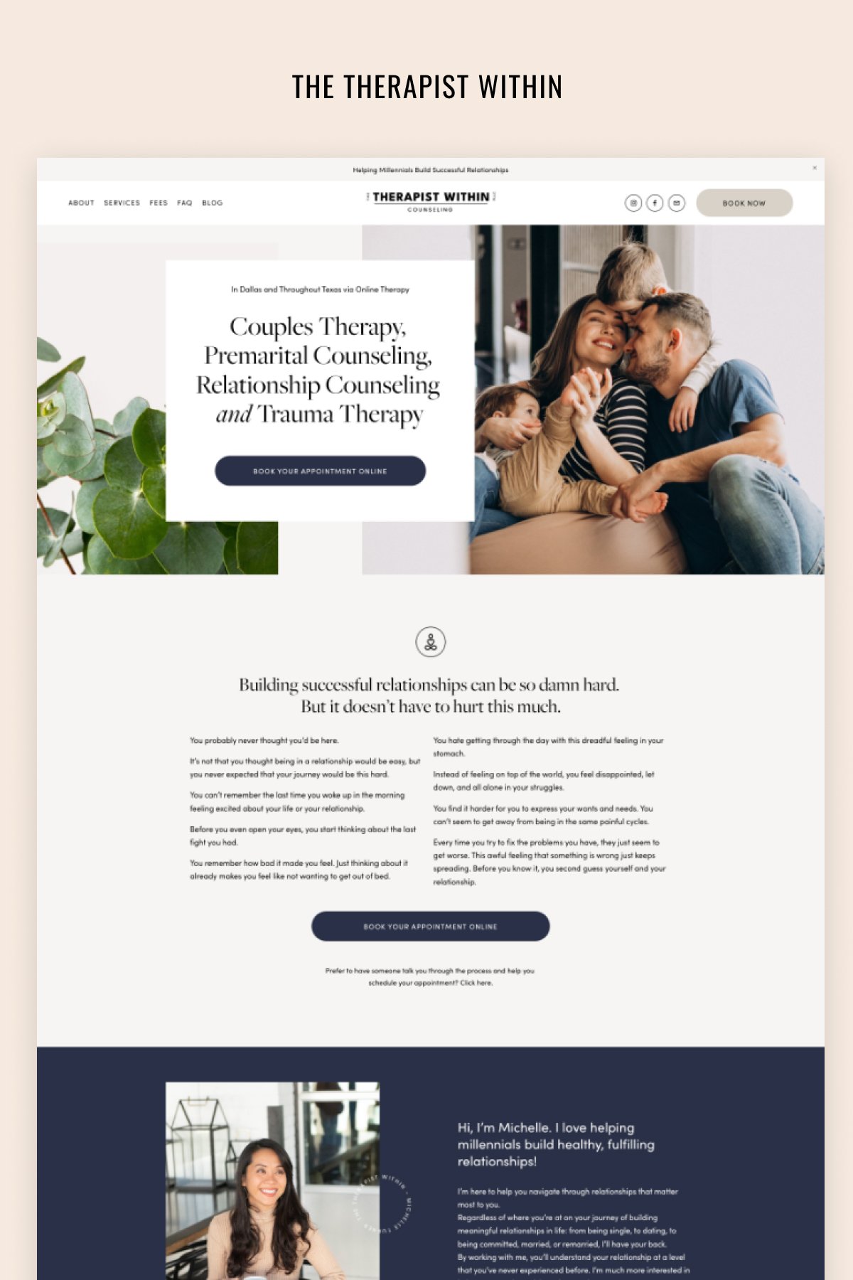
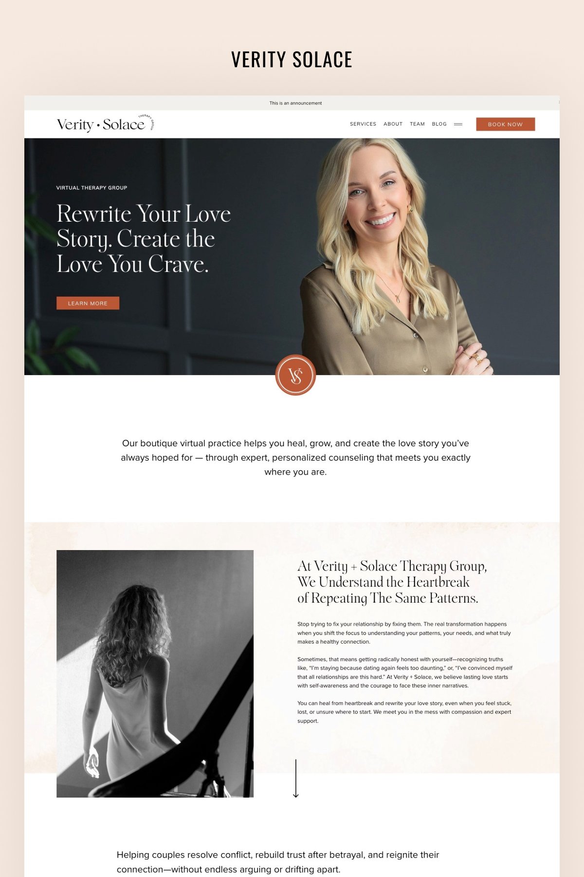
The new Therapist Within website showcases a modern, clean, and professional design, catering to therapy and counseling services.
We used a harmonious combination of muted blues and grays, suggesting trustworthiness and calm. These colors are thoughtfully accented with black typography, ensuring readability and elegance. The use of varied font sizes and weights effectively draws attention to important information while maintaining an organized and cohesive look throughout.
All the images chosen resonate with the theme of relationships, connection, and well-being. They evoke emotions and create a sense of trust and reliability. The visuals are intimate and genuine, with a focus on human connection. Whether it's a couple sharing a moment or hands held together in support, they encapsulate the essence of therapy – understanding, connection, and healing.The choice of using a simple plant photograph further enhances the brand's commitment to growth, healing, and organic development.
Information is neatly organized into sections. With a mix of text and imagery, the content provides a balance between emotional appeal and important information. The use of white space is particularly effective, making the site feel uncluttered and easy to navigate.
"The Therapist Within" website combines serene aesthetics with user-friendly design principles. Every element, from the choice of images to the positioning of call-to-action buttons, has been crafted to resonate with the target audience, ensuring they feel seen, heard, and understood even before the first therapy session begins.
Scroll through the home page:


