Must-Haves Checklist for Photographer Websites
Things to put on your photography website to make it highly convertible
Every photographer would like a website that brings leads and books clients without any hassle. You’d like to have a reliable stream of inquiries and clients, and your working hours booked just like you want them to be booked – no more, no less. Ideally, you would also like to receive inquiries from clients that are a good match for your business, not random people, who want things you don’t work with.
The good news is that a carefully designed website can do all of these things for you – it could be your business card, your booking system, your marketing funnel, your big ad on the internet, and even your “colander” to filter out clients.
To make your website work for you, you can add certain information and features to it, and we’ve gathered them all in this blog post, so read on!
1. Key Information: Location & Niche
Location is a critical aspect of the photography business. Your potential clients need to know where you work to decide whether they can hire you. So, you need to make your whereabouts clear from the start.
Mention your city, state, or region in your hero section statement or in a short introductory paragraph right below it. You can integrate the location seamlessly by saying that you are “Portland-based” or that you are “serving Minnesota & Arizona”.
Now, if you’re a photographer who’s able and willing to travel, don’t forget to mention it! Also, explain a little how your traveling influences them. Would the client need to pay for travel and accommodation separately? Or is that included in the package? How many days in advance would you be arriving at the location? Be sure to include all the relevant details to make your potential customer's life easier.
Another essential element that every photographer needs to mention on their website is a niche. It wouldn’t make sense for a soon-to-be bride to hire a brand photographer with zero experience shooting weddings.
Make sure you clearly state your niche as visibly as possible on your website so you don’t waste your visitors’ time.
2. Testimonials & Portfolio
Social proof is everything. So, don’t forget to ask your clients for feedback and display it proudly in a dedicated section on your website. This will encourage potential customers to work with you and reassure them that you know what you’re doing.
And if you want to get much more specific, add a portfolio to your website!
The portfolio provides prospects with deeper insight into your work dynamic through the experience and lens of previous projects. A well-rounded portfolio example should include some information about the customer and their requests, a sneak peek into the photo shoot, the final result, and a statement from the client talking about why they liked working with you. It can fit nicely into a blog post.
Testimonials and portfolio examples are powerful conversion tools, so you should leverage them to the max. Don’t be afraid to highlight them and include them in several sections of your website.
3. Showcase Your Work
This sounds like a no-brainer, but when it comes to photography websites, choosing image-heavy website designs to showcase your work is vital. If you have a Squarespace website, use templates designed for photographers, you can find some examples in this blog post.
Apart from Gallery and Portfolio pages, make all the pages on your website work for you. Add photos around your website – there are many tools available: gallery blocks, different types of image blocks, collages, section backgrounds.
Take full advantage of every single section of your website to show off. The hero section could welcome visitors with some of your pics. And, as they scroll down, they should be able to see your work everywhere.
This way, the browsing experience will feel a lot more natural and seamless, and potential customers will be able to appreciate your work even if they decide not to visit the portfolio page.
4. About Page
Pretty much every website needs an About page. It’s the place to tell your potential customers all they need to know about you – your education, experience, niche, style, aesthetics, and mission of your business. You may include everything that you find relevant and what makes your business tick.
But above all, you must use this page to build trust and establish a connection with your potential customer. You can show empathy and build trust so that people feel comfortable being photographed by you.
Include little hints and facts that show that in addition to being a great professional, you are a human too. This might help dissipate the intimidation and self-consciousness of being in front of the camera.
5. Contact Information and Form
Being service-based photographers better make it easy for potential customers to contact them.
You can achieve this by strategically displaying your contact information in the right places on your website. Your potential customers would expect it to be in the footer and on your Contact page. You can add a contact form that prospects can quickly fill out with their inquiries. This way you will always be able to build your email list on the way.
It’s also crucial for photographers to make sure that the links to their social media are accessible and easy to find on their websites, especially Instagram, Pinterest, and other image-oriented or visual platforms.
Ultimately, it’s all about making your customers’ lives easier, so make sure it’s not hard to find you.
6. Packages & Pricing
Displaying your packages and pricing on your website serves a two-fold purpose.
Firstly, your customers don’t need to make an extra effort to understand how much your services cost. Secondly, it’s an excellent way for you to filter potential customers who might not be the right fit for you. If they know you don’t match price-wise, they won’t even make an inquiry saving both their and your time. Only those with a genuine interest in working with you will reach out, streamlining the entire process.
If you offer custom packages, mention that too. Customers looking for more personalized options will already have a general idea of your rates when they contact you for a tailored bundle of services, so they won’t be too surprised by your quote.
To avoid misunderstandings, you must be thorough and precise about the services included in each package. How many hours does the session last? How many pictures will you be sending your customer? Will they be edited? Will they be able to pick the final shots? What payment options do you offer? Do they have to pay you upfront? Are there any extra costs, like renting a studio? Try to leave no room for doubt.
7. Cool Bonuses
Now that we’ve covered the must-haves, here are some other cool ideas that can help you polish up your photography website and put your business a step forward:
A backstage sneak peek
Why not engage your visitors by taking them backstage and showing them the magic of a photo shoot? A well-produced short video of a session you particularly enjoyed can be a great tool to build hype and connect with potential customers on a different, more personal level.
They will be able to see you in action, gain a deeper understanding of your process, and witness the real impact you had on your customers.
An overview of your entire work process
Providing customers with as much information as possible from the get-go will put their minds at ease and free you up from tedious and repetitive tasks.
One cool way to do that is to offer them comprehensive details about your work dynamics. What’s the onboarding process like? What comes after that? How do sessions normally go? And what happens after the session? Walk them through the process step by step so they know what’s coming next and what to expect. You can have a separate page consecrated to this or a long blog post.
An FAQ section
Along the same lines, you should also include an FAQ section to address your customers’ most pressing and common concerns before they contact you.
You can pinpoint the most frequent questions customers ask you during the discovery phase and add them to your website. This will be quite beneficial for both your visitors and you and free up your schedule for other activities.
The most common form to display an FAQ section is an accordion block. Check out how we like to style them in Squarespace.
A lead magnet
A lead magnet is a freebie you give your visitors in exchange for their emails. Growing your email list will allow you to market your services via email marketing and ads in a closer, more direct way.
Why not offer your visitors a quick guide showing the best ways to pose in wedding pictures? Or maybe a short ebook on how to DIY their professional portraits? You can even offer them a discount or free extra images for their first session with you!
Looking for the best templates for Squarespace photography websites?
At Applet Studio, we have several Squarespace templates designed with the photographers’ needs in mind. There’s one matching every taste!
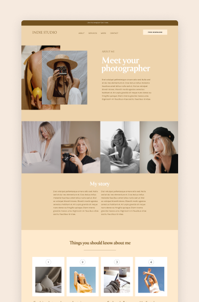
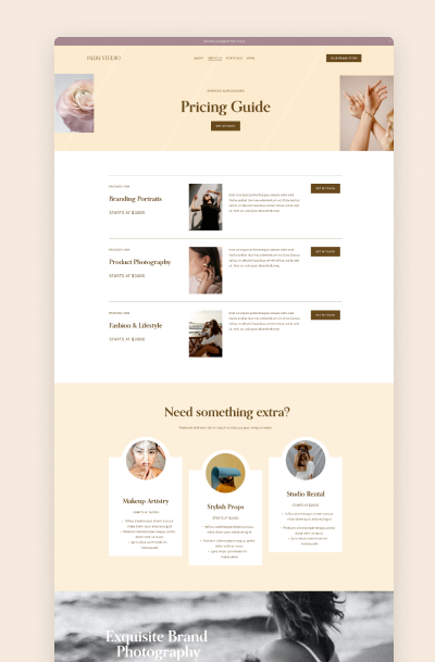
For instance, our Indie Studio template is perfect for brand photographers. With muted colors, golden tones, and geometric accents, this design can help you create a refined, luxurious, and image-heavy website to showcase your talent and drive customers in.
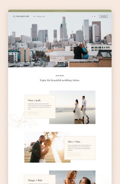
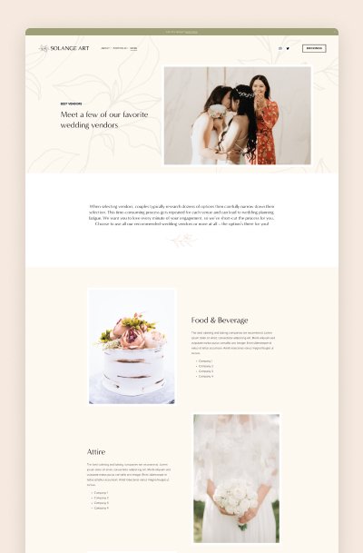
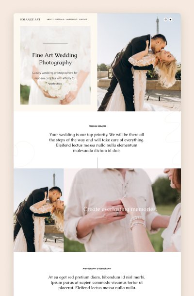
Solange Art, on the other hand, is a pre-made solution for wedding photographers. It is a minimal and elegant Squarespace template that has a high-end, polished design for industry leaders and trend-setters.
We can also design a custom Squarespace website fully tailored to your needs and preferences. For example, check out this boho-inspired website we created for Tessa Lange, an Arizona-based natural light wedding and brand photographer.
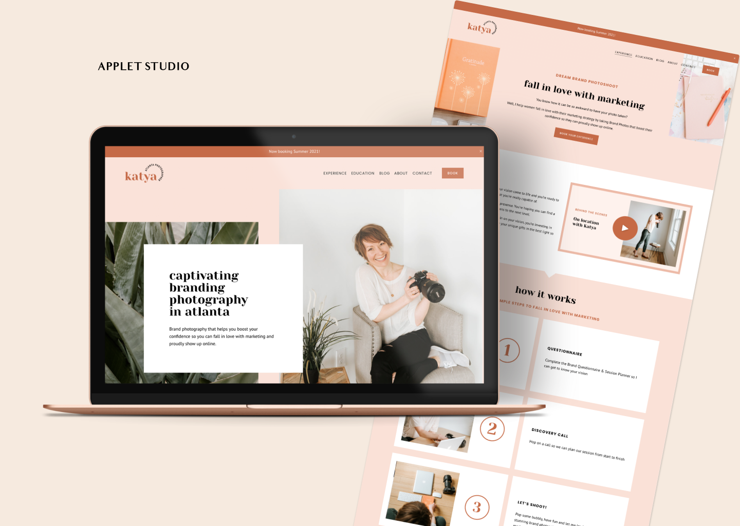
You can check out a Squarespace website we designed for an Atlanta-based photographer and brand strategist Katya Vilchyk. The result is a peach and feminine website that shows Katya’s vibe – warm, friendly, and easy-going.


