Fix Centered Menu On Squarespace
How to prevent centered menu navigation on Squarespace from jumping to the second row
When it comes to designing a user-friendly website, having clean and intuitive navigation is paramount. That's why it's important to keep the number of items in your navigation menu to a minimum.
However, if you're using Squarespace, you may have encountered a common problem with their centered menu navigation. It can be frustrating when your menu items don't fit into one line, resulting in a clunky and awkward design. But fear not! There's a simple solution to this issue. By implementing a little CSS magic, you can adjust the size of your header menu and ensure that all your menu items fit seamlessly into one line. Say goodbye to the hassle of jumbled navigation and embrace a sleek and polished website design. Let me show you how it's done!
Try Squarespace for free – and save 10% when you purchase a subscription with code APPLET10

Log in to your Squarespace account and navigate to the website you want to edit.
If you have multiple websites, select the one you want to edit from the "Website Manager" page.
Click on the "Design" tab in the left-hand menu.
This will take you to the design settings for your website.
Click on "Custom CSS" to access the custom CSS editor.
This will open up a text editor where you can add your own CSS code to customize your website.
Copy and paste the provided CSS code into the editor. By adjusting the width and flex properties of the header title, navigation menu, and additional actions, the CSS code helps create a balanced and visually appealing centered menu that fits into one line, resolving the problem of a clunky design caused by menu items jumping into the second row.
Make sure to copy the entire code block and paste it into the editor.
Click "Save" to apply the changes to your website.
Squarespace will automatically save your changes and apply them to your website.
Verify that the menu now displays properly by previewing your website and testing the menu on different screen sizes.
To preview your website, click the "Preview" button in the top-right corner of the screen.
Here is your snippet of code. You need to copy and paste it in the text window in the Design > Custom CSS.
// Header menu size adjustment
.header-layout-nav-center {
  .header-display-desktop {

    @media screen and (min-width: 768px) {
      .header-title {
        width: 20%;
        flex: 1 1 20%;
      }

      .header-nav {
        width: 60%;
        flex: 1 1 60%;
      }

      .header-actions {
        &.header-actions--right {
          width: 20%;
        }
      }
    }
  }
}
That's it! Your menu should now display properly and prevent menu items from jumping into the second row. If you need to make further adjustments, you can edit the CSS code in the custom CSS editor and click "Save" to apply the changes.
Creative Workshop Series for Squarespace
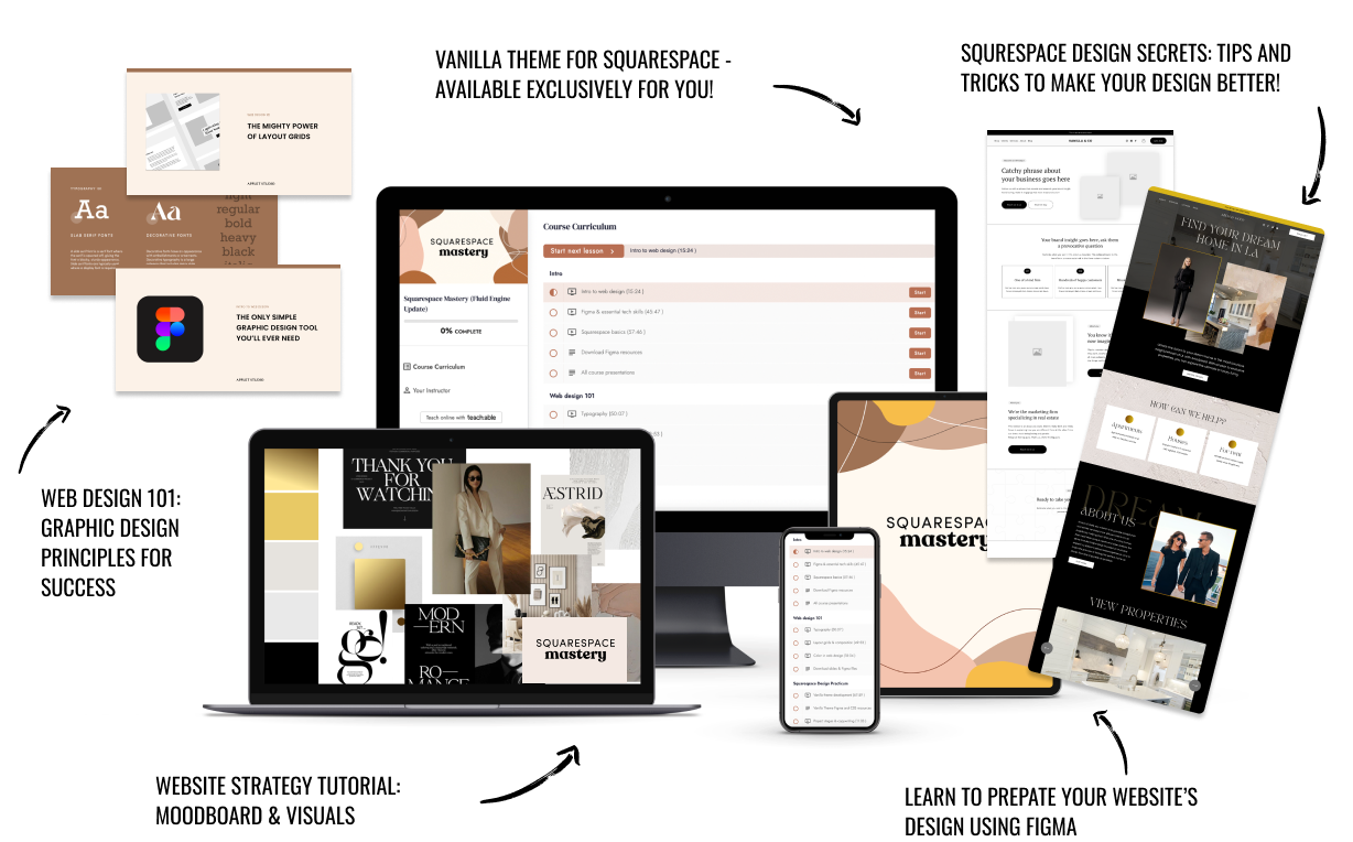
The workshop is jam-packed with design goodness. Inside, you’ll find the following topics:
What size should I design for? Responsive layouts and industry standards
Typography 101: How fonts can elevate your design & look professional
My approach to using colors in web design
Complete Figma tutorial
How to use layout grids to direct the attention of your website visitors
How to create a mood board and plan your website visuals
Squarespace Vanilla theme build-out: Complete walk-through, CSS snippets and Figma wireframe
Massive Squarespace design practicum: We go from a mood board to a finished design on Squarespace in a matter of an hour. Two designs included along with CSS plugins and Figma templates
Redesign 2 real websites with me in real time
How to grow as a designer and how to look for creative inspiration
Plus, there are some really helpful documents included: Complete Squarespace development checklist, copywriting and branding guides, sample client questionnaire and so much more!
Are you in? I’ll see you in Squarespace Mastery!


